Looking for affiliate landing page examples that actually bring fast sign-ups?
You’re in the right place.
This post shows real pages from top brands and explains why they work, not just how they look.
The truth is, without a strong affiliate landing page, clicks get wasted. People visit, get confused, and leave without signing up. That means lost money, lost time, and slow growth.
In this blog post, you’ll learn what makes affiliate landing pages convert fast. You’ll see how design, copy, layout, and simple page elements guide visitors to take action.
By the end, you’ll know what to copy, what to avoid, and how to build a page that gets more sign-ups without stress.
Let’s get into it…
In this article
1. Grammarly Affiliate

Grammarly’s affiliate page feels simple and confident.
Right at the top, it tells you what you’ll get… earn money by promoting Grammarly.
The headline is clear: it’s about earning by sharing a product people already love.
The page uses big, friendly visuals and a quick “Sign up” button that stands out.
The copy explains key benefits like competitive commissions, cash bonuses, a long cookie window, and support, in short lines you can scan quickly.
It doesn’t bury you in text… it gives bullet lists that are easy to skim. It also mentions perks for top performers, which feels motivating.
All of this helps you understand “what’s in it for me?” without reading a wall of text.
The simple layout and clear value make it easy for someone new to affiliate marketing to decide to join.
2. Bluehost Affiliate

Bluehost’s affiliate landing page uses big, bold messages that make you feel like this is a serious money-making opportunity.
The title “Earn big” grabs your attention right away, and the page walks you through exactly how it works: sign up, promote, and get paid.
It uses a visual and phrases to show the process in three simple steps, which helps anyone understand fast.
Right below that, there are benefit boxes that highlight high commissions, trusted brand reputation (millions of users), support, and tracking tools… all presented with icon and short phrases, not long paragraphs.
You also see real testimonials from other affiliates, which builds trust and makes the offer feel real.
The “Become an Affiliate” button appears many times, so you never have to scroll back up to find it.
This mix of visual cues, clear copy, and trust elements keeps you engaged.
3. Shopify Affiliate

Shopify’s affiliate page leans on brand trust and support for creators.
The headline talks about earning income by referring people to Shopify, and they instantly connect you to the idea that affiliates are part of a larger community of educators, influencers, and creators.
The layout breaks information into clear sections… benefits, what you’ll earn, and how it works… with space between paragraphs so it doesn’t feel crowded.
Shopify uses friendly, encouraging language that feels like a conversation.
They also explain who can join and what tools you get, which makes it easier for beginners to see if they fit.
The page doesn’t overwhelm you with numbers… it focuses on why affiliates love the program and how you can grow with it.
That emotional tone mixed with practical benefit statements keeps you reading and clicking.
4. Moosend Affiliate

Moosend’s affiliate page is bright, organized, and very specific about earnings.
It uses tiered commission visuals (Bronze, Silver, Gold, etc.) so you instantly see how your income can grow as you refer more customers. This tiered layout feels playful and makes the offer look like a game you want to win.
The page also includes simple stats like conversion rates and average earnings per click, which helps you understand real earning potential without guessing.
There’s a clear “Become an Affiliate” button, and they also offer a resource center with banners, email text, and social images… so affiliates feel supported.
The smart use of icons, short descriptions, and structured sections makes it easy to find the most important details quickly.
5. Kit Affiliate

Kit’s affiliate page keeps things focused and direct.
The headline clearly states the earning opportunity… a 50% commission for the first year, plus recurring revenue… which is a strong number that grabs attention right away.
The layout uses simple sections that cover how the commission works and how you continue earning after you refer people.
The copy is straightforward with very little fluff: you see percentages and conditions in short lines that are easy to read.
The page also uses buttons like “Apply to join,” so anyone ready to sign up doesn’t have to look for the link.
Because Kit focuses on one strong benefit (high commission and recurring earnings), the message stays simple and persuasive.
There’s no visual clutter, just straightforward numbers and a clear call to action… perfect for people who want facts fast.
6. Fiverr Affiliate

Fiverr’s affiliate page is strong because it sells variety and flexibility.
The design is clean and modern, with a clear headline that tells you that you can earn by promoting Fiverr services.
The page quickly explains how affiliates get paid, including different commission plans based on what you promote. This makes it feel flexible, not confusing.
The layout uses short sections with icons to explain benefits like wide range of offers, marketing tools, personal support, etc.
You also see examples of what you can promote, which helps beginners imagine how they’ll make money.
The copy is simple and friendly, not salesy. Call-to-action buttons appear often, so joining feels easy.
7. AWeber Affiliate

AWeber’s affiliate page feels friendly and beginner-safe.
The headline clearly says you earn 50% by referring people to AWeber. That one line already answers the big question: “Will I earn big?”
The page layout is simple, with sections that explain commissions, who the program is for, and how to get started.
The copy avoids big promises and instead focuses on trust, long-term earnings, and support.
The page uses calm colors and lots of white space, so it doesn’t feel noisy.
AWeber’s strength is clarity… it doesn’t rush you. It calmly explains the offer and makes joining feel safe and reliable.
8. Teachable Partner

Teachable’s partner page focuses on creators helping creators.
The design feels premium but simple, with a subheadline that explains you earn by recommending Teachable to people.
The page does a great job explaining who this program is for… bloggers & writers, course strategies, and educators… so visitors quickly know if they fit.
The copy feels supportive and encouraging, not aggressive. You also see social proof through Teachable’s strong brand reputation, which adds trust without needing heavy testimonials.
The call-to-action buttons are clear and placed after key sections, so you’re guided step by step.
Teachable works well because it connects earnings with helping others build online businesses.
9. Kajabi Partner Program

Kajabi’s partner page is built around big value and big rewards.
Earlier into the page, it highlights high commissions and recurring earnings, which instantly grabs attention.
The design is clean, with strong headings and visuals that make the page feel premium.
The layout explains the program in steps… how to join, how to promote, and how you get paid.
The copy is confident and benefit-focused, often reminding you that Kajabi is an all-in-one platform creators already trust.
The page avoids clutter and keeps sections short, so you can scan it quickly. Kajabi stands out by combining clear money talk with a polished, high-quality look.
10. Typeform Referral

Typeform’s referral page feels simple, friendly, and human. Unlike heavy affiliate pages, this one focuses on ease.
The design is very clean, with lots of space and soft visuals that match Typeform’s brand.
The copy explains the reward system in plain words… refer friends and earn rewards. There’s no long explanation or complex structure.
The layout shows the steps clearly: share link, someone join, you earn. This makes it feel effortless.
The page also removes pressure by keeping everything short and calm. Buttons are clear, and nothing feels hidden.
Typeform works well because it doesn’t try to “sell hard.” Instead, it makes sharing feel natural, which fits the product and builds trust fast.
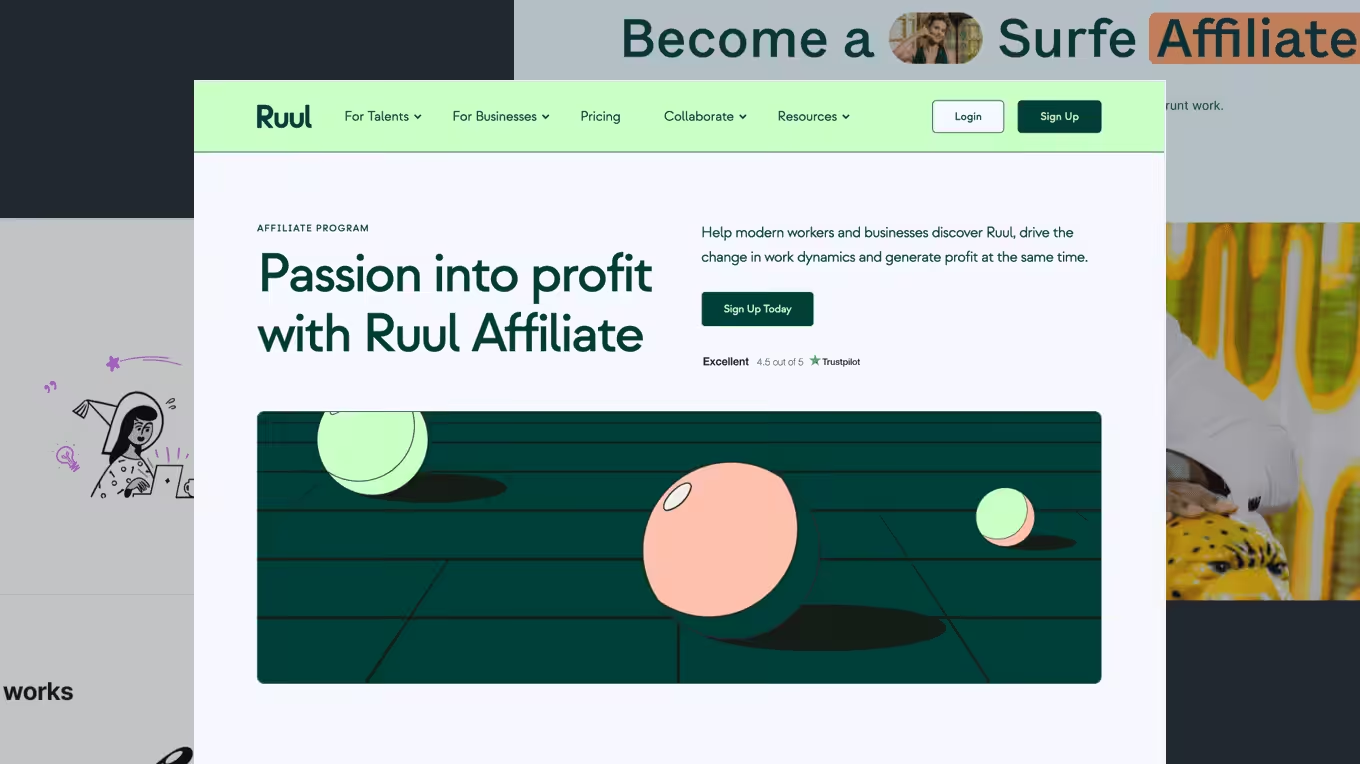
11. Pabbly Affiliate

Pabbly’s affiliate page works well because it is very direct about money.
After the hero section, it talks about earning recurring commissions, which is what most affiliates care about.
The design is simple, not fancy, but it does its job.
The layout uses clear blocks and bullet points, so you don’t have to read everything word for word.
One strong part of the page is how it explains lifetime commissions, which makes the offer feel long-term, not one-time.
The copy feels honest and practical, not hype-driven. The call-to-action button is clear and easy to find.
Pabbly’s affiliate page may not be flashy, but it wins by being clear, transparent, and easy to trust, especially for affiliates who like straight facts.
12. Monday Affiliate

Monday’s affiliate page looks modern, bold, and professional.
Right from the top, it talks about earning commissions by promoting a popular work tool.
The design uses bright colors, strong headings, and lots of space, which makes the page easy to read.
The layout breaks the message into sections like benefits, how it works, and why the brand is trusted.
The page repeats the sign-up button at the right moments, so you’re always guided forward.
Monday.com stands out because it combines strong visuals with clear earning benefits, making the program feel serious and profitable.
13. Payoneer Affiliate

Payoneer’s affiliate page focuses heavily on trust and global reach.
The headline clearly explains that you earn money by referring people to Payoneer.
The design feels corporate and clean, which matches a finance product.
The copy avoids hype and instead talks about real value: worldwide payments, trusted by businesses, and used in many countries. This makes affiliates feel safe promoting it.
Icons and short texts help break down complex ideas into simple points. Also, the call-to-action buttons are clear but not pushy.
Payoneer’s strength is making a financial product feel safe, global, and easy to recommend.
14. Wix Affiliate

Wix’s affiliate page does a great job of selling popularity. It reminds you that millions of people already use Wix, which instantly builds confidence.
The design is clean and friendly, with simple visuals and clear sections.
The copy explains how affiliates earn by referring users who build websites on Wix. You quickly see benefits like competitive commissions, creative resources, and unlimited referrals.
The layout keeps things simple, moving from “why join” to “how it works” without confusion.
Wix also explains who the program is best for, which helps visitors know if it fits them.
The page feels beginner-friendly and welcoming.
15. Jotform Affiliate

Jotform’s affiliate page feels clear, calm, and very structured.
The headline tells you exactly what you’ll earn by referring users to Jotform.
The design uses soft colors and simple layouts, so nothing feels overwhelming.
One strong part is how it shows how much affiliates can earn using a calculator, helping affiliates understand what to expect.
The copy is simple and friendly, not sales-heavy. Icons and short lines help you scan fast.
The sign-up button is easy to find and placed after key info, so you feel ready before clicking.
Jotform stands out by making everything feel organized, honest, and easy to understand.
16. ClickFunnels Affiliate

ClickFunnels’ affiliate page is very bold and sales-focused, just like the brand.
The headline quickly talks about high commissions and recurring income, which grabs attention fast.
The design uses strong colors, big text, and clear sections that guide your eyes down the page.
The copy clearly explains how much you can earn and why ClickFunnels converts well.
The layout repeats the call-to-action often, so you’re always pushed to sign up.
The page is not quiet or soft… it’s energetic.
ClickFunnels works because it matches its audience: people who like big promises, clear money talk, and strong direction.
17. Wise Affiliate

Wise’s affiliate page feels simple, calm, and trustworthy.
The design is clean, with lots of space and soft colors, which fits a finance product.
The headline encourages visitors to become Wise partner, without hype.
The layout walks you through how the program works, what actions earn commissions, and who it’s best for.
The copy uses plain language and focuses on trust, low fees, and global use. This makes it easy to recommend without feeling uncomfortable.
Icons and short paragraphs help break things down.
The call-to-action is clear but not pushy.
Wise stands out by making affiliate marketing feel safe, honest, and easy to explain.
18. Notion Affiliate

Notion’s affiliate page is clean, modern, and creator-friendly.
The design is minimal, with lots of white space and simple visuals.
The headline clearly says you can earn by sharing Notion with others.
The copy uses simple and clear language.
The layout explains how the program works, who can join, and what support you get. Everything is short and clear, so you don’t feel lost.
The page feels welcoming, especially for content creators and educators. Buttons are simple and well-placed.
Notion works well because it keeps things light, human, and easy, while still explaining the value clearly.
19. Printful Affiliate

Printful’s affiliate page is strong because it explains a clear use case. You earn by promoting a print-on-demand service people already need.
The design is bright and friendly, with product visuals that show what Printful does.
The copy clearly explains commission rates, cookie duration, and how long you earn from referrals.
The layout uses steps and bullet points, so beginners understand fast.
Printful also highlights its global fulfillment and trusted brand, which makes promoting it easier.
The call-to-action button is visible and direct.
20. ClickUp Affiliate

ClickUp’s affiliate page feels structured and professional.
The design uses clear sections, icons, and short text blocks to explain the program.
The headline focuses on earning by promoting a fast-growing productivity platform.
The copy highlights benefits like strong commissions, tiered structure, and guidelines for success.
The page is easy to scan, and the sign-up button is placed at the right moments.
ClickUp affiliate page works because it balances clear earnings info with a clean, organized layout.
Wrapping up
If there’s one thing these affiliate landing pages show, it’s this:
Small details matter.
- Clear headlines
- Simple layouts
- Strong CTA buttons
- And honest copy…
…all work together to drive sign-ups fast.
You don’t need fancy design or long pages. You need to explain the offer clearly and guide visitors to take action.
Use these examples as a guide, not something to copy word for word. Pick what works, test it, and improve as you go.
A better affiliate landing page means more clicks, more trust, and more sign-ups in the long run.
Frequently Asked Questions
What should be included on an affiliate landing page?
A good affiliate landing page should include a clear headline, short benefits list, simple steps, trust signals, and a strong call-to-action button. It should avoid too many links or distractions that pull attention away from signing up.
Do affiliate landing pages need testimonials?
Testimonials help build trust, but they are not always required. If the brand is well known, clear benefits may be enough. When used, testimonials should be short and real. They help visitors feel safe before signing up.
How long should an affiliate landing page be?
An affiliate landing page should be as long as needed to explain the offer clearly. Some pages work well with short content, while others need more details. The key is clarity, not length. Every section should push users to sign up.