If you design landing pages for your agency or B2B clients, you already know one truth…
Getting business buyers to take action isn’t easy.
They don’t click impulsively. They think, compare, and calculate.
That’s why a weak landing page can quietly kill great offers.
You might be running ads, sending traffic, or pitching your client’s best deal… but if the landing page doesn’t convert, all that effort goes to waste.
Most agencies make the same mistakes:
Unclear headlines, long forms, and confusing layouts that push visitors away instead of pulling them in.
The result?
Low conversions, wasted ad spend, and clients who think “the campaign didn’t work.”
But it doesn’t have to be that way.
In this guide, you’ll discover 10 B2B landing page best practices that will help you design pages that actually convert… not just look nice.
You’ll learn how to write clear headlines, build trust fast, use simple forms, and structure your pages for easy reading.
Whether you’re building landing pages for your agency or your B2B clients, these tips will help you turn more visitors into real business leads…
The kind that make campaigns and clients truly successful.
In this article
10 powerful B2B landing page best practices for agencies
As a B2B agency, you already know the challenge…
As mentioned earlier, getting busy decision-makers to stop, read, and take action isn’t easy.
Unlike B2C buyers who make quick emotional purchases, B2B buyers think longer, ask questions, and compare options.
That’s why every detail on your landing page must guide them to trust you… and convert.
Let’s look at the 10 B2B landing page best practices your agency should follow to create pages that don’t just look good but actually bring in leads.
1. Craft a clear and benefit-focused headline
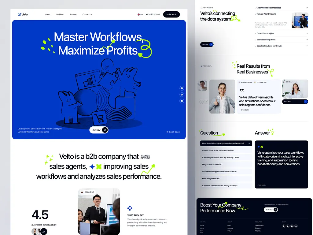
Let’s be honest… most people judge your landing page in the first few seconds.
If your headline isn’t clear, they’ll close the tab before scrolling.
In B2B marketing, clarity always beats creativity.
Your headline should instantly tell visitors what they’ll get and why it matters.
Strong headline example:
“Automate Your Agency’s Client Reporting in 2 Clicks”
Weak headline example:
“Smarter Solutions for Modern Agencies”
See the difference?
The first one is direct and promises a benefit. The second is vague and forgettable.
Quick tip:
Make sure your headline connects to the ad, email, or campaign that led visitors to the page.
If someone clicked an ad about “AI Reporting Tools,” your landing page should repeat that phrase in the headline.
That’s how you keep the promise and maintain trust.
2. Lead with a value proposition that solves a pain point
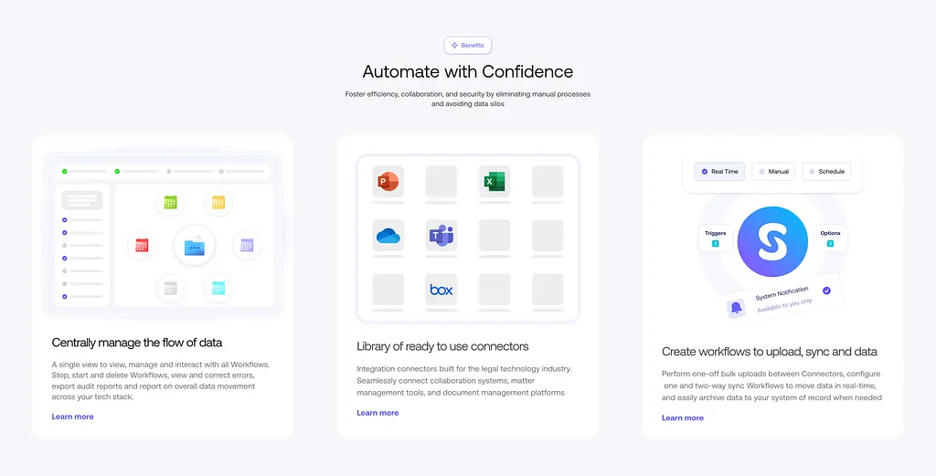
Your value proposition is the “why” behind your offer… why should someone choose you over the rest?
For B2B pages, your value proposition should directly solve a problem your target audience faces.
To do that, you first need to identify your client’s pain points.
Ask yourself:
- What keeps their team stuck?
- What’s wasting their time or money?
- What result are they desperate to achieve?
Once you know this, your landing page message becomes simple:
“You have this problem. We solve it. Here’s how.”
Example:
Before: “Managing data manually takes hours every week.”
After: “Our tool helps you automate data entry, saving 10+ hours weekly.”
See?
The “after” focuses on a clear solution. That’s the power of a strong value proposition.
3. Simplify page layout and visual hierarchy
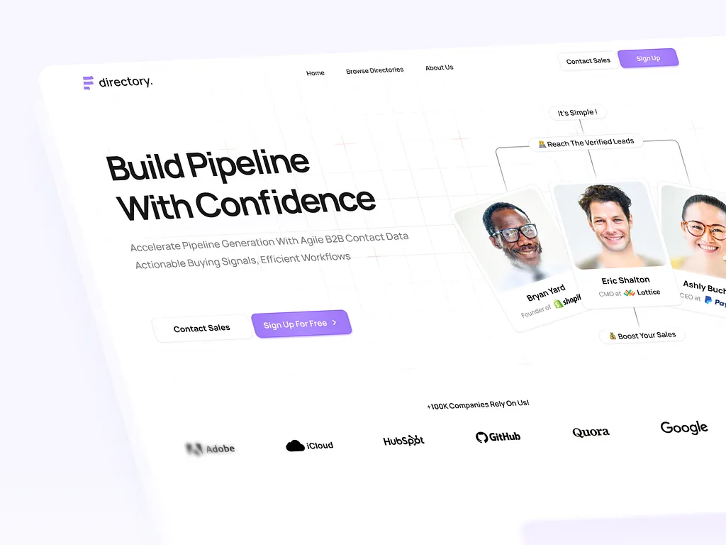
A cluttered page confuses people. And confused visitors don’t convert.
Your layout should help readers move smoothly from one section to another.
Keep it clean:
- Use plenty of white space. It makes the page easy on the eyes.
- Break text into short paragraphs and bullet points.
- Guide readers’ eyes with clear headings and visuals.
Designers often use layout patterns like the F-pattern or Z-pattern… these show how people naturally scan a page.
You can use heatmap tools like Hotjar or Crazy Egg to see how visitors move across your landing page and adjust accordingly.
4. Use trust signals and social proof strategically
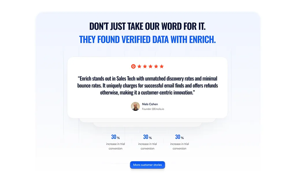
As mentioned before, B2B buyers don’t make impulse decisions. They want proof your solution actually works.
That’s why social proof… testimonials, case studies, and client logos… is key.
If you can, use real numbers and results:
“Helped Company X increase leads by 230% in 3 months.”
Add client photos or company logos next to testimonials to make them feel genuine.
Even better, include short video testimonials. People trust faces more than text.
Your goal here is to show that other businesses, just like your visitor’s, have trusted you… and succeeded.
5. Create compelling and conversion-focused CTAs
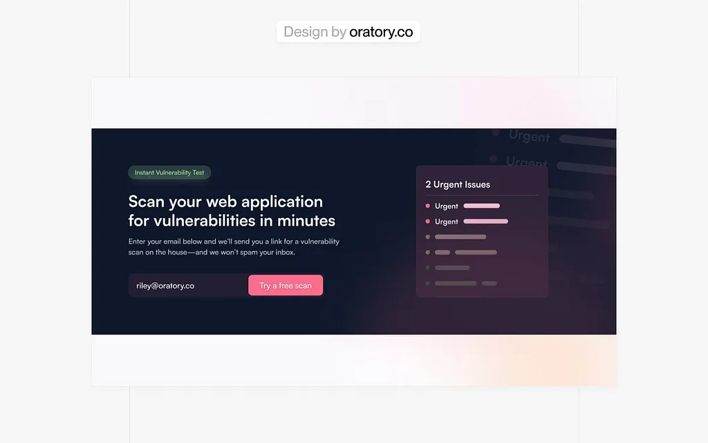
Your call-to-action (CTA) is where all your effort pays off.
Don’t hide it or use boring words like “Submit” or “Learn More.”
Instead, write action-focused CTAs that tell people exactly what they’ll get.
Examples:
- “Get My Free Demo”
- “See How It Works”
- “Book a 15-Minute Strategy Call”
Also, don’t just place your CTA once. Repeat it throughout the page… above the fold, mid-page, and at the end.
Finally, test your CTAs.
A simple color change or wording tweak can increase clicks.
Use A/B testing tools like VWO to find what works best.
6. Optimize forms for simplicity and completion
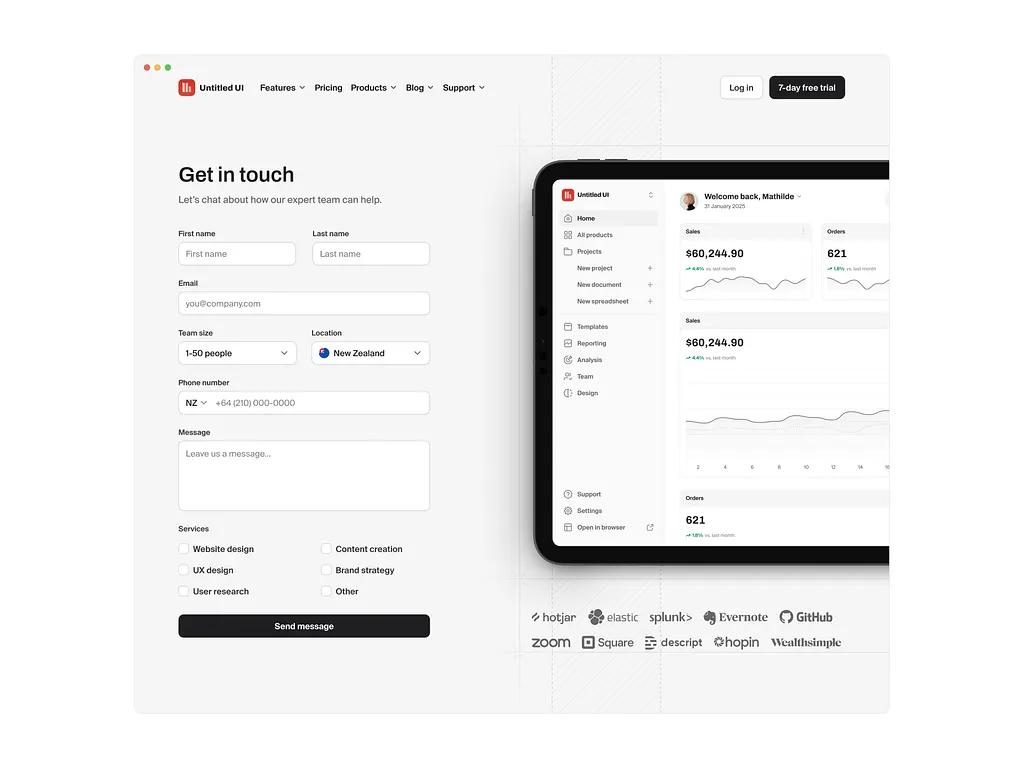
If you’ve ever filled a long form online, you know how frustrating it feels.
Now imagine a busy business owner facing 10+ form fields. They’ll quit instantly.
Your landing page form should only ask for what’s necessary… name, email, company, maybe phone number.
Everything else can wait until later.
Quick tips:
- Add autofill to make typing faster.
- Use progress bars if your form has multiple steps. It keeps people motivated to finish.
Shorter, simpler forms usually mean more conversions… especially in B2B.
7. Use visuals that support, not distract
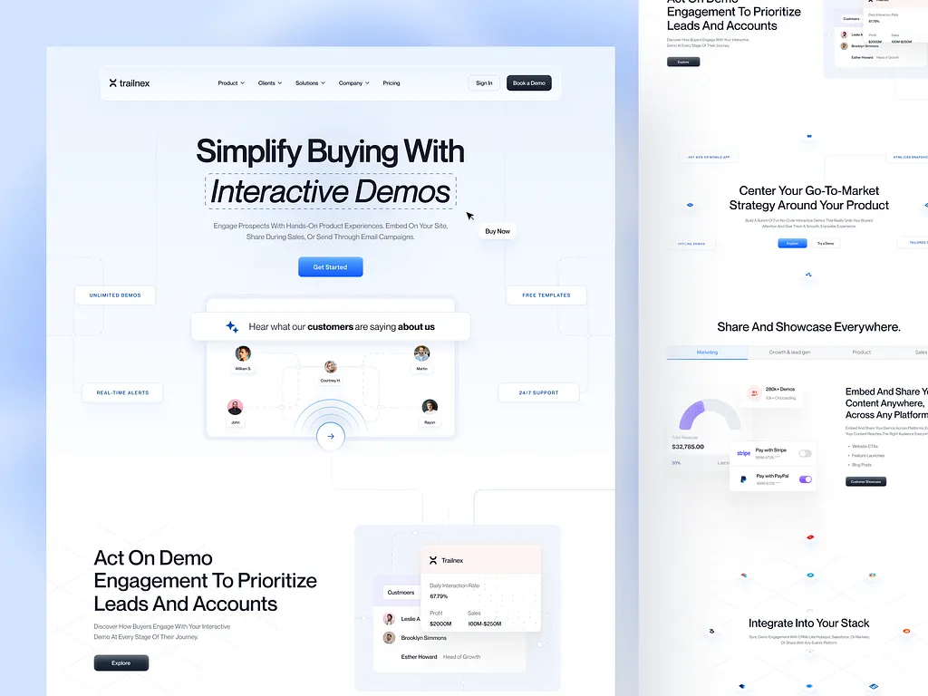
Visuals are powerful, but only when they serve a purpose.
Don’t just add random images or flashy graphics.
Use visuals that explain or reinforce your message… like screenshots, demo videos, or short clips showing your product in action.
If possible, use real people instead of stock photos. Viewers can tell the difference.
Also, make sure all visuals match your brand colors and tone. Consistency builds trust.
When done right, visuals make your message clearer… not noisier.
8. Make your landing page mobile and speed optimized
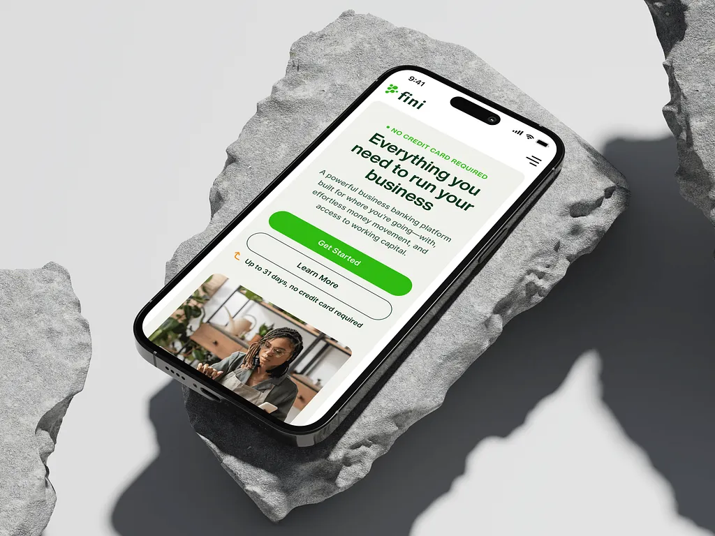
If your page loads slowly or looks bad on mobile, you’ll lose visitors before they even read your headline.
Speed matters… even in B2B.
Studies show that if a page takes more than 3 seconds to load, over half of users leave.
You can test your page speed using PageSpeed Insights or GTmetrix.
If it’s slow, compress your images, use lighter code, and reduce plugins.
Also, design with mobile users in mind.
Buttons should be easy to tap, text should be readable, and forms should fit nicely on small screens.
Remember: a smooth experience equals higher conversions.
9. Personalize copy and offers for each audience segment
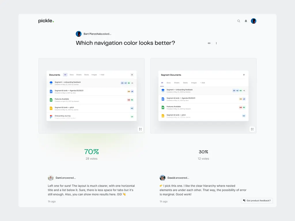
Not all your visitors are the same.
Some may be startups, others big corporations. That’s why your landing page should speak directly to each group when possible.
This is where personalization comes in.
You can show different messages or offers depending on who’s visiting.
Example:
If the visitor is from a SaaS company, your headline could say: “Automate Reports for Your SaaS Clients.”
If it’s a marketing agency, it could say: “Simplify Reporting for All Your Clients.”
10. Test, measure, and refine regularly
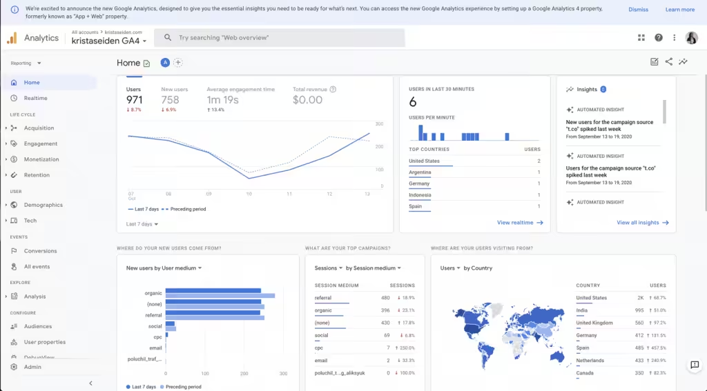
A good landing page is never “done.”
Even if it performs well today, you can always improve it. That’s why testing and tracking are so important.
Keep an eye on:
- Click-through rates (CTR)
- Bounce rates
- Form completions
- Time spent on page
If a section isn’t working, try changing the headline, image, or CTA… one thing at a time.
Testing tools like VWO or Convert make this easy.
The best agencies treat optimization as a habit, not a task.
Wrapping up
In the end, a good B2B landing page is all about clarity, trust, and focus.
When you keep things simple, speak directly to your audience, and show proof of results, more people will take action.
Don’t try to impress… aim to connect.
If you want help designing landing pages that actually convert, our team at Block Agency can help.
We build clean, high-performing websites and landing pages for agencies and their clients.
Let’s make your next page one that doesn’t just look great… but turns visitors into leads.
Talk to us here: hey@blockagency.co
Frequently Asked Questions
What’s the difference between B2B and B2C landing pages?
B2B landing pages target businesses, so they focus on solving problems and showing results. B2C landing pages target individuals and often appeal to emotion or impulse.
What should a B2B landing page include?
A B2B landing page should include a headline, short message, visuals, social proof, and a call-to-action button. It should also explain your main benefit in simple terms.
