Do you want to see the best B2B landing page examples and learn what makes them convert so well?
That’s smart.
Because a weak landing page can cost you leads, demos, and even sales. Visitors leave fast when…
- Your message is confusing
- Your design is messy
- Or your call to action is unclear
But the good news is this:
You don’t need to guess what works. By studying the best examples, you can copy the simple things they do right… strong headlines, clean layouts, real proof, and clear value.
In this blog post, you’ll see 15 proven B2B landing pages, what makes each one work, and the exact ideas you can apply to your own landing page to boost conversions.
Let’s get into it…
In this article
1. Pipedrive
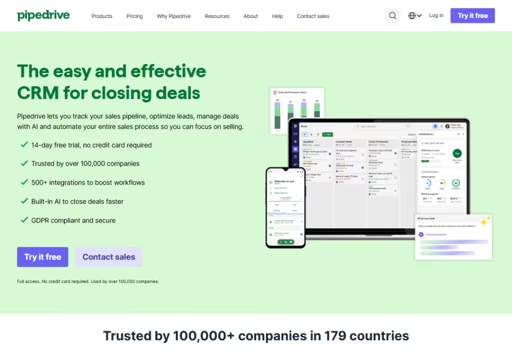
Pipedrive’s landing page is simple and focused:
It shows what the product does fast and lets you start a free trial with one click.
The page uses clear, friendly language (“easy-to-use CRM”) and highlights concrete wins… like many integrations (500+) and AI deal closer… so visitors know the benefits right away.
The layout leads your eyes from a bold headline & subheadline, to a short feature list, to 2 simple CTA (“Try it free”, “Contact sales”), to social proof (logos and customer counts), then a clear CTA (“chart with Nora”), and so on.
That mix of clarity, social proof, and low-friction signup makes the landing page trust-building and action-focused.
2. Lattice
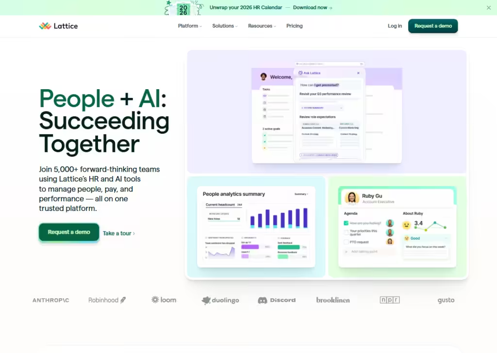
Lattice’s landing page uses strong visuals and short, human copy to explain a complex product:
People and performance management.
Instead of long paragraphs, they show product snippets (dashboards, AI assistant) and callouts like “Join 5,000+ teams,” which gives fast social proof.
The page also uses small animations and product cards to show features instead of only telling them… that helps anyone scanning the page understand value in seconds.
CTAs are tailored (Request a demo, Take a tour), so different visitors can pick what fits them. The result:
A friendly, confident page that reduces friction for HR leaders who want to learn more or book a demo.
3. Coda
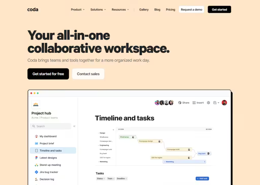
Coda’s landing page sells a big idea (“all-in-one workspace”) but keeps the message short and visual.
It leads with a simple headline and follows with real examples… templates and logos of known teams… so visitors instantly see practical uses.
The page leans on templates and previews so people can imagine using Coda for things like CRMs or plans, not just abstract features.
CTAs are low-pressure (“Get started for free” or “Contact sales”), making it easy for both individual users and teams to take the next step.
By mixing clear benefits, examples, and ready-to-use templates, the page makes a complex tool feel approachable.
4. Monday
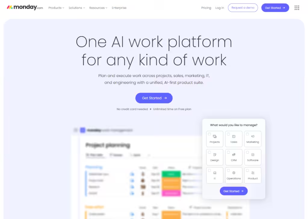
Monday’s landing page is bright, visual, and action-focused.
It quickly shows multiple product views (boards, timeline, Gantt) so visitors understand that Monday is flexible for many workflows.
They highlight AI assistants and practical use-cases, which helps different buyer types see immediate value.
The page uses bold CTAs and demo options for teams who want a guided intro, plus clear product imagery to reduce guesswork.
Overall, the combination of many real use-cases, clear visuals, and targeted CTAs turns curious visitors into trial users or demo requests fast.
5. Typeform
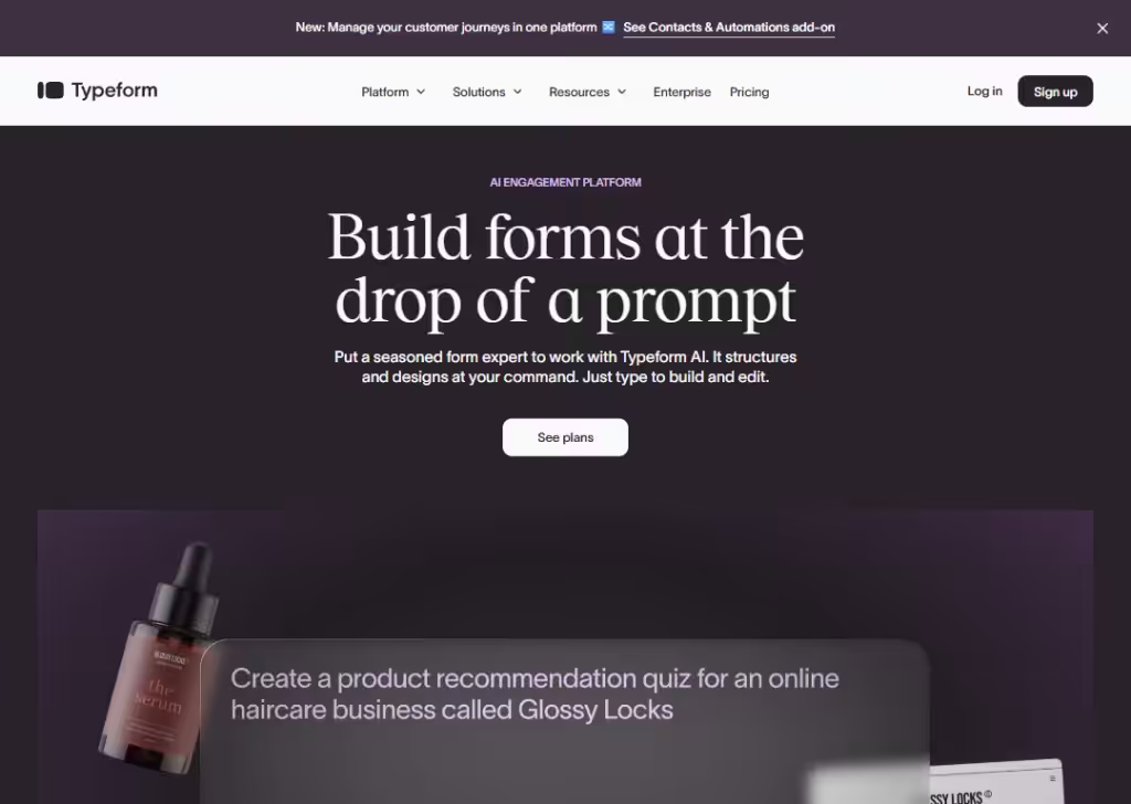
Typeform’s landing page explains quickly what the tool does:
Build nice-looking surveys and forms that feel conversational.
It shows big benefits like “more data with less effort,” and highlights features such as customizable design, integrations, logic flows… which help visitors understand it’s powerful and easy to use.
The layout is clean:
Headline, subheadline, a call to action (“Try Typeform for free”), a video ad, social proof (brands, user counts), and so on… making it easy for a visitor to decide fast.
This kind of clarity + low friction helps convert visitors into sign-ups. Plus, offering a free plan lowers the risk for new users who are just trying it out.
6. Slack
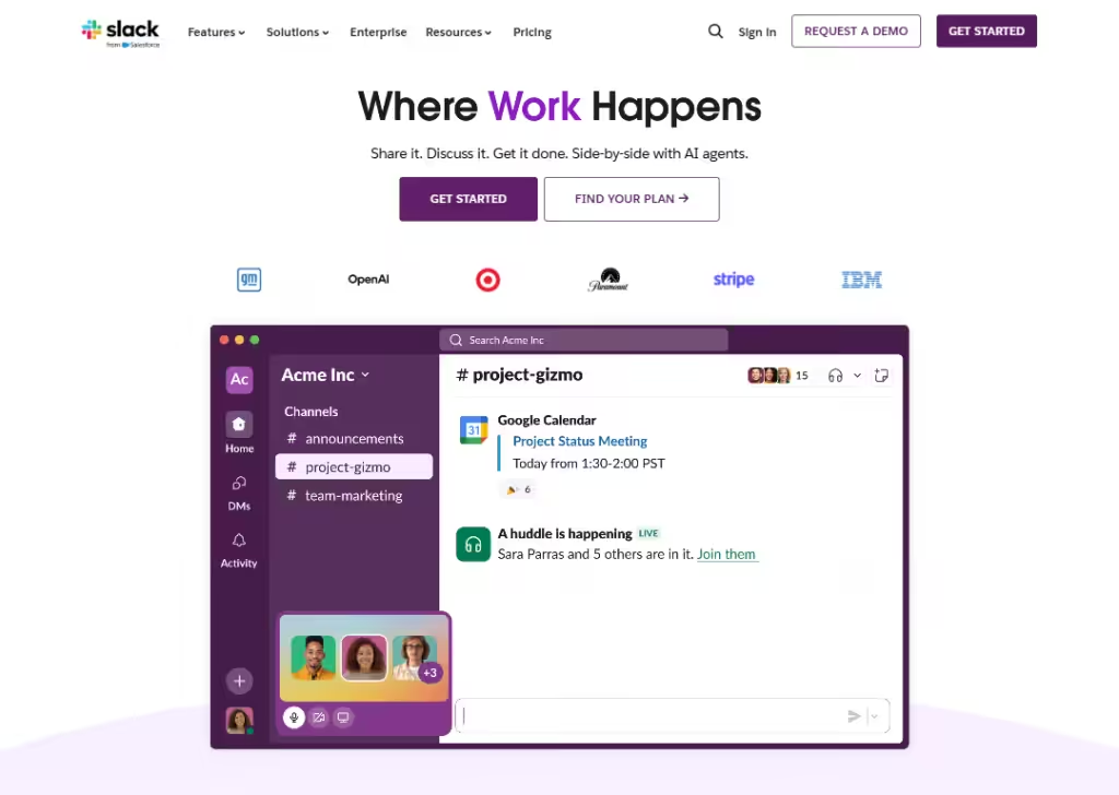
Slack’s landing page presents itself as a “work operating system”:
It promises to bring together people, tools, and even AI into one workspace.
Right away, you see the big idea:
Unify communication, knowledge, tasks, and more… which appeals to teams that need structure and clarity.
The page highlights core features (channels, messaging, integrations, AI tools, workflows) so visitors get a fast sense of what Slack can do.
Slack also uses social proof: big company logos, stats on productivity gains and usage numbers… that builds trust and shows the product is proven at scale.
And the CTAs are simple and strong (“Get started,” “Find your plan”), letting teams jump in quickly.
Because the page focuses on “what problems it solves” rather than “just features,” it connects with actual needs:
Communication, collaboration, and efficiency.
7. Cycle
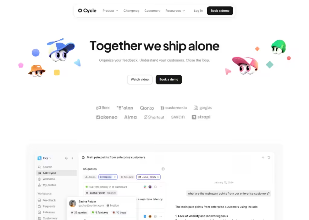
Cycle makes its landing page super clear about 3 promises:
“Organize your feedback. Understand your customers. Close the loop.”
On the page you immediately see the problem they solve (feedback noise, scattered ideas) and how they fix it (capture feedback from many channels, auto-tag, organize, turn it into insights).
They use easy language:
“Organize your feedback. Understand your customers. Close the loop.” That helps people who don’t love technical talk.
8. Wiza
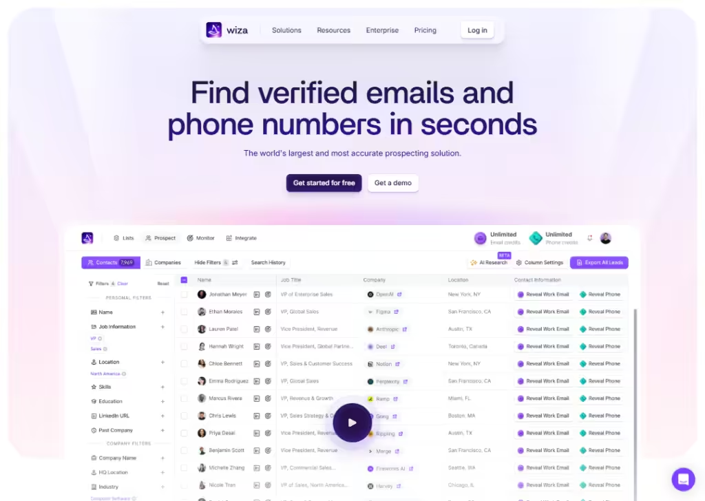
Wiza’s landing page directly calls out a big pain many B2B companies have… outdated or missing contact info… and promises a solution:
“Find verified emails and phone numbers in seconds.”
That straightforward message helps visitors instantly see what Wiza does.
They show trust by saying they work with many “GTM professionals” and by offering a “get started free/get demo” option.
Also, the page is clear about how Wiza works: via a Chrome extension or export to CSV/CRM, which makes using it feel easy and immediate, not complicated.
Because Wiza mixes clarity (what it does), benefit (verified data, lots of contacts), and easy next steps (free start, demo), the landing page reduces friction and helps convince visitors fast.
9. Homerun
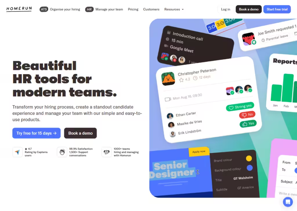
Homerun’s landing page stands out because it speaks to real needs in hiring and HR:
Messy spreadsheets, lost resumes, chaotic job posts.
Right away, it positions itself as “beautiful HR tool for modern team.”
They use simple, everyday words… no jargon… and show what you get: organize hiring, team management. That makes the tool feel approachable even for people who are not “techy.”
By mixing clarity, focus on pain-points, and a clean, friendly design + easy call-to-action (free trial, demo), Homerun’s landing page helps build trust and lowers barriers for companies to try it.
10. SupportNinja
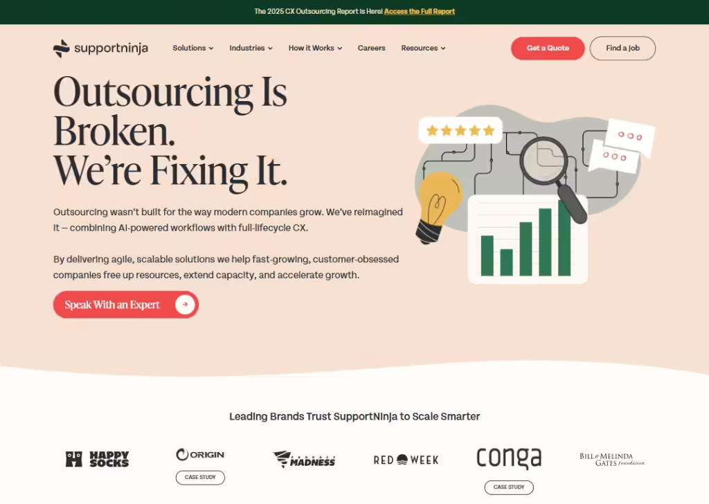
SupportNinja’s landing page grabs attention by critiquing traditional outsourcing (“Outsourcing Is Broken”)… which many companies may feel but don’t see addressed.
That bold statement helps the page stand out and speak to a real problem.
Then they follow up with what they offer: “agile, scalable solutions,” “AI-powered workflows,” and “full-lifecycle CX.
All those sound modern and trustworthy… helpful for companies worried about quality or compliance.
Also, they invite visitors to “Speak With an Expert” rather than push a hard sign-up. That call-to-action feels low pressure and more consultative, which works when services are complex or customized.
This tone + honesty + clarity helps turn visitors into leads.
11. Dock
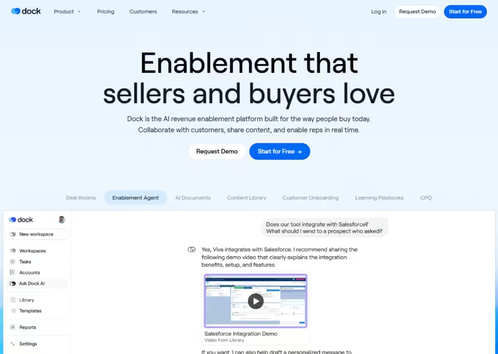
Dock’s landing page is clear about what it offers:
A unified workspace for sales, onboarding, customers portals, and revenue enablement.
They show results: “+25% win rate”, “+22% deals closed”, “2 hours saved per customer,” which gives real social proof that it works.
The page emphasises flexibility… you can use pre-made templates or customize portals, embed documents, and integrate with popular tools (CRM, file storage, communication tools).
Also, they stress convenience: clients don’t need an account, only a link… so sharing info is frictionless.
All this makes Dock’s landing page feel powerful but simple… visitors immediately see what problems it solves (messy onboarding, scattered docs), and how it solves them (organized portals, automation, tracking, smooth handoffs), which helps convert them into users.
12. Slite
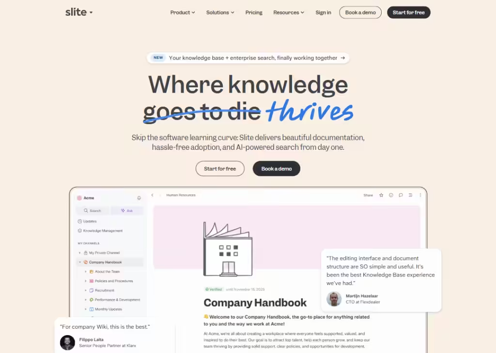
Slite stands out by promising to make knowledge sharing and team collaboration easy.
People can collaborate, comment, share updates, manage documents… all in one place. That helps reduce email chaos and messy version control.
Because the page focuses on benefits (simplicity, teamwork, speed) rather than technical jargon, it speaks directly to teams that want to make communication and knowledge sharing smoother.
13. Miro
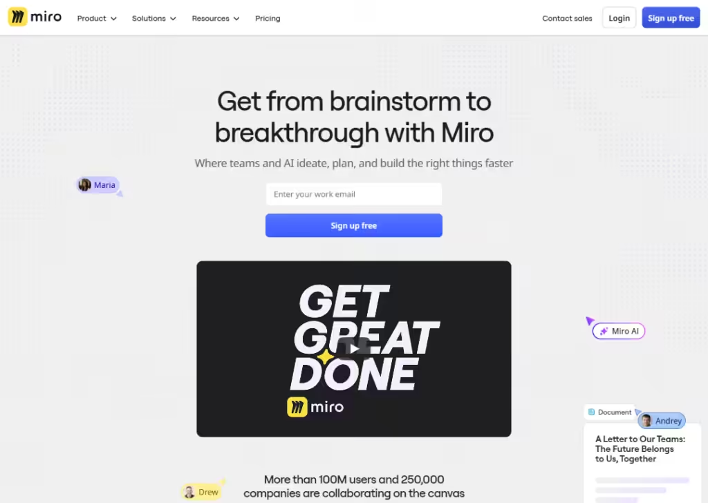
Miro’s landing page shows right away what it does:
A big, infinite canvas for teams to plan, design and collaborate.
It uses a bold headline, previews of boards and templates, and real use-case examples… so visitors quickly see how they could use it.
They show big numbers and social proof: millions of users, thousands of templates, hundreds of integrations… this helps build trust and shows Miro isn’t a “small” tool.
Also, Miro presents a variety of ways to use it: docs, diagrams, slides, design flows, brainstorming… not just one narrow use. That makes it appeal to many different types of teams (designers, marketers, product people).
Finally, the call-to-action is easy (“watch video”) and low-pressure. The clean design + clarity + trust signals + flexibility make this landing page welcoming and convincing.
14. Asana
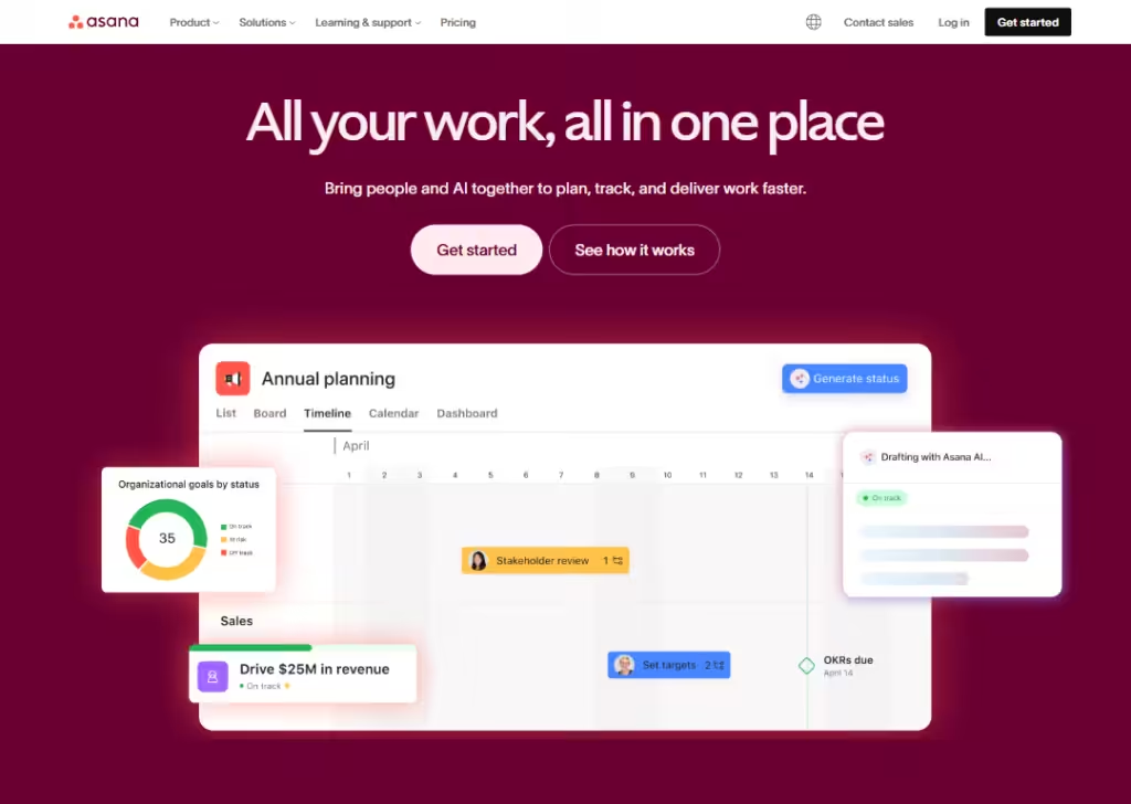
Asana’s landing page makes clear from the start that it helps “teams work together intelligently and scale effortlessly.”
That promise speaks directly to teams and people trying to stay organized.
It shows many features and benefits: project management, goals & reporting, admin & security, automation/workflows, resource planning… so people see right away it’s more than just a basic checklist tool.
They mention integrations (lots of other tools work with Asana) and now even AI support… that gives confidence that Asana stays modern and flexible as team needs grow.
The landing page feels straightforward, organized, and relatable… good for teams who want predictable and smooth project management.
15. Zendesk
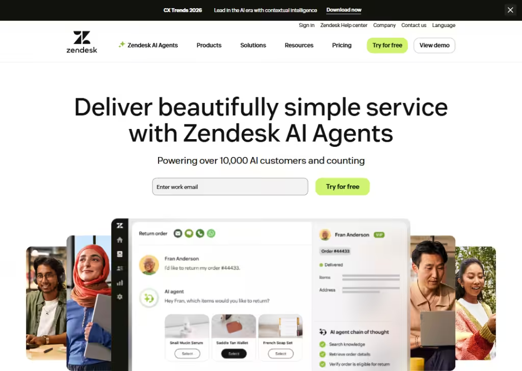
Zendesk’s landing page leads with a simple big idea:
“Deliver beautifully simple service with Zendesk AI Agents”… which immediately tells a visitor what problem Zendesk solves (customer & employee service) and hints at a modern, AI-powered solution.
Zendesk shows social proof: big, recognizable company logos as clients… that gives trust and suggests the tool works at scale.
They make the next steps easy: buttons like “Try for free” or “Get a demo.”
The page doesn’t assume too much… it invites you in, whether you’re a small business or a big company.
Overall, the landing page feels trustworthy, modern (thanks to AI focus), and flexible… good for any type of business that needs to provide customer or internal support.
Wrapping up
Great landing pages are built with clear messages, simple layouts, and a strong focus on what the visitor needs.
The 15 examples you just saw prove that small changes… better headlines, sharper offers, cleaner design… can make a huge difference in conversions.
And if you want a landing page that looks good, loads fast, and turns visitors into real leads, Block Agency can help.
We design clean, high-converting websites and landing pages for agencies that want results.
Talk to us here: hey@blockagency.co
Frequently Asked Questions
Why are landing page examples useful for B2B companies?
Landing page examples help B2B companies see what works in real life. They show simple layouts, strong headlines, and proven ideas that can boost sign-ups or demo requests. Learning from these examples makes it easier to build landing pages that convert better.
How do B2B landing pages differ from B2C landing pages?
B2B landing pages focus on solving clear business problems, showing proof, and guiding leads to book demos or start trials. B2C pages are often more emotional. B2B pages use simple messages, trust signals, and clear value to convince decision-makers.
What should every B2B landing page include?
A strong headline, clear subheadline, simple layout, short benefits, social proof, and a clear call to action. These help visitors understand the offer fast. Adding real results, client logos, or case studies builds trust and improves conversion rates.
