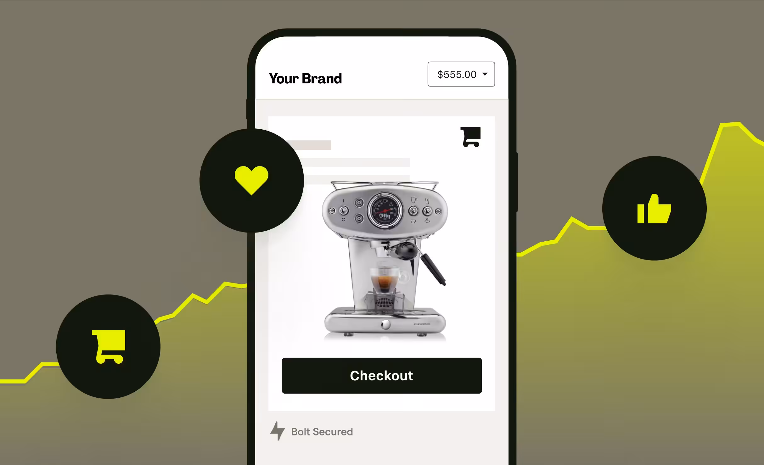
If you run an ecommerce store, you want more visitors to finish paying, not leave halfway, right?
This blog post will help you understand how checkout optimization and checkout UX work, and why they matter so much for sales.
Right now, many stores lose money at checkout.
In fact, the average cart abandonment rate is 70.22%. That means most shoppers add items to their cart but never complete payment. A confusing or slow checkout is often the reason.
In this blog post, you’ll learn 15 proven tips to improve checkout UX.
These tips will show how to make checkout simple, clear, and easy to use, so more shoppers complete their purchase and your store makes more sales.
Let’s get into it…
In this article
Tip 1: Remove forced account creation

Many people just want to buy and leave. They don’t want to create an account, confirm emails, or set a password.
When a store forces sign-up before payment, people get tired and leave.
Guest checkout lets buyers pay fast without stress. If they enjoy the experience, they may create an account later.
This one change alone can reduce abandoned carts a lot. Make buying easy first. Registration can always come after the sale.
Tip 2: Show all costs early

No one likes surprises at checkout.
If a product looks cheap at first but suddenly becomes expensive because of shipping or tax, people feel tricked. This makes them leave without paying.
Showing all costs early builds trust. Buyers can decide faster because they know the full price from the start.
When shoppers feel the store is honest, they are more likely to complete the purchase and come back again.
Tip 3: Keep the checkout short

Long checkout forms scare people away.
Asking for too much information feels stressful. Most buyers just want to pay and move on.
Only ask for what you really need, like name, address, and payment details. Remove extra questions that don’t help the order.
A short checkout feels fast and smooth. The easier it feels, the more people will finish paying instead of closing the page.
Tip 4: Use a progress indicator
People like to know how much work is left.
A progress bar shows how many steps remain in checkout. This makes the process feel clear and simple. Without it, buyers may think checkout will never end.
When shoppers see they are almost done, they are more likely to finish. It also reduces stress and confusion.
Even a small “Step 2 of 3” message can make checkout feel faster.
Tip 5: Make the checkout mobile-friendly

Most people shop on their phones today. If the checkout is hard to use on mobile, buyers will leave.
Buttons should be big enough to tap easily. Text should be clear and readable. Forms should not require too much typing.
A mobile-friendly checkout helps people pay without zooming or mistakes.
When checkout works well on phones, more users complete their purchase anywhere, anytime.
Tip 6: Offer multiple payment options

Not everyone wants to pay the same way. Some prefer cards, others like bank transfers or wallets.
When a buyer does not see their favorite payment option, they may leave.
Offering many options makes checkout easier for more people. It removes friction and builds trust. The goal is simple:
Let buyers pay the way they are most comfortable with, without forcing one method.
Tip 7: Auto-fill and smart defaults
Typing long details is tiring, especially on mobile.
Auto-fill helps by filling address and name details automatically. Smart defaults also help by selecting common options for the user.
This saves time and reduces mistakes. Fewer errors mean fewer failed checkouts.
When checkout feels fast and easy, buyers are more likely to complete payment without frustration or delay.
Tip 8: Show trust signals clearly

People worry about online payments. They want to know their card details are safe.
Trust signals like security badges, payment logos, and SSL signs help calm these fears. These signs tell buyers the site is secure.
When shoppers feel safe, they pay with confidence. Without trust signals, people may doubt the store and leave.
Trust is a big part of checkout success.
Tip 9: Highlight errors clearly
Mistakes happen during checkout. When they do, users should know exactly what went wrong.
Error messages should be clear and easy to understand. Highlight the exact field that needs fixing. Do not erase everything the user has filled. That makes people angry.
Clear error handling helps buyers fix problems quickly and continue checkout without starting over.
Tip 10: Add a clear final CTA

The final button should clearly tell users what will happen next.
Buttons like “Pay now” or “Place order” remove confusion. Avoid vague words like “Continue” or “Submit.” Buyers should feel confident when clicking the final button.
A clear call-to-action reduces hesitation and helps users complete their purchase without second guessing their decision.
Tip 11: Allow easy edits without leaving checkout
Sometimes buyers notice a mistake at the last moment.
Maybe they want to change quantity or address. If they have to leave checkout to fix it, many won’t return.
Let users edit details right inside checkout. This keeps the process smooth and stress-free.
Easy edits help buyers stay focused and finish paying instead of giving up.
Tip 12: Use clear field labels and placeholders
Every form field should be easy to understand.
Tell users exactly what information is needed. For example, say “Email address” instead of just “Email.”
Clear labels reduce mistakes and confusion. When users understand what to enter, checkout moves faster.
Simple instructions help people complete forms with confidence and fewer errors.
Tip 13: Save cart data automatically
People get distracted easily.
If a shopper leaves the site and comes back, their cart should still be there.
Losing cart data frustrates users and kills sales. Saving cart details automatically makes returning easy. It feels helpful and thoughtful.
This small feature brings many buyers back to finish their purchase later.
Tip 14: Offer visible customer support

Sometimes buyers have questions before paying. If they can’t get help fast, they leave.
Showing live chat, WhatsApp, or a help link during checkout solves this. Quick answers remove doubt and build trust.
Support should be easy to find, not hidden.
When help is available, buyers feel supported and are more likely to complete checkout.
Tip 15: Confirm orders instantly

After payment, buyers want reassurance. A clear success page tells them the order worked.
Sending a confirmation email also helps. It shows the store is professional and reliable.
Instant confirmation reduces worry and support questions. Buyers feel calm and confident knowing their order was received and is being processed.
Wrapping up
A smooth checkout can be the difference between a sale and a lost customer.
When checkout feels easy, clear, and safe, more people finish buying. These tips help remove stress and make payment simple for shoppers.
If you run an agency and you want your client’s ecommerce checkout done the right way, Block Agency can help.
We design websites and checkout flows that convert, and we do it as white-label services for agencies.
You focus on clients. We handle the design and UX that helps stores sell more.
Talk to us here: hey@blockagency.co
Frequently asked questions
How can improving checkout UX increase ecommerce sales?
Improving checkout UX removes stress and confusion. A smooth checkout helps more people finish payment. This leads to fewer abandoned carts, more sales, happier customers, and better results for ecommerce stores over time.
What is the purpose of checkout?
The purpose of checkout is to help customers complete a purchase easily. It is where buyers enter their details, choose a payment method, and confirm the order. A good checkout makes payment simple, clear, and safe, so shoppers can finish buying without stress or confusion.
What causes cart abandonment during checkout?
Cart abandonment happens when checkout feels hard. Common causes include forced sign-up, hidden costs, too many form fields, slow pages, limited payment options, and unclear error messages. Fixing these issues helps more users finish their purchase.
How can guest checkout improve conversions?
Guest checkout lets buyers pay without creating an account. This saves time and reduces stress. Many shoppers want to buy quickly. Removing forced sign-up helps more people complete checkout and increases overall conversion rates.
What payment options should ecommerce stores offer?
Ecommerce stores should offer cards, bank transfers, digital wallets, and buy-now-pay-later options. Different users prefer different methods. More payment options reduce drop-offs and make checkout easier for more customers.
