Most agencies want one thing from their website:
More leads.
That’s why you’re here. You want to learn how CRO web design can help your site turn visitors into booked calls and real clients.
Here’s the problem.
The average conversion rate for websites is 2.35%. That means out of 100 visitors, only about 2 people take action.
If your site is not built with conversion focused web design in mind, you could be losing leads every single day.
More traffic won’t fix that. Better design will.
In this blog post, you’ll learn 12 CRO web design best practices that help agencies get more value from the traffic they already have.
But before we dive into these best practices, let’s make sure you know what CRO web design means.
In this article
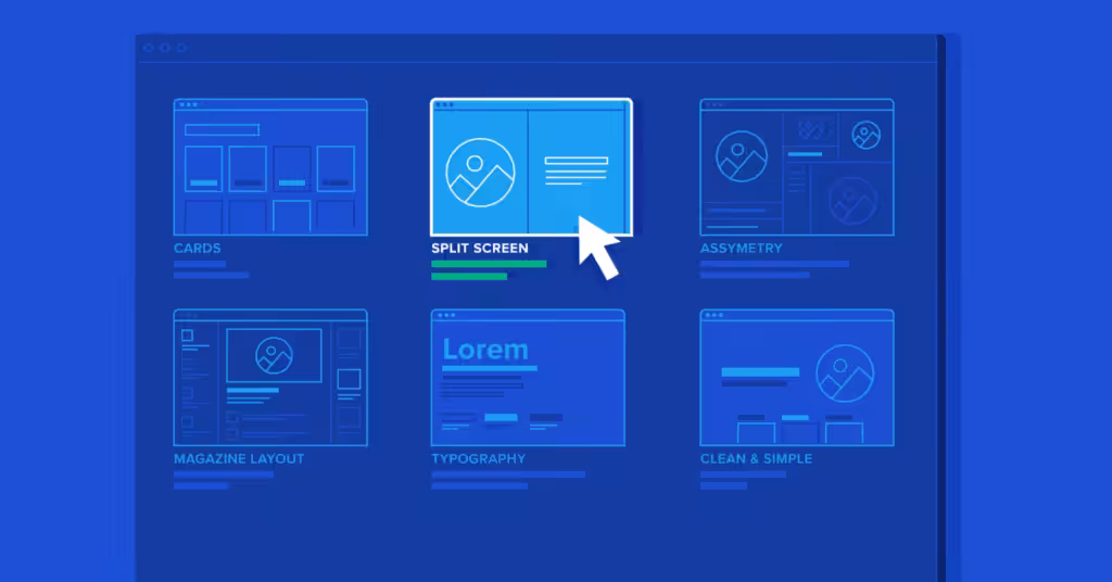
What is CRO web design?
CRO web design means designing a website to get more people to take action.
CRO stands for conversion rate optimization. It’s not just about making your site look nice. It’s about making it work.
For example, if 100 people visit your site, how many buy, sign up, or book a call? CRO web design helps increase that number.
It focuses on clear headlines, simple layout, strong call-to-action buttons, fast loading speed, and easy forms.
12 CRO web design best practices for higher ROI
Here are 12 simple, proven practices you can use to make your agency website convert better and deliver higher ROI.
1. Design with one clear goal per page
When someone lands on your page, don’t confuse them.
If the goal is to book a call, make that the only main action. If the goal is to download a guide, focus only on that.
Don’t ask them to read the blog, check pricing, follow you on social media, and book a call at the same time.
Too many choices slow people down. And when people feel unsure, they leave.
For example, your landing page for paid ads should focus only on one thing… like “Book a Strategy Call.” Remove extra menu links if possible.
2. Write clear, benefit-driven headlines

Your headline is the first thing people read. It should answer one simple question:
“Why should I care?”
Don’t say: “We Are a Creative Digital Agency.”
Instead say: “We Help SaaS Brands Get 3x More Qualified Leads.”
See the difference?
The second one tells people what they will get.
Be specific. Mention results. Mention who you help. Make it simple.
If visitors don’t understand your headline in 5 seconds, they won’t scroll.
3. Use strong, action-oriented CTAs

CTA means call-to-action. It’s the button people click.
- “Submit” is weak.
- “Click Here” is unclear.
Instead, say what they will get. For example:
- “Book My Free Strategy Call”
- “Get My Website Audit”
- “Start My Free Trial”
When your button is clear, people feel safe clicking it.
Also, make your button stand out with space around it. Don’t hide it.
4. Keep navigation simple

If your website menu has 12 links, visitors will wander around. And wandering visitors rarely convert.
Your menu should be simple:
- Home
- Services
- Case Studies
- About
- Contact
That’s enough.
On landing pages, remove the menu completely if possible. Focus them on one action. When people see fewer choices, they decide faster.
Remember, your goal is not to show everything you offer. Your goal is to get them to take one action.
5. Improve page load speed

If your website loads slowly, people leave. It’s that simple.
Even a one-second delay can reduce conversions by about 7%.
Imagine losing 7 leads out of every 100 just because your site is slow.
Big images, too many animations, and heavy code make your site slow.
- Keep images small.
- Avoid too many effects.
- Use clean design.
Speed builds trust. Slow sites feel unprofessional.
If you run ads, speed matters even more. You’re paying for traffic, don’t waste it.
6. Make it mobile-first

Most people visit your site on their phone. So your website must look great on mobile first… not just desktop.
- Buttons should be big enough to tap.
- Text should be easy to read without zooming.
- Forms should be short and simple.
Test your site on your own phone. If it feels stressful to use, fix it.
If mobile users struggle, they leave. And if half your traffic is mobile, that’s half your leads gone.
7. Use social proof strategically

People trust other people. If someone is thinking about hiring your agency, they want proof.
Add:
- Client testimonials
- Case study results
- Before-and-after data
- Client logos
Place them near your call-to-action buttons.
For example, right before “Book a Call,” show a short testimonial like: “They helped us increase leads by 120% in 3 months.” That removes fear.
When visitors see that others trust you, they feel safer choosing you. Trust reduces hesitation.
8. Reduce form friction

The longer your form, the fewer people will complete it.
If you ask for:
- Full name
- Phone number
- Company name
- Company size
- Budget
- Industry
- Website
- Revenue
Many people will stop halfway. Ask only what you truly need.
For example, for a strategy call:
- Name
- Website
You can ask deeper questions later.
Short forms feel easy. Easy forms get completed.
9. Create visual hierarchy

Visual hierarchy means guiding the eye.
When someone lands on your page, their eyes should move like this:
Headline → Subheading → Benefits → CTA button.
Use:
- Bigger font for headlines
- Space between sections
- Bold text for key points
- Clear contrast for buttons
Don’t make everything the same size. That creates confusion.
Your most important action… like “Book a Call”… should stand out clearly.
Design should guide, not confuse.
10. Use clear value propositions
Why should someone hire your agency instead of another one?
Don’t say: “We deliver high-quality services.” That means nothing.
Instead say: “We help B2B brands increase demo bookings by 40% in 90 days.”
Be clear about:
- Who you help
- What result you bring
- How you are different
Specific beats vague every time.
If visitors don’t understand your value, they won’t contact you.
11. Remove distractions

Too many popups, sliders, auto-play videos, and flashing banners make people uncomfortable.
When your page feels busy, people don’t focus. Clean design builds trust.
If your goal is to get someone to book a call, don’t distract them with five different offers. Remove what is not helping the main goal.
Every section on your page should support conversion. If it doesn’t help, remove it.
Simple pages convert better than noisy pages.
12. Test everything (A/B testing)
Don’t guess what works. Test it. Maybe:
- Headline A converts at 3%.
- Headline B converts at 5%.
That small change can double your leads over time.
Test:
- Headlines
- Button text
- Button placement
- Images
- Form length
- Offers
Even small changes can bring big results. Testing helps you improve step by step.
And for agencies, small increases in conversion rate can mean thousands in extra revenue.
How to calculate web design conversion rate

Calculating your web design conversion rate is actually simple.
First, understand what a conversion is.
A conversion is when someone does what you want them to do on your website. For example:
- Book a call
- Fill out a form
- Buy a service
- Download a guide
Now here’s the formula:
Conversion rate = (Number of conversions ÷ number of visitors) × 100
Let’s say 1,000 people visit your website in one month. Out of those 1,000 people, 50 book a strategy call.
So you divide 50 by 1,000.
50 ÷ 1,000 = 0.05
Then multiply by 100.
0.05 × 100 = 5%
That means your conversion rate is 5%.
In simple terms, 5 out of every 100 visitors are taking action.
If your number is low, your design may be confusing, slow, or unclear. If your number goes up after changes, your web design is working better.
That’s it. Simple math.
Wrapping up
At the end of the day, traffic alone won’t grow your agency.
If your website does not guide people to book a call, request a quote, or start a project, you’re leaving money on the table.
Do you want a website that brings real leads, not just visitors?
We can help.
At Block Agency, we design and redesign agency websites with CRO in mind.
Let’s turn your website into your best sales tool.
Reach out to us here: hey@blockagency.co
Frequently asked questions
What is a good conversion rate for a website?
A good conversion rate depends on the industry, but many service websites aim for 2% to 5%. This means 2 to 5 people out of 100 visitors take action. CRO web design helps improve this number over time.
What are key elements of CRO web design?
Key elements of CRO web design include clear headlines, strong call-to-action buttons, simple navigation, fast loading speed, mobile-friendly layout, short forms, and social proof. Each part works together to guide visitors toward one clear action.
Is CRO the same as SEO?
CRO and SEO are not the same. SEO focuses on bringing more people to a website through search engines. CRO focuses on turning those visitors into leads or customers. SEO gets traffic. CRO makes that traffic take action.
What does CRO stand for in design?
CRO stands for conversion rate optimization. In design, it means creating a website that encourages visitors to take action. This could be booking a call, signing up, or making a purchase. The goal is to increase the number of visitors who convert.
What is CRO and UX?
CRO is about increasing conversions. UX means user experience, which focuses on how easy and smooth a website feels to use. Good UX supports CRO. When a website is simple, clear, and easy to use, more visitors are likely to take action.