If you want to run a giveaway that actually brings entries, grows your email list, and gets real attention…
You first need to see what a good giveaway page looks like.
That’s why you’re here… to study real giveaway landing page examples that already work. Because here’s the truth:
If you don’t understand what makes a giveaway page convert, you may end up with a page that looks good but brings almost no entries.
This blog post fixes that. You’ll see 19 giveaway landing page examples that show you the exact structure, design, and copy that make people enter without thinking twice.
You’ll learn what each page does right, what you can copy, and how to apply it to your own campaign so you can run a giveaway that brings real results.
Let’s get into it…
In this article
1. KitKat
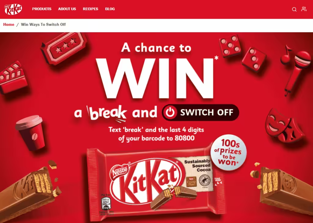
This landing page leans into relaxing… “switch off” is in the header, matching KitKat’s message of taking a break.
The design uses a clean white background with red accents (KitKat color), which makes important bits pop.
The main action is “text BREAK + barcode digits” to enter… very simple, low friction, mobile-first.
The copy feels warm and friendly, encouraging you to take a break and maybe win something that helps you relax (cinema tickets, coffee vouchers, escape room tickets, etc.).
The messaging is very on-brand: break, relax, and enjoy.
Legally, they have the terms and conditions clearly laid out, which helps build trust.
Overall, it’s minimal but effective… not too many distractions, just the prize, how to enter, and why it matters (a break).
2. Adidas
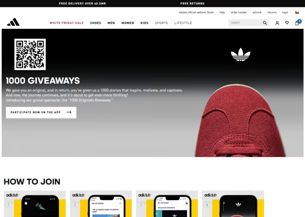
This landing page feels modern and sleek.
The design is minimal… it doesn’t show a ton of clutter. The copy is very straightforward: become a member (or sign up) and presumably get a shot at something.
It leans into exclusivity (“Become a Member”), making people feel like they’re part of a special club.
The message feels more like “join us, and maybe you win” rather than “win big now,” which could be good for building long-term engagement.
The element of data collection (sign-up) is key here.
The page doesn’t dump too much legal text or huge prize lists, which keeps it clean, though it could risk being unclear for someone expecting big item giveaways.
It feels like a brand-building promo more than a full grand-prize sweepstakes.
3. Woorise
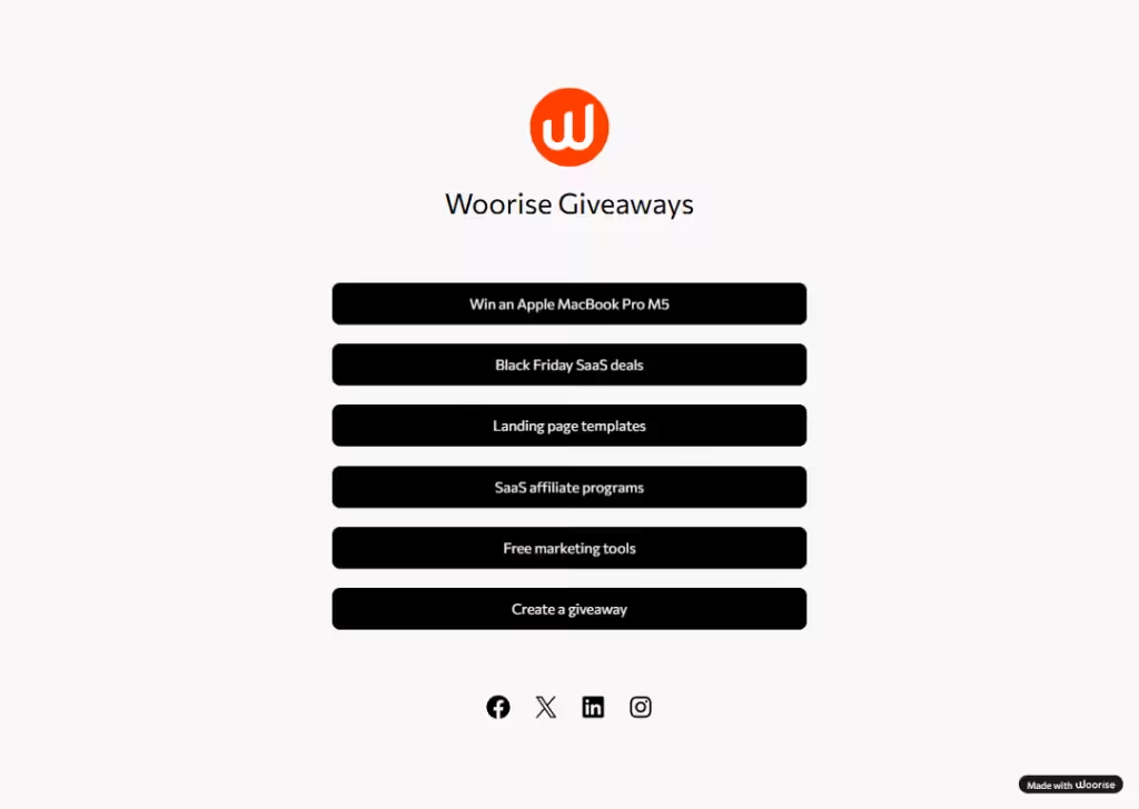
Woorise’s giveaway page shows off how powerful and flexible their platform is.
Design-wise, it’s functional: easy navigation, clear calls to action, and 3 giveaways (Apple MacBook Pro M5, free marketing tools, and landing page templates).
Though the main message doesn’t feel like a single brand giveaway but rather a tool for people to create their own.
Copy is very specific: “Win an Apple MacBook Pro M5,” “Free marketing tools,” “Landing page templates.”
The elements are all about usability: giveaway creating, templates, free guides. It’s less about winning something and more about helping others run giveaways.
Very clean, very business-friendly.
4. Gleam
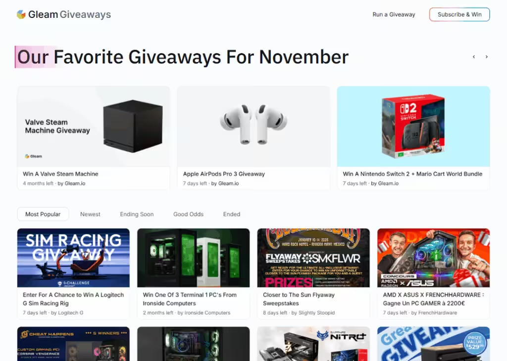
Gleam’s giveaway page is more like a hub to show what their platform can do.
The design is sleek, with a headline that says “Our Favorite Giveaways for November”.
The copy is very benefit-heavy:
It talks about benefits (“win”, “run a giveaway”). It shows real entry methods (email subscription) to prove that it’s a full-fledged tool.
The message is clear: if you want to run a giveaway that’s professional and legit, use Gleam.
The elements: feature list, a call to “Subscribe” or “Win”.
It’s not a single contest, but their own landing page for their service.
5. Gofobo
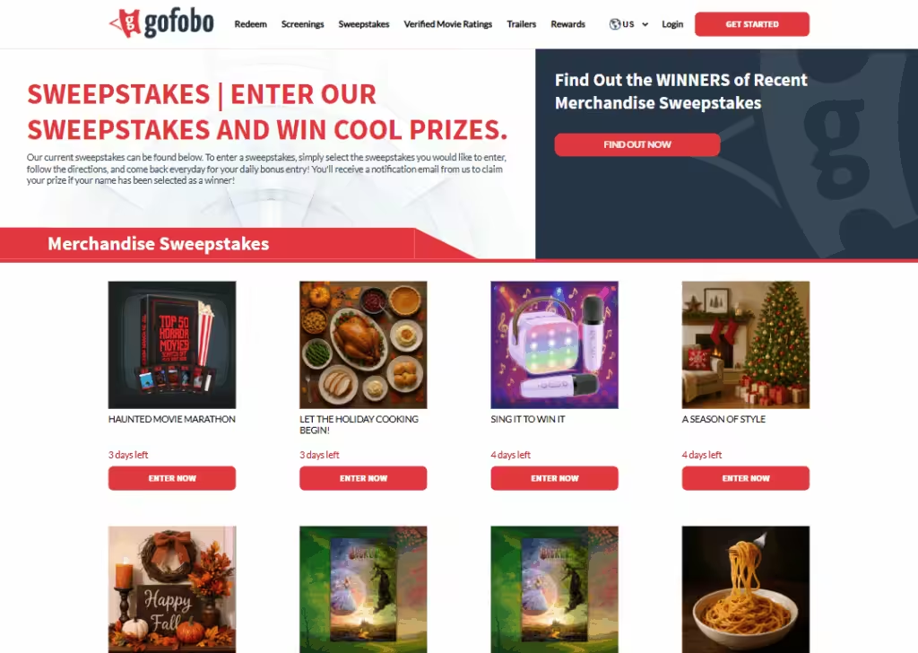
Gofobo’s sweepstakes page is very polished.
The design feels cinematic… probably because Gofobo is about movies/tickets. There’s a clear “Sweepstakes” header, and you can see different prize opportunities.
The giveaway promises “Holidays”, “Watch movies”, “Food and Snacks”, etc. Messaging is straight forward: “Enter our Sweepstakes and Win Cool Prizes.”
The entry process is likely integrated into their email list or user account.
Elements: visuals (foods, posters, etc.), simple call-to-action buttons “Enter Now”.
The page feels trustworthy and value-driven: not just “free stuff,” but “special experiences.”
6. Wheel of Fortune
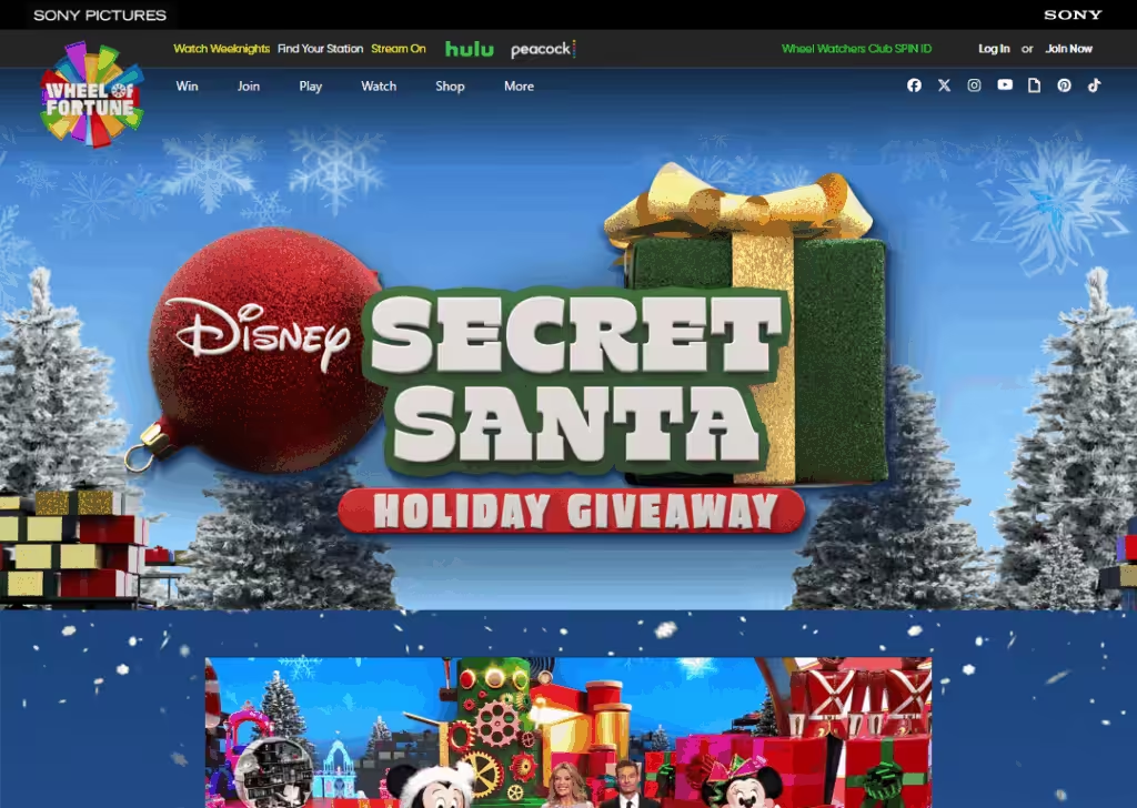
This one feels festive and fun.
The design likely has holiday graphics (because “Secret Santa”), which makes the giveaway feel seasonal and exciting.
The message is about winning a holiday with Wheel of Fortune… that’s a big trust builder because Wheel of Fortune is a very known brand.
The copy is light and cheerful, playing into gift-giving spirit.
The elements: holiday-themed graphics, clear entry “Login in” or “Sign up”.
It works because the emotional appeal (“holiday gift” + “my chance to win”) is strong. It doesn’t feel like a hard sell… more like a fun, feel-good contest.
7. Viridien Group
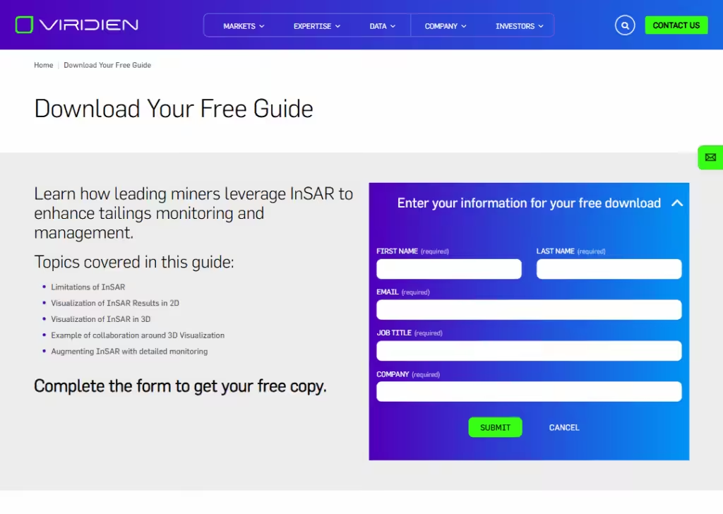
This landing page is designed to feel professional and trustworthy. The main goal is simple:
Get visitors to download a free guide.
The design uses a clean layout, clear sections, and a big call-to-action button saying “Submit.” The colors are muted and corporate, which gives confidence and feels reliable.
The copy is straightforward: it explains what the guide covers and why it’s helpful. There are small bullets highlighting benefits, making it easier for the visitor to scan and understand quickly.
The message is clear:
“We know our stuff, and we want to help you for free.”
Key elements include a headline, subheadline, CTA button, short bullet points, and a form.
Overall, it’s simple, professional, and persuasive without overwhelming the visitor.
8. Jago
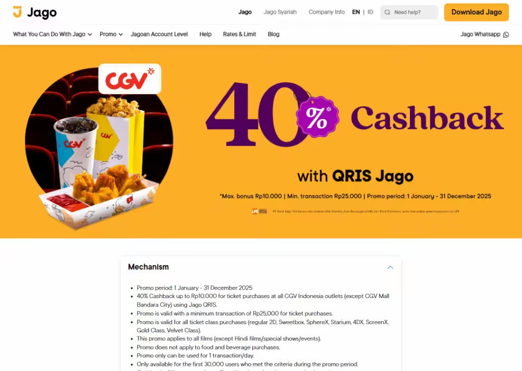
This page is bright and colorful, with a friendly vibe.
The main message is to promote a promo event.
The hero section immediately shows what the visitor can get or win. The copy is short and easy to read, using simple language like “40% Cashback”
The design focuses on clarity: small image, clear sections, and simple terms and conditions. This keeps the user focused on entering the promo.
The elements include a headline, mechanism, terms & conditions, and frequently asked questions.
The message feels encouraging and fun, making the user feel like they can easily participate.
The page doesn’t overcomplicate things… it’s goal-oriented: Download the app to get a cashback. The combination of simple design, clear CTA, and clear messaging makes it inviting and effective.
9. Learning.net
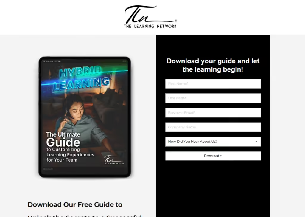
This page is very clean and minimal.
The main goal is to collect email addresses in exchange for a free guide.
The design uses white space to highlight the CTA button, which says “Download.” There’s a short paragraph explaining what’s inside the guide, written in plain language.
The copy is simple and benefit-driven. This makes it clear why the visitor should act.
Key elements include a headline, subheadline, bullet points, an image of the guide, a form, and the download button.
The message is direct:
You get valuable content for free, and it’s easy to get it.
Everything points to the download, so visitors aren’t distracted. The page is professional, clear, and user-friendly.
10. Nestlé Cereals
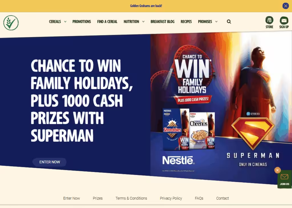
This landing page is bright, colorful, and very fun… perfect for a family-oriented audience. The main message is clear:
Buy a promotional Nestlé cereal pack and get a chance to win a family holiday to Six Flags in Texas, plus 1,000 cash prizes.
The design uses superhero visuals, mostly Superman flying across the page, which instantly grabs attention. Red and blue colors dominate, tying to the Superman theme.
The copy is simple and exciting… it highlights the prizes, explains how to enter, and keeps the tone friendly.
Key elements include headline, subheadline, prize visuals, step-by-step entry instructions, QR code instructions, and a call-to-action button (“ENTER NOW”).
The page also includes rules and privacy info at the bottom for trust.
The message feels thrilling and urgent: buy, scan, enter, and you could win big. It’s playful, visually engaging, and easy for families to understand.
11. L’Oréal Paris USA
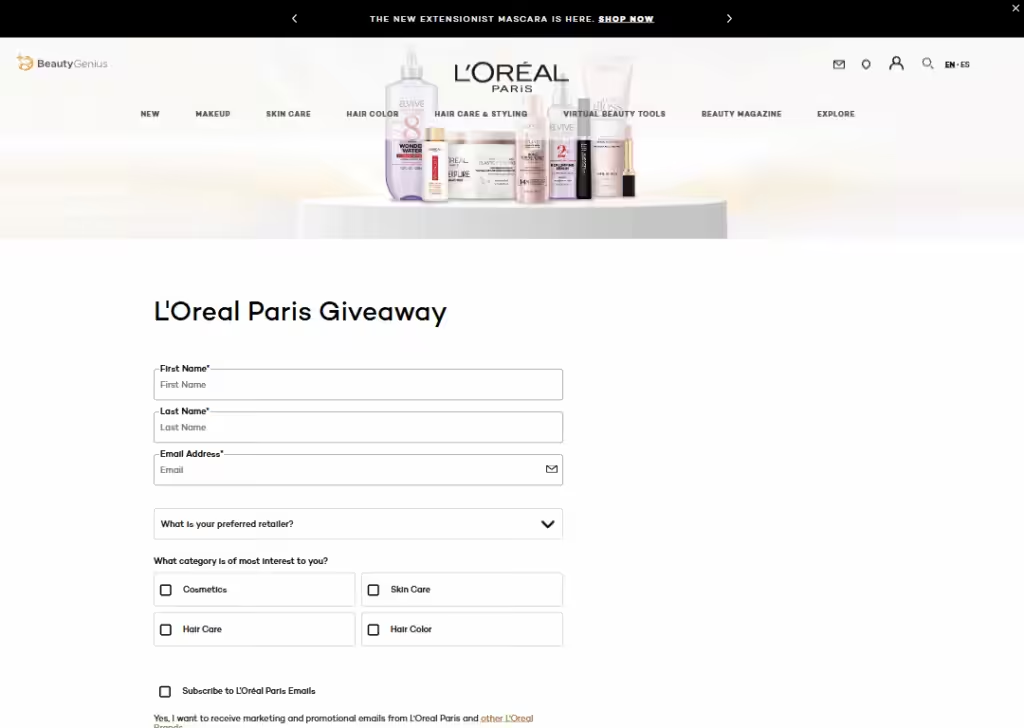
This landing page is bright and bold.
The design uses product visuals and vibrant colors that immediately grab attention.
The copy is simple and benefit-oriented, highlighting free product opportunities.
The message is clear:
Try your luck and win L’Oréal products.
Elements include a headline, product visuals, entry form, and CTA buttons.
The overall feel is fun, professional, and trustworthy, giving visitors confidence and excitement about participating.
12. Hilton
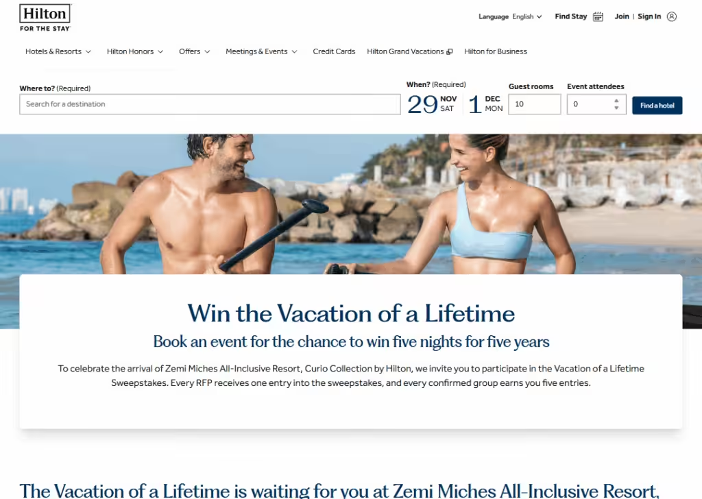
This page is elegant and visually appealing.
Big images of resorts and vacation destinations grab attention. The message is exciting:
Win a dream vacation.
The copy is simple and persuasive, explaining what’s included (flights, hotel stays) and how to enter. Key elements include headline, prize visuals, CTA button, and entry instructions.
The design creates a sense of luxury and desire.
The page is straightforward: it’s all about the vacation prizes, with no distractions. Visitors can quickly understand the benefits and act immediately.
13. Citron
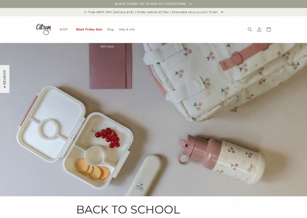
This landing page is colorful and playful.
The main message is to win back-to-school prizes. The design uses bright visuals, fun fonts, and images of products.
The copy is friendly and simple, clearly explaining how to enter: complete a form.
Elements include headline, prize images, entry form, and CTA button.
The message is fun and urgent, appealing to families and students preparing for school.
Everything is easy to follow, making visitors more likely to participate.
14. Coca-Cola
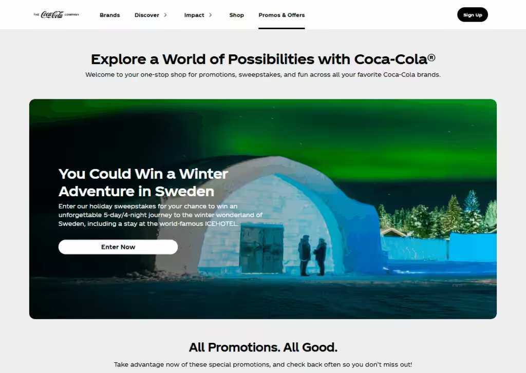
This page is vibrant and brand-consistent.
Design uses bold red colors and visuals of Coke products. The copy is friendly and clear, highlighting current offers and sweepstakes.
The message is exciting: play, enter, download.
Key elements include hero image, CTA buttons, and prizes.
It feels trustworthy and fun, making visitors excited to participate while keeping the entry process simple.
15. Superdrug
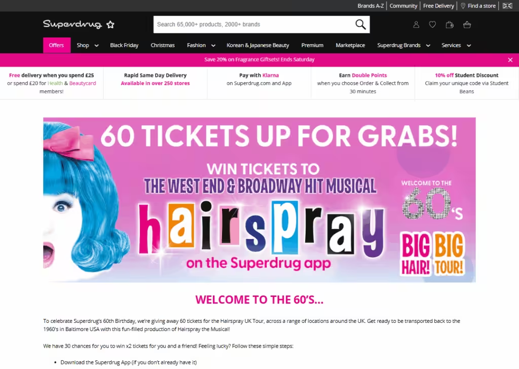
This page feels bright, fun, and playful.
It uses strong colors, bold fonts, and a cheerful tone that matches the “Hairspray” theme.
The design pulls you in right away with product images and a big headline. The message is simple:
Download the Superdrug app and enter the giveaway.
The copy is light and friendly, making the process feel easy. Key elements include the hero headline, app-related instructions, prize details, and a large button telling you exactly what to do next.
It also explains how long the giveaway runs and who can enter.
The page is not cluttered… it gives you only the important details so you can act fast.
The tone feels fun and youthful, which fits the “Hairspray The Musical” branding.
Overall, it’s simple, colorful, and inviting, making users excited to download the app and enter.
16. M&M’s
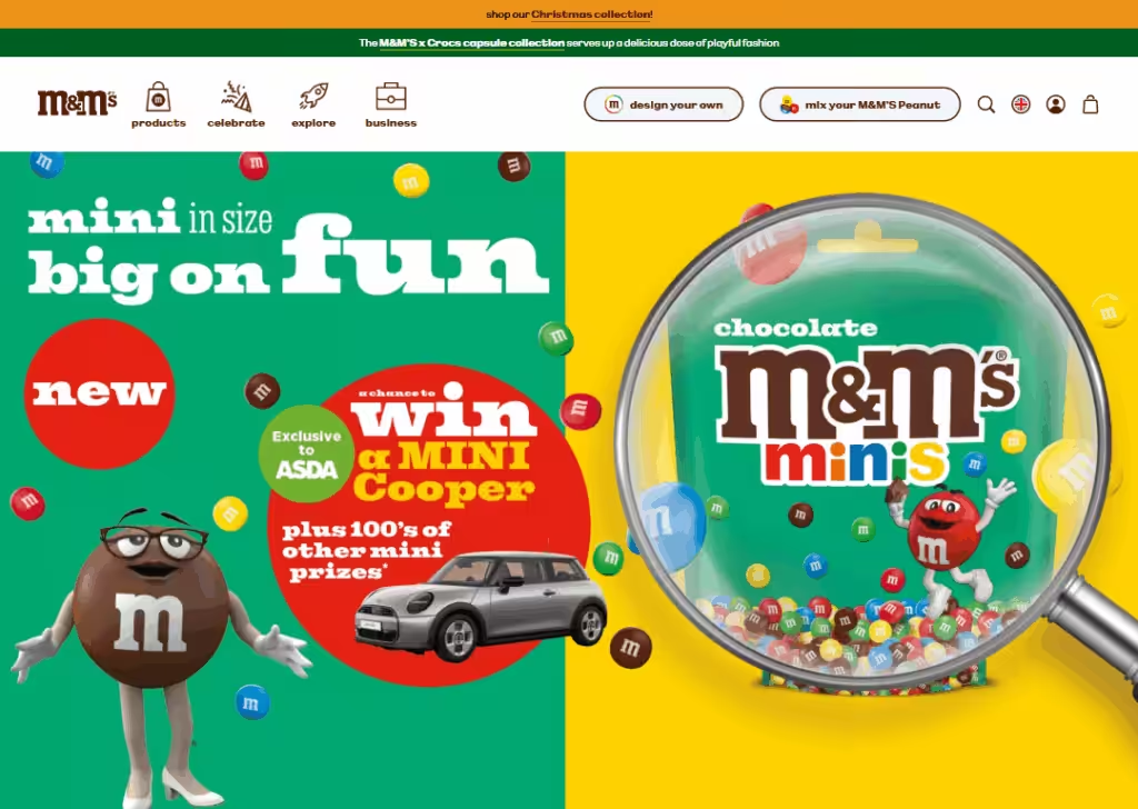
This landing page has a friendly feel with the bright M&M’s colors.
The page uses a simple layout that focuses on explaining how to enter the “Win a Mini” promo.
The design uses yellow, red, and green visuals that feel playful and match the brand. The copy is very straightforward…
It tells you how to buy a pack, enter the code, and stand a chance to win a MINI car or other fun prizes.
The tone is light and easy to understand. Even though the page has “FAQ” in the name, it doubles as a clean giveaway guide.
Key elements include step-by-step instructions, entry rules, prize info, and small notes about who can enter. It feels trustworthy because all the rules are laid out clearly.
17. Toyota Ireland
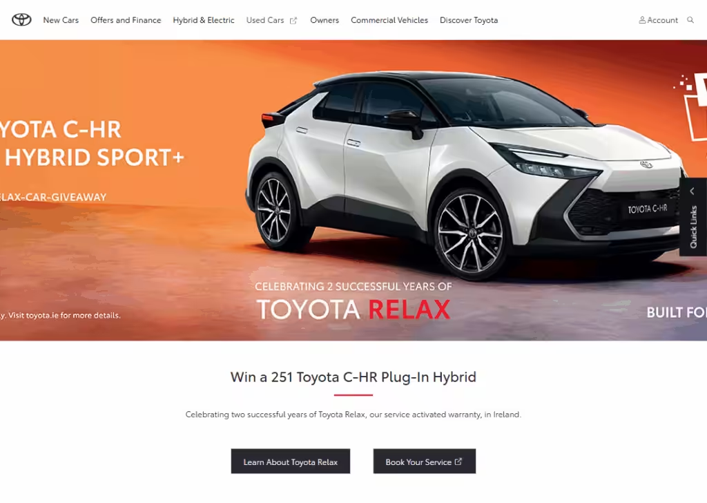
This landing page feels clean, modern, and trustworthy… which matches Toyota’s brand.
The design uses lots of white space, bold images of the car, and short easy-to-read text. It creates a calm and confident feeling.
The copy is simple:
Enter the giveaway, follow the steps, and stand a chance to win a Toyota.
The page explains exactly what you need to do, who can enter, and when the giveaway ends.
Key elements include the headline, a big image of the prize car, a step-by-step guide, CTA button, and terms and conditions. Everything is laid out neatly.
The message is all about trust and clarity. Toyota keeps it simple so visitors don’t feel confused.
The visuals and short text make the process feel easy, and the prize (a whole car) makes the page exciting and motivating.
18. Marshfield Ice Cream
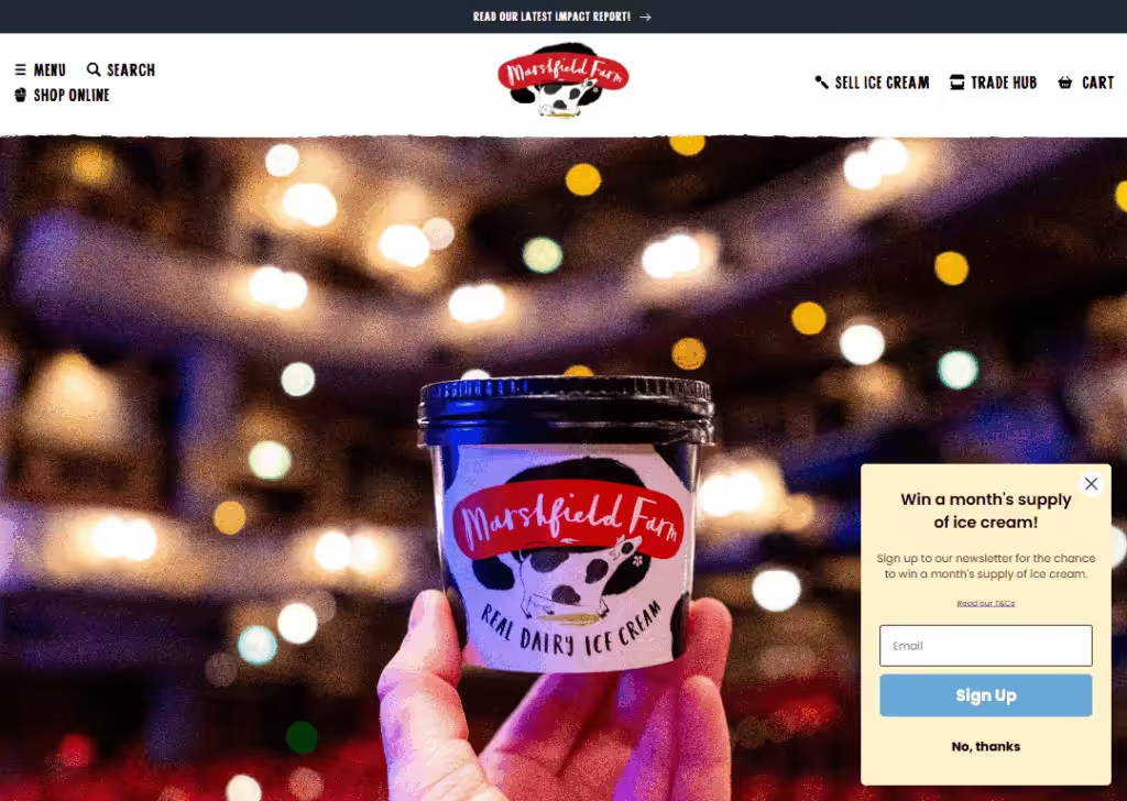
This landing page feels fun, friendly, and warm… just like an ice cream brand should.
The design uses soft colors, product photos, and a simple layout that makes you want ice cream right away.
The copy is light and playful. It tells you what the prize is (usually free tubs of ice cream or bundles) and how to enter. The language is simple and inviting.
Key elements include the headline, colorful visuals, CTA button, and a short rules section. There’s nothing confusing or overwhelming.
The message is clear: Enter for a chance to win free ice cream. The tone matches the brand perfectly… sweet, simple, and fun.
The page feels safe, friendly, and motivating for anyone who loves treats.
19. Fetch
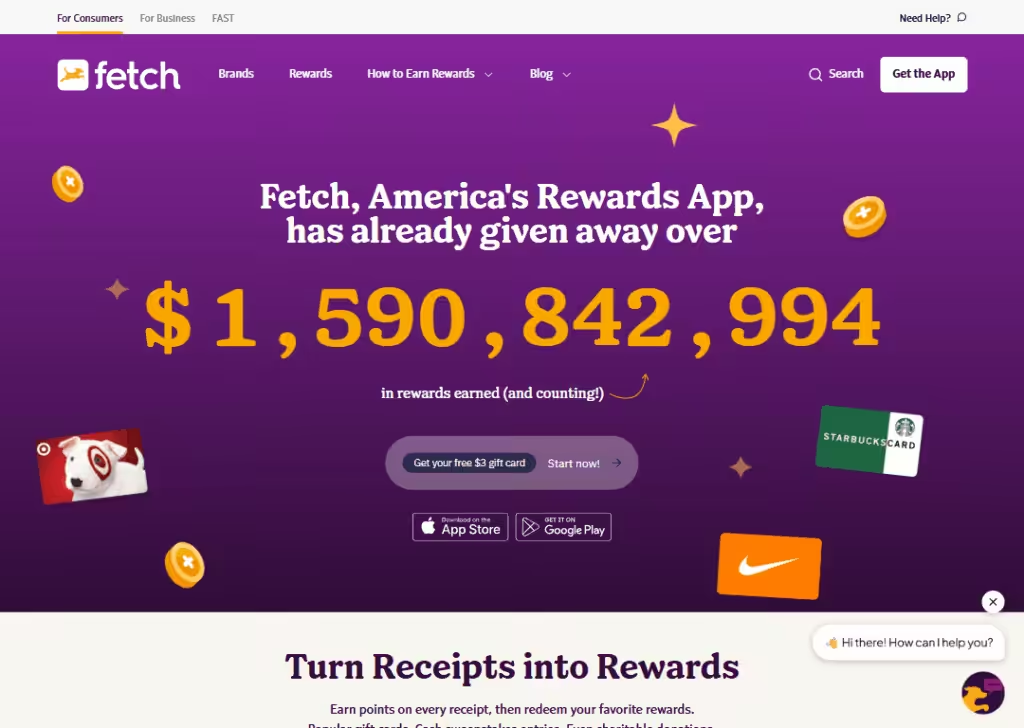
This page is bright and modern.
The design uses clean white backgrounds, colorful icons, and simple sections to show how Fetch rewards work.
While it’s not a traditional giveaway page, it often features special reward events and bonus point offers that feel like giveaways.
The copy is friendly and very easy to understand. It explains how to scan receipts, earn points, and redeem rewards. The tone feels casual and helpful.
Key elements include headline, reward categories, app screenshots, and CTA buttons like “Start Now.”
The page is very clear… everything is broken down into small, simple parts. The message is clear:
Use the app, earn points, and get free rewards.
It feels motivating because it shows real benefits without overwhelming the visitor.
The whole experience feels smooth, honest, and user-friendly.
Wrapping up
Giveaway landing pages don’t have to be complex.
As you’ve seen from these examples, the best ones are clear, simple, and focused on one goal: getting people to enter.
Whether it’s a big brand like Coca-Cola or a small shop giving away a gift box, the winning pattern is the same… clean design, clear steps, and a strong message.
Use these examples as a guide to build your own page. Keep it simple, keep it honest, and make it easy for people to take action.
Do that, and your giveaway can pull in more entries and better leads.
Frequently Asked Questions
What should a giveaway landing page include?
A good giveaway landing page needs a clear headline, a picture of the prize, simple rules, an easy entry form, and a strong call-to-action. Social proof, countdown timers, and trust badges can also help increase entries. Everything must stay clear and simple to understand at first glance.
How can a giveaway landing page boost conversions?
A giveaway landing page boosts conversions by removing confusion. It focuses only on one goal… getting entries. With simple text, strong visuals, and a direct call-to-action, more people join. Giving clear steps, showing the reward, and keeping the design clean helps turn visitors into real leads.
What mistakes should be avoided on giveaway landing pages?
Avoid long text, unclear rules, slow-loading pages, and tiny forms. Avoid too many colors or distractions. Do not hide the prize or entry steps. A giveaway landing page should stay clean, simple, and easy to follow so visitors can join fast without thinking too much or leaving early.
Are giveaway landing pages good for email list building?
Yes, giveaway landing pages are great for email list building. People share their email in exchange for a chance to win. With a clear form and easy steps, brands can collect many new leads. These emails can later be used for updates, offers, and long-term engagement.
