Every agency wants a homepage that doesn’t just look good but also brings in real clients.
That’s why you’re here…
To learn how to design high converting homepages that turn visitors into leads.
Because the truth is, a beautiful homepage that doesn’t convert is like a shop with no sales. It looks great from the outside, but no one’s buying.
If your homepage isn’t clear, fast, or focused, visitors will scroll for a few seconds and leave.
- They won’t read your offers.
- They won’t book a call.
They’ll just move on to another agency that explains things better.
And that means missed clients, lost revenue, and wasted design effort.
But don’t worry… fixing this doesn’t require a full redesign.
In this blog post, you’ll learn 15 proven tips to design high converting homepages.
You’ll see how to write headlines that grab attention, use visuals that build trust, and create layouts that guide visitors to take action.
By the end, you’ll know exactly how to make your homepage not just look good, but work hard for your agency.
Let’s get into it.
In this article
15 proven tips to design high converting homepages
1. Craft a clear, benefit-focused headline
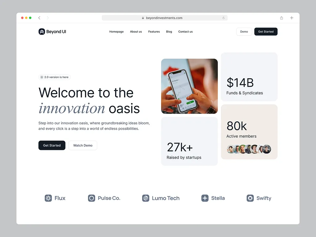
Your headline is the first thing people see when they land on your homepage.
It should tell them exactly what your agency does and who you help… in one short sentence.
Avoid vague lines like “We create digital experiences.” Instead, be specific about the benefit your clients get.
For example, “We design websites that help SaaS startups grow faster.”
This instantly tells visitors what you offer and what they’ll gain.
Think of it as your “first impression line”… if it’s clear, people will stay and scroll; if it’s confusing, they’ll click away.
2. Lead with a strong value proposition
Your value proposition explains why someone should choose your agency over others.
It’s like saying, “Here’s what makes us special.” The easiest way to write one is with this formula:
We help [type of clients] achieve [specific results] through [service you offer].
For example, “We help real estate brands get more clients through high-converting websites.”
Keep it simple and real… no fancy words. The goal is to show what you do, who you do it for, and what result they’ll get.
That’s how you quickly earn attention and trust.
3. Simplify layout and visual hierarchy
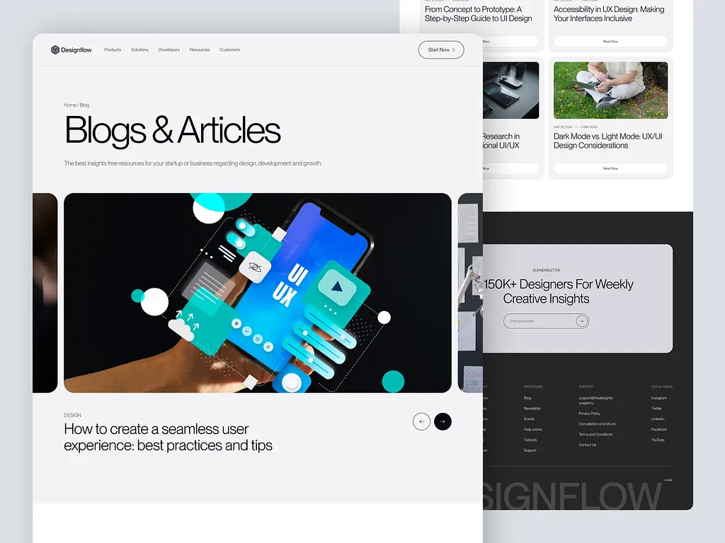
A messy homepage confuses people. A clean layout guides visitors to what matters most… like your headline, services, and CTA.
Use plenty of white space so your design can “breathe.”
Group similar sections together and make your most important messages stand out with bigger text or bolder colors.
Avoid cramming too many things above the fold. The goal is to help visitors’ eyes flow naturally down the page, not make them hunt for information.
Simple layouts feel professional and are easier to understand… and that’s what helps people stay longer.
4. Use trust signals and social proof strategically
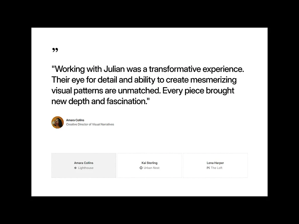
Before people buy from or contact your agency, they need to trust you.
That’s where testimonials, client logos, and success stories come in. They show that others have worked with you and got great results.
- Place a few recognizable client logos near the top of your homepage.
- Add short testimonials in key sections, and if you have case studies, link to them.
- You can also mention awards or certifications.
Think of it this way:
Social proof is like a friend’s recommendation… it makes new visitors more confident in your agency.
5. Add a clear, compelling CTA above the fold
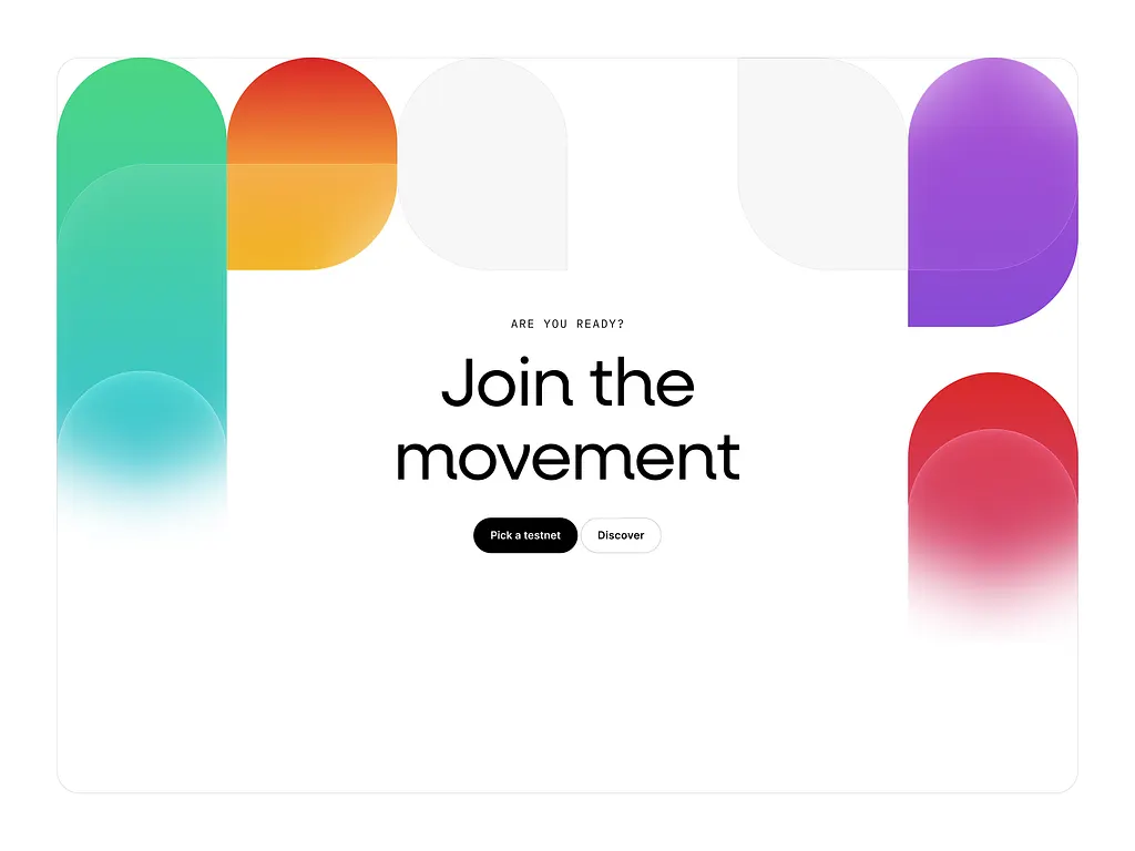
Your CTA (Call-to-Action) tells visitors what to do next… like “Get a Free Quote” or “Book a Call.”
Always keep one visible above the fold (the first section people see). Avoid vague buttons like “Learn More” or “Click Here.”
Instead, make it action-driven and benefit-focused, such as “Get Your Free Design Audit.”
Use a color that stands out and repeat your CTA a few times throughout the homepage.
When visitors instantly see what to do next, it removes hesitation and increases your chances of turning them into leads.
6. Showcase your top services clearly
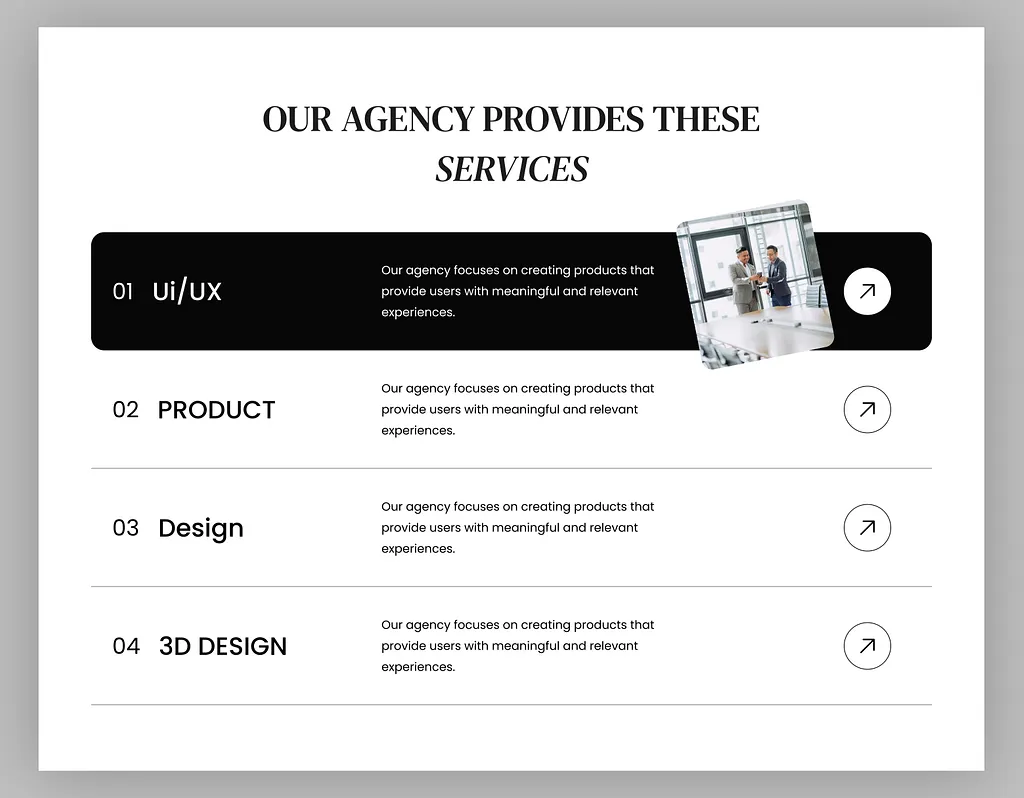
Your homepage isn’t the place to list every service you offer. Highlight only your main ones… the ones clients ask for most.
Show them in clear boxes or sections with short, benefit-focused descriptions.
Instead of saying “UI/UX Design,” say “We design user-friendly websites that help you get more signups.” This shows value, not just features.
Add icons or images to make it visual and easy to skim.
Think of this section as your “menu preview”… it helps visitors quickly see if you offer what they need.
7. Use visuals that support, not distract
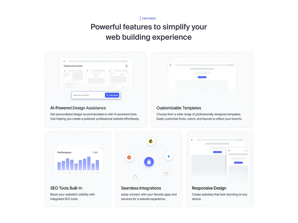
Pictures, videos, and graphics are powerful, but they should help tell your story… not steal attention from it.
- Use real project images or photos of your team instead of random stock photos. If you use a video, make it short and relevant.
- Avoid flashy animations that slow down your page or distract users.
- Every visual on your homepage should serve a purpose… to build trust, show results, or make your message clearer.
When visuals match your message, visitors stay focused and more likely to take action.
8. Optimize forms for simplicity and completion
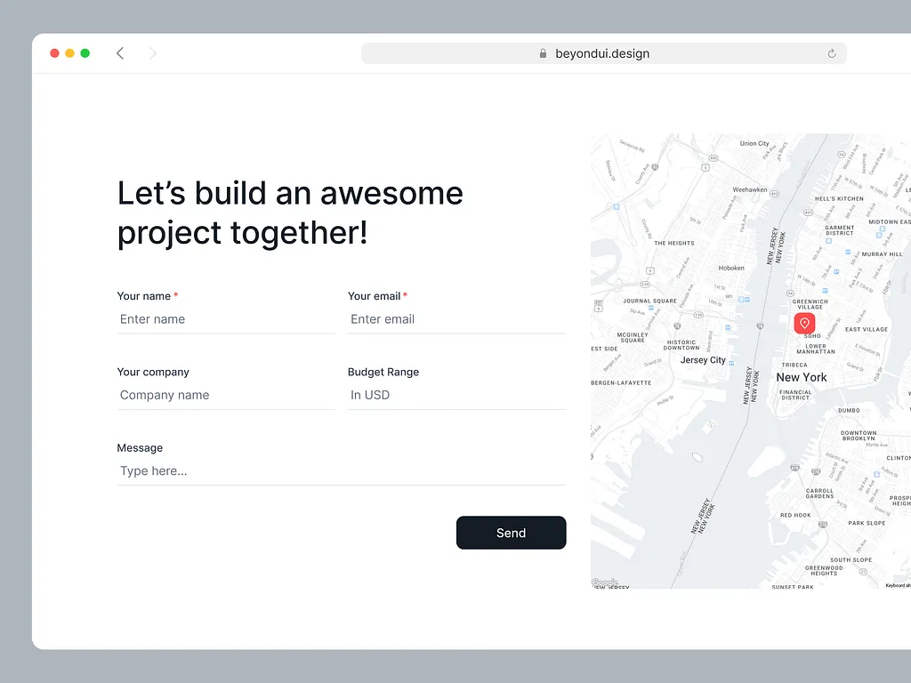
If your homepage has a form (like “Book a Call” or “Request a Quote”), make it short and easy to fill out.
The fewer fields, the better.
People hate long forms. Ask only what’s necessary… maybe name, email, and message. Label everything clearly and reassure users their info is safe.
You can also use progress bars or friendly text like “Takes less than 30 seconds.”
A simple form means more people will complete it.
Complicated ones scare visitors off, even if they’re interested in your services.
9. Make navigation intuitive
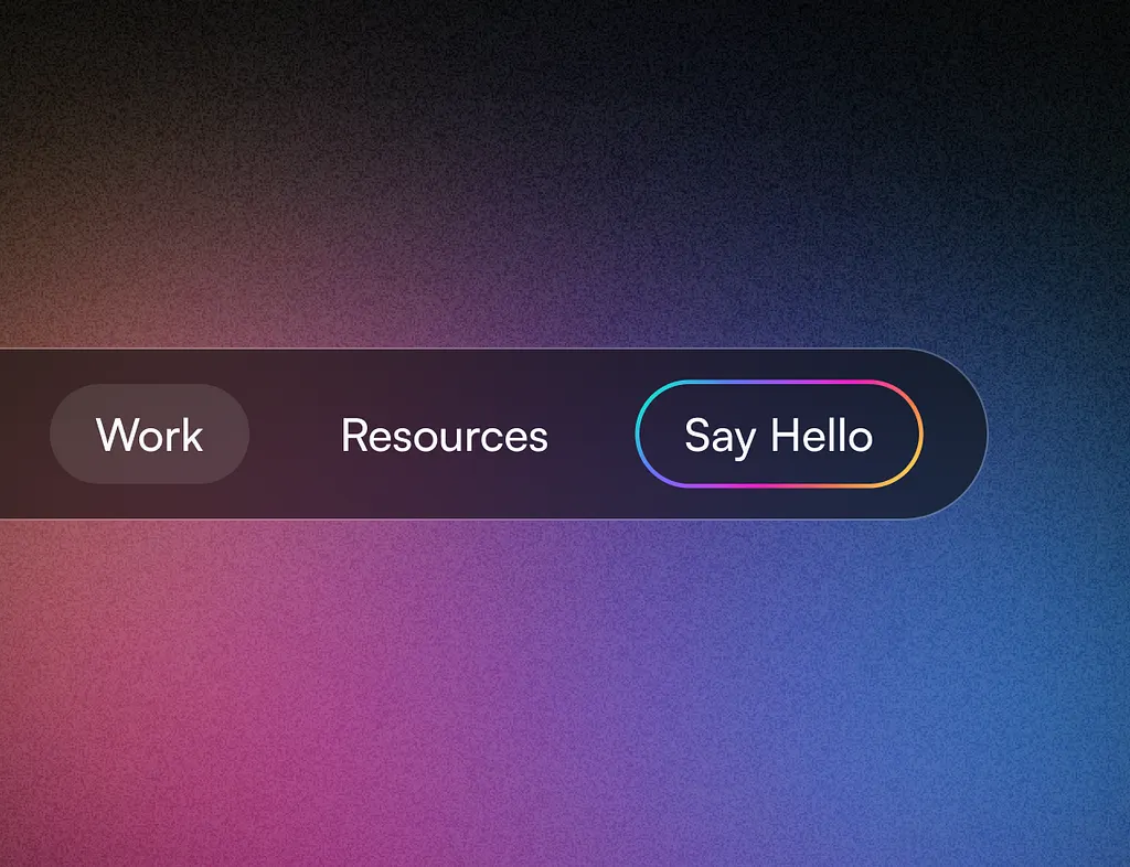
Your website menu should be short, simple, and easy to understand.
- Use clear labels like “Services,” “About,” “Work,” and “Contact.”
- Avoid technical or fancy terms. Make sure visitors can reach any section of your homepage in one or two clicks.
- Add anchor links for smooth scrolling if your homepage is long.
Think of your navigation like road signs… if they’re clear, people will find their way easily; if not, they’ll turn back.
When your website feels easy to use, it builds confidence and keeps visitors exploring.
10. Highlight results or metrics
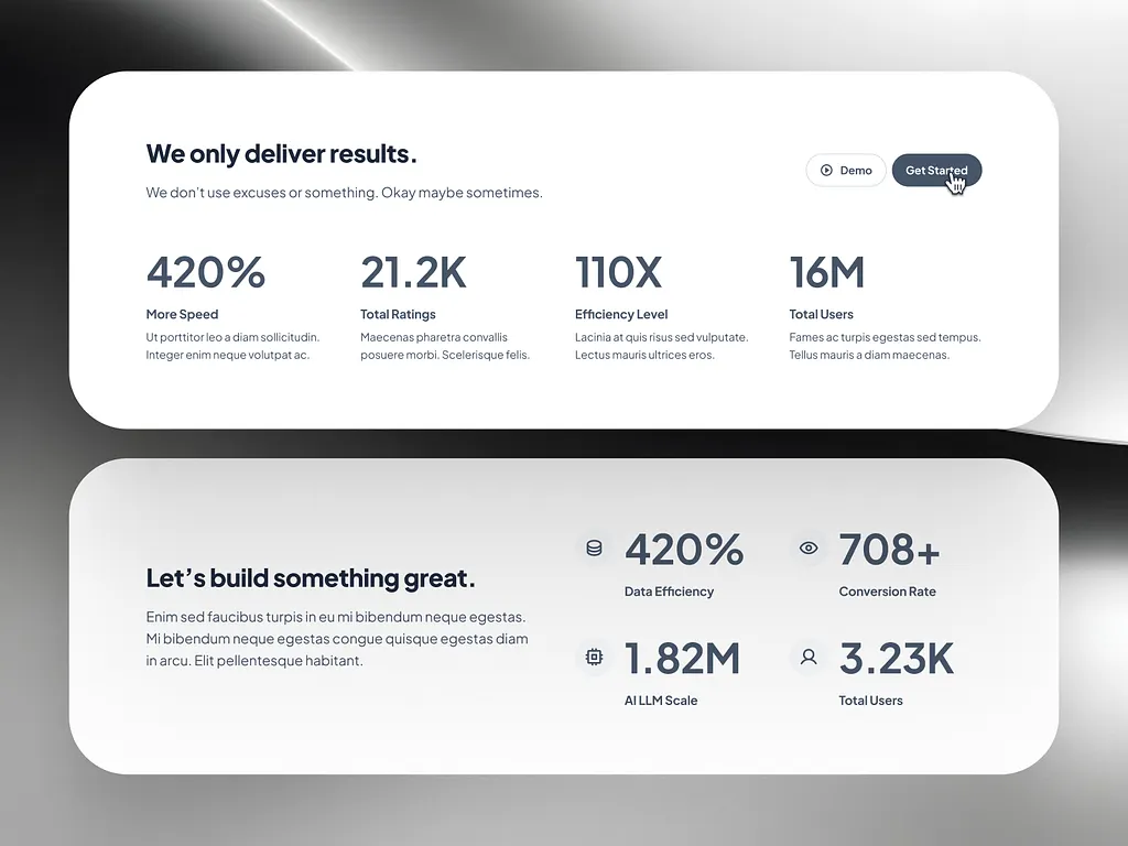
Numbers grab attention and build instant trust.
Instead of just saying, “We create beautiful websites,” show proof: “We helped 15 brands increase conversions by 45%.” Results speak louder than promises.
- Use real data from past clients if you have it… like projects completed, revenue boosted, or customer growth.
- Add them in bold or larger text to make them pop.
This helps visitors believe you can deliver what you claim.
People love measurable outcomes… it gives them confidence to contact your agency.
11. Personalize copy and offers
Your homepage should speak directly to your ideal client.
If you help SaaS founders, use their language. If you serve real estate agents, mention their needs.
Personalization makes visitors feel seen and understood.
You can even adjust offers… for example, “Free design audit for eCommerce websites.”
Some advanced websites use dynamic content that changes based on the visitor’s location or behavior.
But even simple tweaks like personalized headlines can make a huge difference.
When your homepage feels like it’s talking to them, visitors stay longer and engage more.
12. Optimize for mobile experience
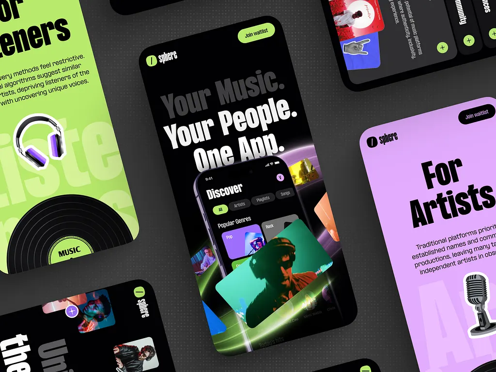
Most people visit websites on their phones first. So, your homepage must look great and load fast on mobile.
Check that…
- Text is easy to read
- Buttons are big enough to tap
- And CTAs are clearly visible without scrolling too much
Avoid heavy videos or large images that slow down loading.
Test your website on different phone sizes to be sure it looks right.
Remember, a clunky mobile experience can lose you leads fast. A smooth one keeps people browsing and makes your agency look professional.
13. Test and analyze above-the-fold content
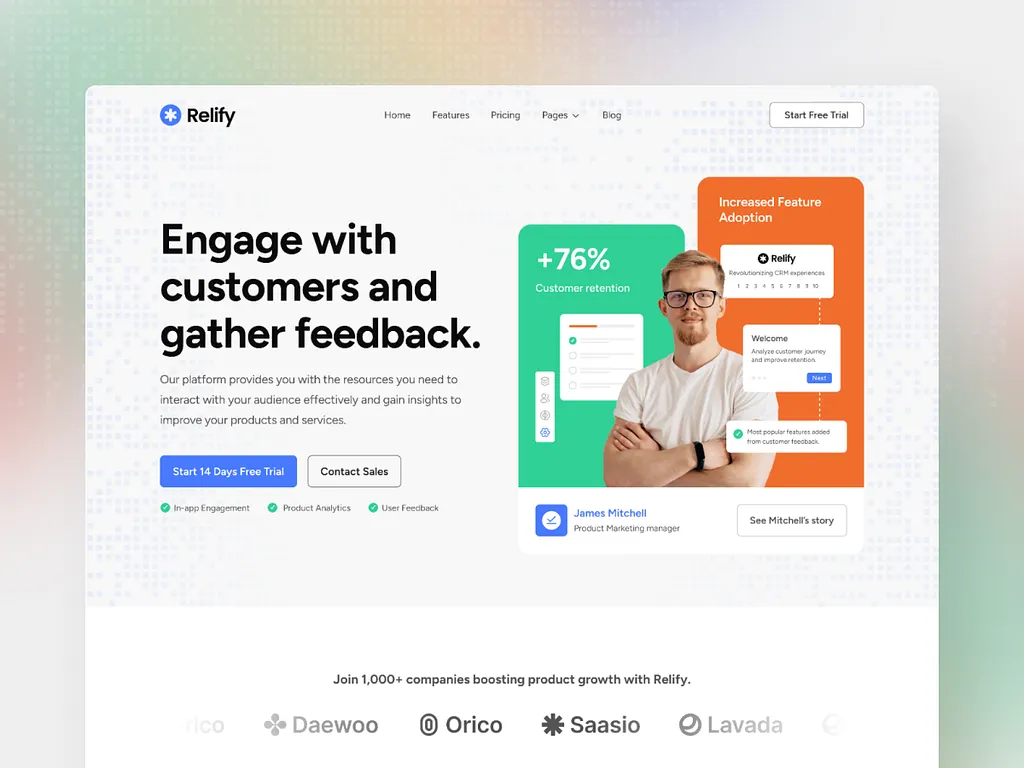
The “above-the-fold” area is what visitors see first without scrolling. It’s your homepage’s most valuable space.
Test different versions of your headline, image, and CTA to see which performs better.
Tool like Hotjar help you see what users click and where they stop.
Small changes… like button color or headline wording… can double your conversions.
Think of testing as fine-tuning your homepage engine. Don’t guess what works; use data.
Over time, your homepage will keep getting stronger and more effective.
14. Add engaging micro-interactions
Micro-interactions are small animations or effects… like a button changing color when hovered or an image sliding in as you scroll.
These small touches make your website feel alive and modern.
But don’t overdo them. Too many animations can distract or slow things down. Use them to highlight key actions (like CTAs) or guide users’ eyes smoothly down the page.
When done right, micro-interactions make your website feel more interactive and enjoyable… helping visitors feel comfortable and more likely to click or contact you.
15. Keep page speed lightning fast
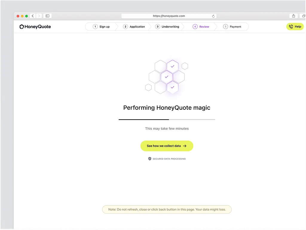
No one likes a slow website.
If your homepage takes more than a few seconds to load, people will leave before even seeing your content.
Speed is one of the biggest factors in conversions.
- Compress your images
- Remove unnecessary scripts
- And use caching tools
You can test your website speed using tools like PageSpeed Insights or GTmetrix.
Fast-loading pages feel professional and trustworthy.
Remember: a beautiful homepage that loads slowly is like a fancy store with a jammed door… people won’t wait to enter.
Wrapping up
Your homepage is more than just a pretty design… it’s your agency’s first salesperson.
When it’s clear, fast, and built around what clients care about, it quietly turns visitors into leads.
And if you need help, we’re available.
At Block Agency, we design websites for agencies that want results.
Let’s build a homepage that gets clients clicking, not bouncing.
Talk to us here: hey@blockagency.co
Frequently Asked Questions
What are common mistakes that lower homepage conversions?
Common mistakes include unclear headlines, too many CTAs, messy layouts, and slow-loading pages. Some agencies also forget mobile users.
How fast should a homepage load for good conversions?
Your homepage should load in 3 seconds or less. Slow websites make visitors leave before they even see your content. Compress your images, remove unused plugins, and use caching tools.
What should every homepage include?
Every agency homepage should have a clear headline, short value statement, strong call-to-action, and proof of trust like testimonials or client logos. Add short sections about your services and past work.


