“If I push more traffic to my store, sales will go up.”
Many e-commerce store owners believe the only way to get more sales online is by sending traffic to their store. But here’s the truth:
Traffic doesn’t guarantee sales. You can have 10,000 people visit your website, and still end up with almost no orders. Why?
Because if your website isn’t built to guide people to buy, no amount of traffic will fix it.
Shoppers might click your ad, but if your website is slow, confusing, or doesn’t look trustworthy, they’ll leave before checking out. That means you’re paying for visitors who never turn into customers.
The smarter approach is to improve your website itself.
Instead of just chasing more visitors, make sure the people who already land on your store actually want to stay and buy. That’s where the real growth happens… not in traffic, but in conversions.
In this blog post, we’ll walk you through how to improve an e-commerce website step by step.
You’ll see simple changes you can make to your design, checkout process, and overall shopping experience that can turn more visitors into paying customers.
By the end, you’ll understand why improving your website matters more than chasing endless clicks… and how these changes can help your store finally start selling the way you want.
In this article
10 proven ways to improve an e-commerce website
1. Make your website load faster
Think about the last time you tried buying something online. If the page took forever to load, you’d probably got annoyed and closed it, right?
That’s exactly how your customers feel when your e-commerce website is slow.
In fact, a slow website is one of the biggest reasons people leave without buying anything.
Speed matters because online shoppers want things quick. If your store loads in just a few seconds, people are more likely to stay, browse, and buy. But if it drags on, they’ll simply move to another store that feels smoother and faster.
That’s why speed can literally make or break your sales.
Here are some simple fixes to make your website faster:
- Compress images: Big pictures look nice but take longer to load. Shrinking the file size keeps them clear while making your website quicker.
- Use caching: This is like saving a shortcut of your website on visitors’ devices so it loads instantly the next time they visit.
- Reduce plugins: Too many extra tools slow down your store. Keep only the ones you truly need.
When you make these small changes, your website loads faster, your customers stay longer, and you get more sales.
It’s like making your shop doors easier to open… people won’t walk away before they even get inside.
2. Keep your design clean and easy to use

Imagine walking into a physical store where everything is scattered…
Clothes mixed with shoes, no signs to guide you, and items piled up in random corners. You’d feel confused, maybe even leave, right?
That’s exactly how visitors feel when an e-commerce website looks messy or hard to use.
A clean design makes shopping simple and enjoyable. Customers don’t want to waste time hunting for products. They want to find what they need fast, and your website design plays a big role in that.
Here’s how you can make it easy:
- Simple layouts: Don’t overload your pages with too much text, images, or flashing banners. A neat, uncluttered look keeps people focused on buying.
- Clear menus, categories, and filters: Shoppers should be able to click “Men’s Shoes” or “Kitchen Items” and instantly see only those products. Filters like “Price” or “Color” make shopping even smoother.
- A search bar that works: Many people skip browsing and go straight to the search bar. If your search actually shows the right products, you’ll win more sales.
Think of your design as the shelves and signs in a physical store. If it’s tidy and clear, shoppers stay longer, explore more, and buy more.
But if it’s confusing, they’ll walk out and spend their money elsewhere.
3. Focus on mobile shoppers

Take a look around… almost everyone is glued to their phone. Meaning?
Most online shopping now happens on mobile, not computers. People browse products, compare prices, and place orders right from their phone.
If your e-commerce website doesn’t work well on a phone, you’re losing a big part of your sales.
That’s where mobile-friendly design comes in.
A website with responsive design adjusts itself automatically to fit any screen… whether it’s a big laptop, a small tablet, or a smartphone.
This means no endless zooming, squinting, or scrolling sideways. Customers see a clean, easy-to-use store that feels natural on their device.
Here are some tips that will help:
- Use responsive design: This ensures buttons, menus, and images look good on all screen sizes.
- Make buttons easy to tap: Shoppers should be able to add items to cart with one thumb, without struggling.
- Keep text readable: Nobody wants to pinch and zoom just to read a product description.
And don’t just assume it looks fine… test it.
Open your website on different phones and tablets. Check if product images load well, menus open smoothly, and checkout works without frustration.
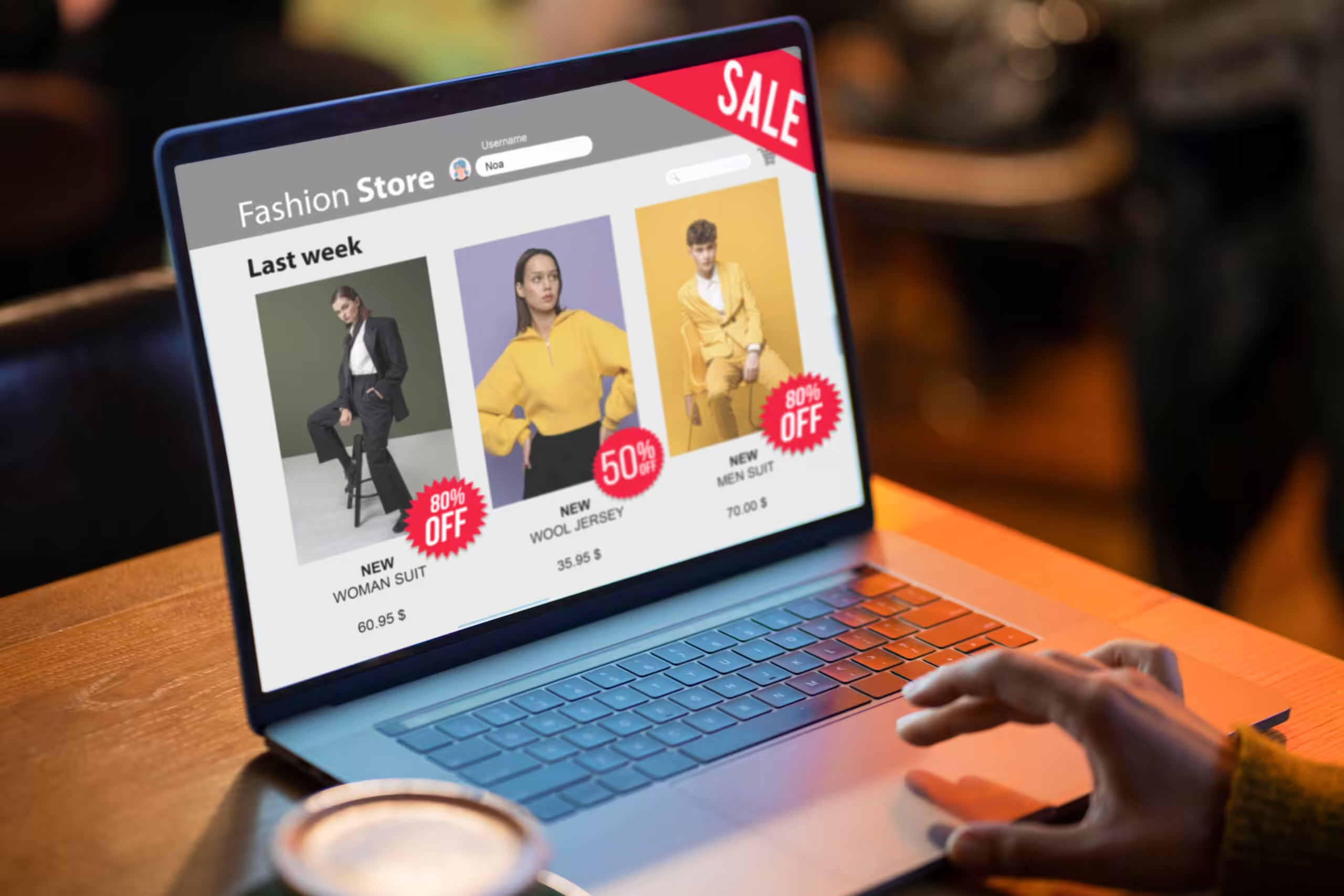
4. Upgrade your product pages

Think about this:
When people shop online, they can’t touch, feel, or try the product like they would in a real store. All they have is your product page.
That’s why upgrading your product pages can make or break a sale.
The first thing shoppers notice is images and videos. Blurry or tiny pictures turn people off. But clear, high-quality images that show the product from different angles help customers imagine owning it.
Even better, short videos showing how the product works or looks in real life can boost confidence and push them closer to buying.
What about product descriptions?
A dull or confusing product description leaves shoppers with questions. Instead, write clear, simple, and helpful descriptions. Tell people…
- What the product does
- Why it’s useful
- And what makes it better than others
Think of it as explaining the product to a friend… straightforward and honest.
Also, nothing builds trust like customer reviews.
Before buying, shoppers want to see if others were happy with the product. Reviews and ratings act like word-of-mouth recommendations. Even a few honest reviews (good and not-so-perfect) make your store feel more real and trustworthy.
When you combine sharp visuals, clear descriptions, and genuine reviews, your product pages feel reliable and convincing. Shoppers don’t just look… they decide to buy.
5. Make checkout simple

Have you experienced this before?…
You’re excited to buy something online, you add it to your cart, but then the checkout feels like a never-ending form. Too many clicks, too many steps, and suddenly, you don’t feel like buying anymore.
That’s what happens to many shoppers when checkout is complicated.
A smooth, simple checkout can completely change that. The fewer clicks it takes to buy, the better.
If customers can move from “Add to Cart” to “Order Confirmed” in just a few steps, they’re far more likely to complete the purchase. Long, confusing processes make people abandon their carts and leave.
Another way to make checkout easier is by offering “multiple payment options”.
Not everyone wants to pay with the same method. Some prefer credit cards, others want PayPal, mobile payments, or even bank transfers. By giving options, you make it easy for every shopper to pay the way they like.
And don’t forget “guest checkout”. Forcing someone to create an account before buying can feel annoying. Sometimes, shoppers just want to grab one item quickly without filling out extra details.
Guest checkout gives them that freedom, and later, if they enjoy the experience, they might come back and sign up.
In short, checkout should feel like opening a simple door, not breaking into a locked safe. Make it quick, flexible, and hassle-free, and you’ll see fewer abandoned carts and more happy customers hitting that “Buy” button.
6. Improve your store’s SEO

Imagine having a beautiful online store with amazing products, but nobody can find it.
That’s what happens when your e-commerce website doesn’t show up on Google.
This is where SEO (Search engine optimization) comes in… it’s about making sure your store appears when people search for the things you sell.
One of the easiest ways to start is by using keywords on your product pages. Keywords are just the words your customers type into Google.
For example, instead of only writing “Model X123,” write “Wireless Bluetooth Headphones – Model X123.”
That way, when someone searches “wireless headphones,” your product has a better chance of showing up.
Next, focus on “meta titles and descriptions”.
Think of these as the little preview text you see on Google before clicking a link. A clear title and description can make your store stand out and convince people to click.
For example: “Buy Stylish Men’s Sneakers Online – Free Delivery Available.”
And also, there’s “schema markup”.
Sounds technical, but in simple terms, it helps Google understand your store better. It can show extra details like product prices, ratings, or stock availability right on the search results.
When shoppers see those details, they’re more likely to click your store instead of another.
Improving your e-commerce SEO doesn’t give instant results, but over time it helps bring more people to your website without paying for ads.
More visitors means more chances to make sales.
7. Personalize the shopping experience

Think about the last time you walked into a small shop where the owner remembered your name and even suggested items you might like. It felt good, right?
That personal touch made you want to buy more. The same idea works for e-commerce websites… personalization makes shopping feel easier and more enjoyable.
One simple way is to “show related or recommended products”.
For example, if someone is looking at a phone, you could suggest a phone case or earbuds. This not only helps the customer but also increases the chance of selling more items in one order.
Another smart way is offering “tailored discounts”.
Instead of sending the same promo to everyone, you could give a special discount to someone who has been browsing but hasn’t bought yet.
It feels like you’re speaking directly to them, which makes them more likely to come back and buy.
Today, many stores use AI tools for this. Don’t worry, it’s not complicated… AI simply studies what customers are clicking on or buying, and then suggests products they might like.
It’s like having a shop assistant working 24/7, showing the right products to the right people.
When you personalize the shopping experience, customers feel valued. They don’t see random items; they see what’s actually useful to them.
And when shoppers feel understood, they stay longer, buy more, and return again.
8. Build trust with security

When people shop online, the first question in their mind is, “Is this website safe?”
If your store doesn’t look secure, many shoppers won’t risk typing in their card details… no matter how good your products are.
That’s why building trust with security is so important for an e-commerce website.
The first step to do this is adding “SSL (HTTPS)”.
You’ve probably seen the little padlock icon in the browser bar when visiting some websites. That lock tells customers their personal details… like passwords or card numbers… are protected.
If your website shows “Not Secure,” most people will leave immediately.
Next, use “secure payment gateways”.
Shoppers feel more comfortable when they see familiar names like PayPal, Stripe, or trusted bank options. These systems keep transactions safe, which means customers can pay without worrying about fraud.
Also, display “trust badges and guarantees”.
These are small logos or messages that say things like “100% Secure Checkout” or “Money-Back Guarantee.”
It may look simple, but these signals reassure buyers that your store is reliable.
9. Use content to drive more sales

When people shop online, they often have questions before buying: “Which product is best for me?” or “How do I use this?”
If your website gives them answers through useful content, they’re more likely to trust you and make a purchase.
One way to do this is by “writing blogs and buying guides”.
For example, if you sell skincare, a blog titled “How to Choose the Right Face Cream for Your Skin Type” can guide customers and gently lead them to your products. Helpful content positions your store as the go-to expert.
Another smart way is creating “FAQs (Frequently Asked Questions)”.
Shoppers don’t want to waste time emailing or waiting for answers. If your website already explains things like shipping, returns, or product details, it removes doubt and makes buying easier.
And don’t underestimate the power of “user-generated content”.
This means encouraging customers to leave reviews, share photos, or post how they’re using your product.
It’s like word-of-mouth online. New visitors see real people enjoying your products, and it builds instant trust.
10. Track what’s working (and what’s not)

Running an e-commerce website without tracking is like driving with your eyes closed…
You don’t really know where you’re going. To grow your store, you need to see what’s working well and what needs fixing.
Tool like Google Analytics can help. It show you how many people visit your website, which pages they like, and where they drop off.
Heatmaps go a step further by showing exactly where visitors click, scroll, or stop. This tells you what’s catching attention and what’s being ignored.
Another key thing to check is your “cart abandonment rate”.
This shows how many people add items to their cart but leave without buying.
If that number is high, something is wrong… maybe checkout is too long, shipping costs are too high, or payment options are limited. Knowing this helps you fix the problem.
You can also run “A/B test”.
This simply means testing two versions of a page… like two different “Buy Now” buttons… to see which one gets more clicks.
Over time, small changes like these can make a big difference in sales.
Wrapping up
At the end of the day, learning how to improve an e-commerce website is all about giving shoppers a smooth, simple, and trustworthy experience.
When your store works the right way, visitors don’t just browse; they buy, and they come back.
Now, here’s the catch:
The same rules apply to every website (even agency’s website), not just online stores.
Whether it’s an SEO agency, a PPC agency, or a social media agency, your website is the first place clients decide if they can trust you. If your website feels messy or outdated, you’ll lose leads before they even call.
That’s where we come in. At Block Agency, we build clean, conversion-focused websites for digital agencies. Our goal is simple:
Help you turn visitors into paying clients, just like we’ve shown how store owners can turn browsers into buyers.
Want a website that wins trust and drives results?
Let’s build it together. Talk to us here: hey@blockagency.co
Frequently Asked Questions
How long does it take to see results after an e-commerce website improvements?
It depends on what changes you make. Simple fixes like faster loading or a cleaner checkout can boost sales almost immediately. Bigger updates, like redesigning the whole website, may take weeks. But every small step improves your chances of turning visitors into paying customers.
What are the first steps to improve an e-commerce website?
Start by checking speed, design, and checkout flow. If your pages load slowly, fix that first. Next, make your website easy to navigate, with clear product details and images. Finally, simplify checkout so customers don’t get frustrated and abandon their carts halfway.