Are you struggling to turn landing page visitors into users for your app?
The problem might not be your app… it could be your landing page.
A weak landing page can make even the best app look unappealing, leaving potential users scrolling past without a second thought.
That means fewer installs, less engagement, and a lot of wasted effort.
In this blog post, we’ll show you 17 mobile app landing page examples that actually convert visitors into users.
You’ll see real designs, strategies, and features that make these pages irresistible.
By the end, you’ll have clear ideas to create your own landing page that boosts installs and helps your app get the attention it deserves.
Let’s get into it…
In this article
1. Opal
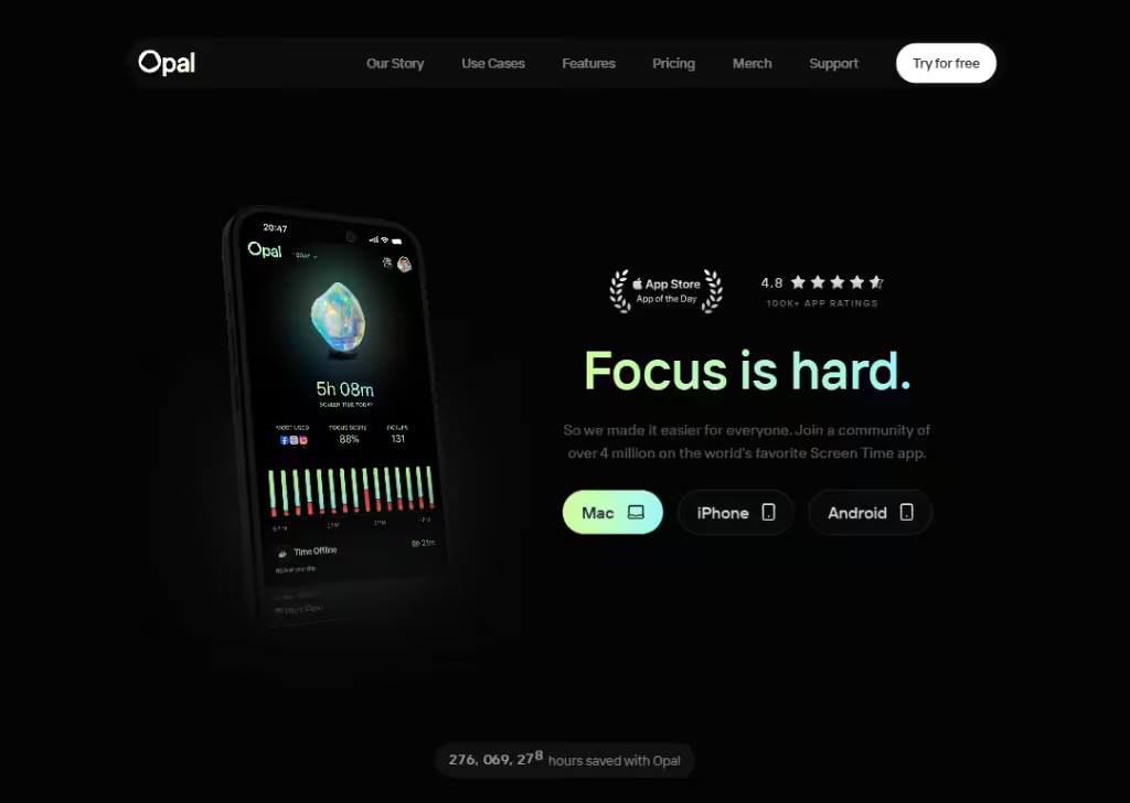
Opal’s landing page is great because it speaks directly to real life problems.
The moment you land, it talks about how much time people spend on their phones and how Opal helps you focus instead of scrolling endlessly.
It uses real numbers… how many hours you can “save”… which is easy to understand and feels tangible.
The design is clean, not crowded, and it highlights results before features, so you immediately know the benefit.
It also shows testimonials from real people, not just fancy buzzwords. This makes visitors trust the product and imagine themselves achieving better focus.
Opal uses visuals and simple text to guide you step by step to download the appor start using it.
The page feels calm, useful, and purposeful, which matches the app’s goal of reducing distractions.
2. FitnessAI
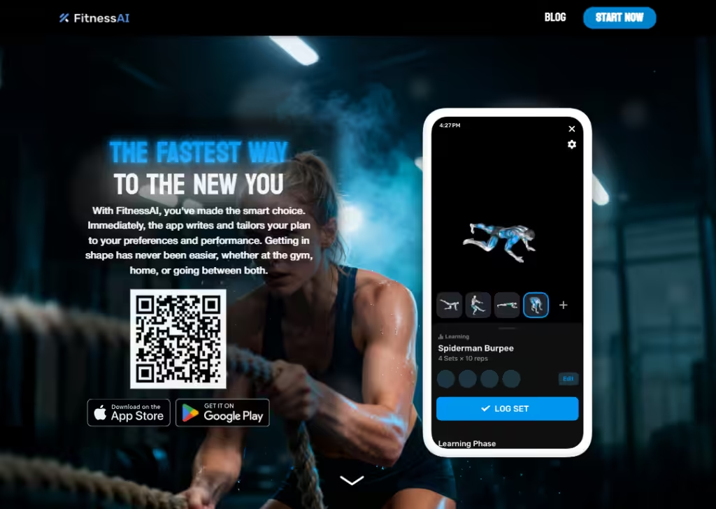
The FitnessAI landing page is strong because it explains what the app does in plain language right away:
It builds smart workouts for you using artificial intelligence.
You don’t need to scroll long to get it… you see what it offers and how it helps you reach your fitness goals.
The page uses big numbers (like millions of workouts and thousands of users) to show the app’s credibility, so people feel confident it’s based on real experience and not just hype.
The layout is not crowded, so important info stands out. This simplicity and strong proof help visitors understand and trustthe app fast.
3. Dropset
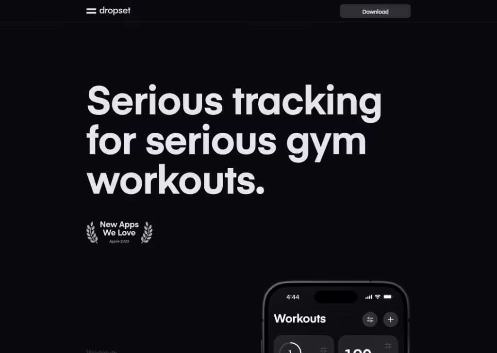
Dropset’s landing page feels friendly and practical because it talks directly to people who want a simple but powerful workout tracker.
The design uses calm, clear text that feels straightforward rather than flashy.
Focus on real user feedback and reviews on the page shows that real people like it, which builds trust.
There are visuals and short descriptions that make it feel modern but not overwhelming. Also, it doesn’t confuse visitors with too many features at once.
Ultimately, the landing page feels like a workout companion, not just another fitness app… this personal feel sets it apart.
4. SEEN
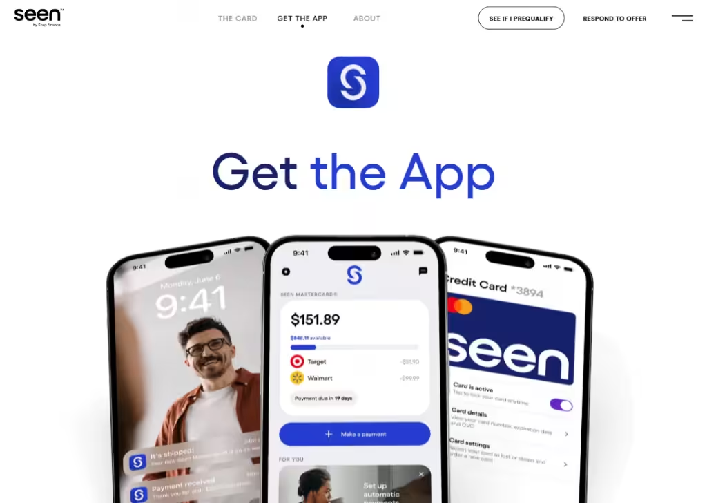
The SEEN landing page is clear because it tells you exactly what the app does up front.
Instead of vague descriptions, it shows key features like “Autopay”, “Realtime alert”, “Sending with digital card”. These are real features that people care about right away.
The page also highlights security features like encryption and instant card locks with one tap… that gives peace of mind to users who are wary of finance apps.
The layout is simple:
You see features, benefits, and calls to action without confusing. It doesn’t try to sell you a million features… it sticks to what matters for someone considering a credit or finance app.
That straight-to-the-point focus makes it feel trustworthy and easy to follow.
5. Galileo Health
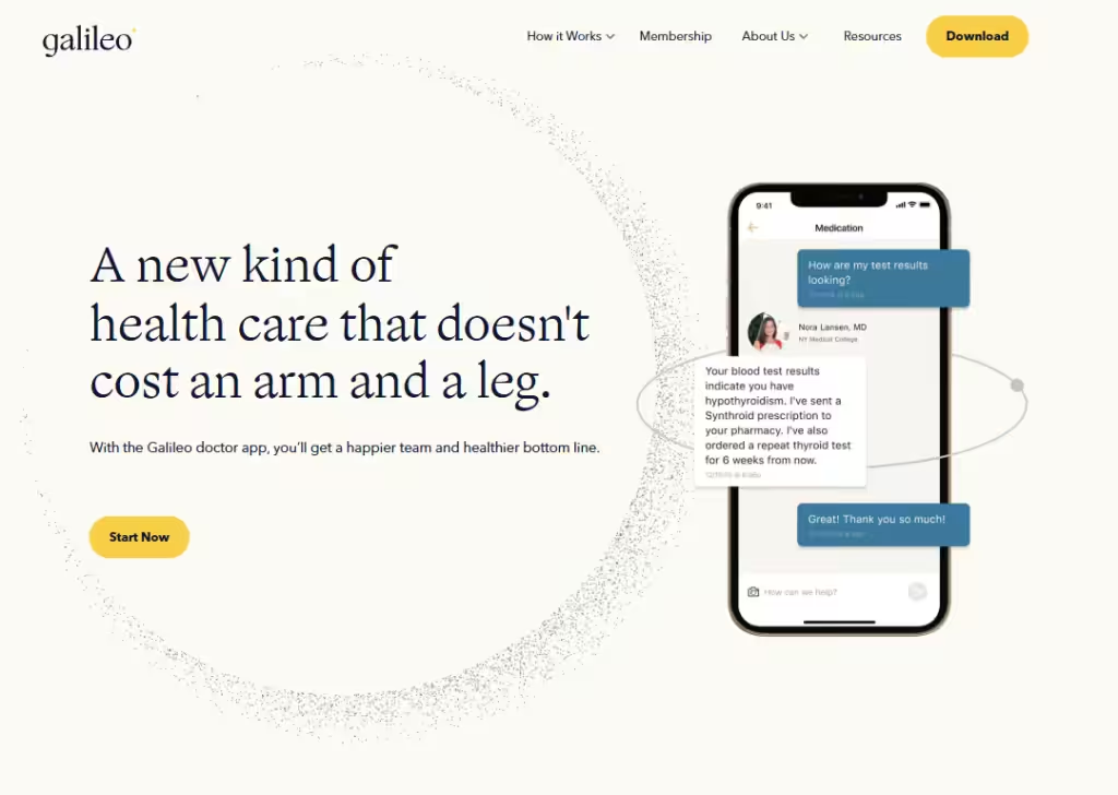
Galileo Health’s landing page works well because it explains healthcare without stress.
Right away, it says, “With the Galileo doctor app, you’ll get a happier team and healthier bottom line”. That’s a big win for busy employees.
The page clearly lists what you get:
Doctor consultation, prescriptions, lab help, emergency care, etc. Nothing feels hidden or confusing.
The design is calm and clean, which is important for a health app… it makes users feel safe and supported.
It also explains who the app is for, like employees or team workers. This helps visitors quickly decide if it fits them.
Overall, the page builds trust by focusing on access, speed, and real medical support, not fancy promises.
6. Aura Health
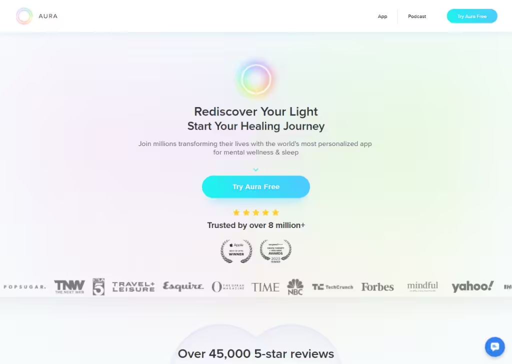
Aura’s landing page stands out because it focuses on how you feel, not just app features.
From the first message, it talks about “finding your light” and “starting your healing journey”.
The page uses friendly language and soft visuals, which makes the experience feel safe and comforting.
It also highlights personalization, showing that the app adapts to your mood and needs, instead of giving everyone the same content.
Testimonials and user numbers help build trust without overdoing it.
The page flows naturally, guiding you from understanding your problem to seeing how Aura helps solve it.
This emotional connection makes visitors feel understood, which is why the landing page works so well.
7. FaceApp
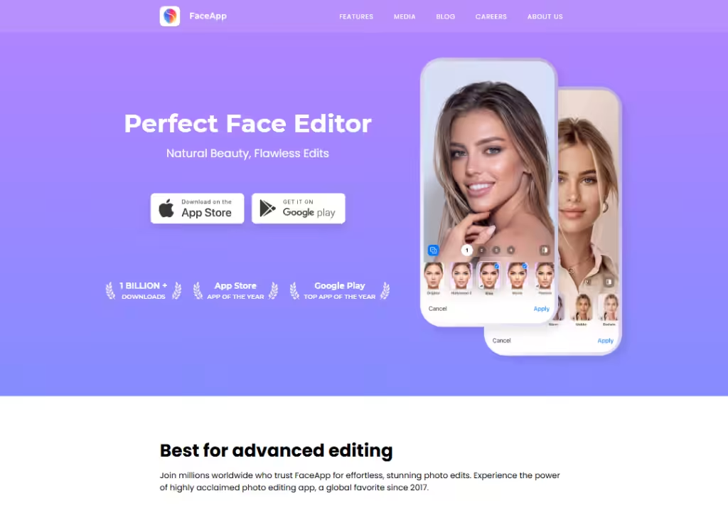
FaceApp’s landing page is effective because it shows instead of explaining too much.
The app’s purpose is very clear:
Edit faces faster.
The page highlights popular features like age changes, hairstyles, and photo filters, which people already recognize from social media.
You don’t need long text to understand it… the visuals do most of the work. This makes the page fast and easy to scan.
The design is simple, and the main call-to-action pushes visitors to download the app direct from Apple Store and Google Play.
FaceApp’s landing page works because it matches the product: quick, visual, and fun. It doesn’t distract users… it gets straight to what people came for.
8. HolyOwly
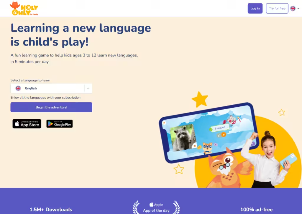
HolyOwly’s landing page is great because it speaks directly to parents, not kids.
It explains clearly that the app helps children learn new language. The message is simple:
Kids practice speaking a new language every day (for 5 minutes), in a fun and safe way.
The page focuses on results parents care about… confidence, speaking skills, and consistency.
Visual show a happy kid with a phone, making it easy for parents to picture their own child using the app.
The tone feels supportive, not salesy. Clear sections explain how it works, who it’s for, and why it’s effective.
This clarity makes HolyOwly’s landing page trustworthy and easy to say yes to.
9. Mojo
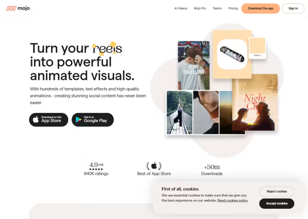
Mojo’s landing page works because it targets a very specific user:
People who want better social media content.
Right away, it shows what you can create… animated text, templates, and eye-catching designs. This removes guesswork.
The page doesn’t overwhelm visitors with design terms; instead, it shows how easy it is to make content that looks professional.
The visuals match what users want to achieve, which builds excitement.
Mojo’s landing page is effective because it sells results, not tools. You don’t feel like you need to learn anything… just open the app and create.
10. Evernote
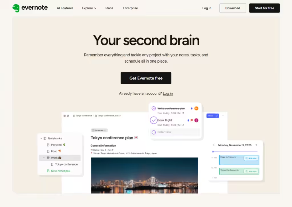
Evernote’s landing page is strong because the idea is clear:
“Remember everything and tackle any project with your notes, tasks, and schedule all in one place.”
Right away, you understand that the app helps you write notes, save ideas, and stay organized.
The page shows common problems people face… forgetting things, scattered notes, messy tasks… and positions Evernote as the solution.
It explains features like notes, to-do lists, collaborating with a team, etc.
The layout is clean, so each benefit stands out.
Visuals show real use cases, like planning projects or saving articles, which makes it easy to imagine using the app daily.
The call-to-action is clear and friendly, pushing visitors to try if for free.
Overall, Evernote’s landing page works because it feels useful, familiar, and practical.
11. Planta
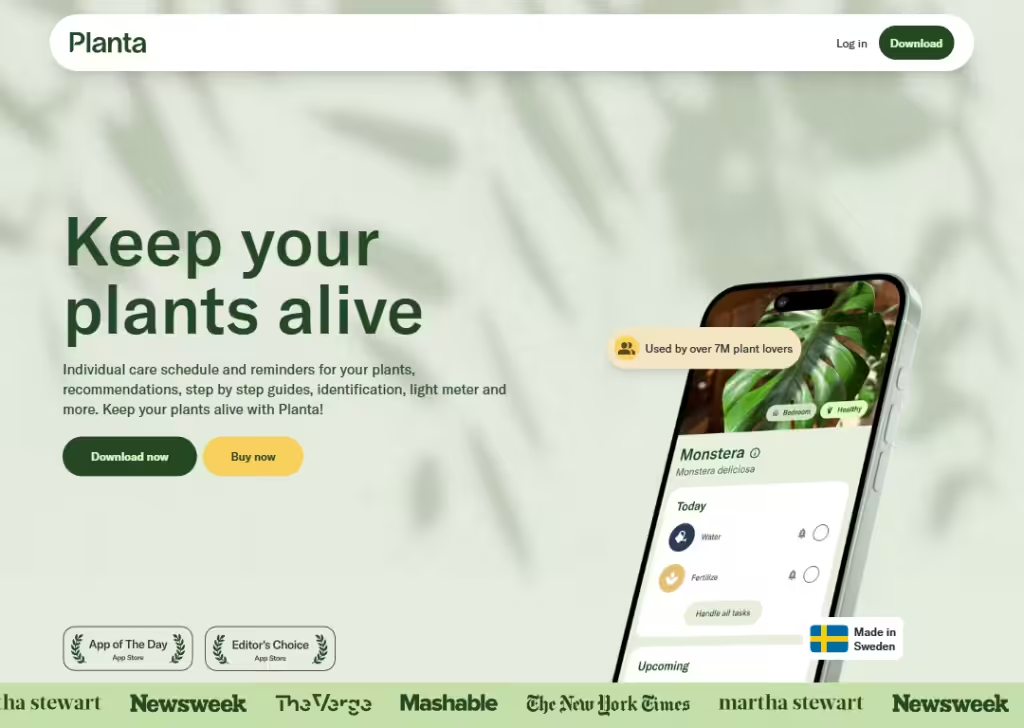
Planta’s landing page works well because it turns plant care into something simple and stress-free.
Right away, it tells you the app helps you keep your plants alive… which is exactly what plant owners worry about.
The page explains how Planta reminds you when to water, checks light levels, and gives care tips. Everything is written in easy language, so even beginners feel confident.
The visuals show healthy plants and clean app screens, which builds trust.
Planta’s landing page is effective because it removes fear, promises guidance, and makes plant care feel doable for anyone.
12. Pocket Casts
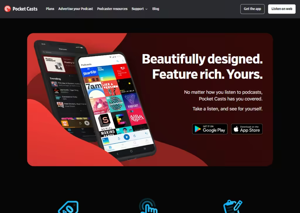
Pocket Casts’ landing page stands out because it focuses on listening experience, not just podcasts.
It explains that the app helps you discover, organize, and enjoy podcasts easily.
The language is clear and friendly, not technical. Visual show a bit of how the app looks, so users know what to expect.
It also speaks to both casual listeners and serious podcast fans, without sounding complicated.
Pocket Casts’ landing page works because it respects the user’s time and shows how the app makes listening smoother and more enjoyable.
13. Artisse
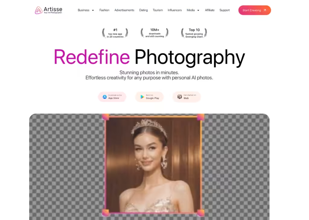
Artisse’s landing page is effective because it explains AI photos in a very human way.
Right away, it tells you that you can create realistic photos of yourself with AI. That message is clear and exciting.
The page shows examples of results, which helps users trust what the app can do.
The language stays simple, avoiding heavy AI terms. The visuals are the main focus, which makes sense for a photo app.
The call-to-action encourages visitors to directly download the app from Apple Store, Google Play, or Get started on web.
Artisse’s landing page works because it sells confidence, convenience, and results… not complex technology.
14. Headspace
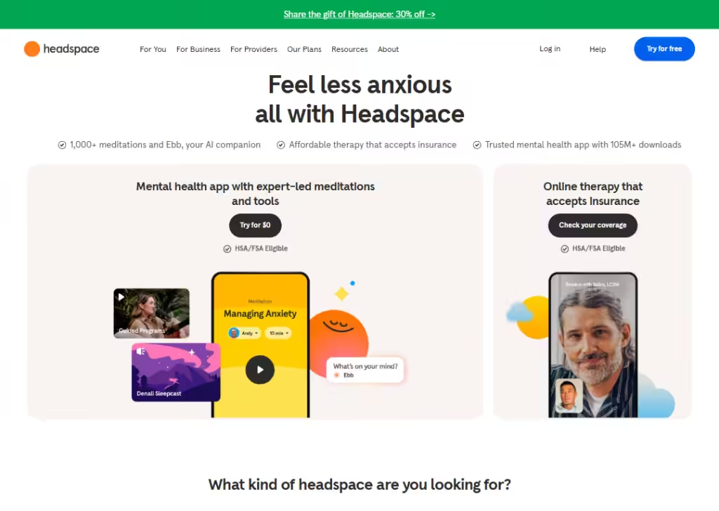
Headspace’s landing page works because it feels calm from the first second.
The colors, illustrations, and wording all match the idea of mindfulness and peace.
The page explains clearly how Headspace helps with stress, sleep, focus, and everyday mental health.
It doesn’t overwhelm users with information. Instead, it breaks things down into simple benefits anyone can relate to.
Trust is built through science-backed claims and millions of users, mentioned in a simple way.
Headspace’s landing page is great because it makes mental health feel normal, accessible, and easy to start.
15. Cameo
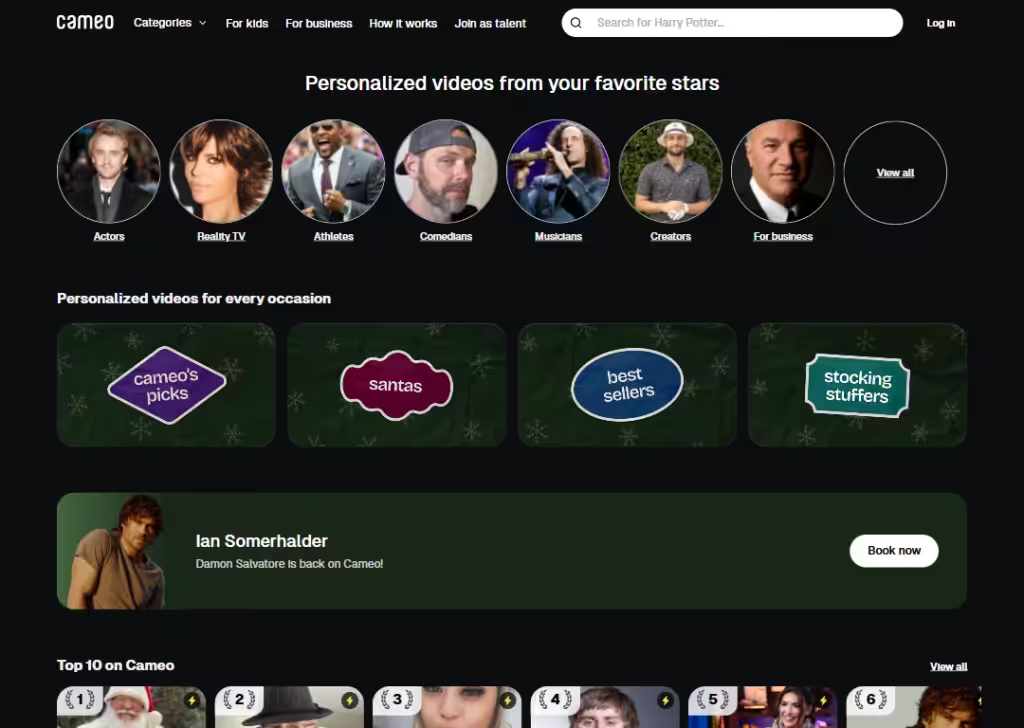
Cameo’s landing page works because it explains the idea clearly:
Get a personal video from a celebrity.
There’s no confusion about what the app does.
The page shows real examples of celebrities and creators, which makes the product feel fun and real.
It explains common use cases like birthdays, santas, and special moments, helping visitors picture when they would use it.
The layout is simple, with clear categories that make it easy to browse.
The landing page also builds trust by showing that videos are personal and made just for you.
Overall, Cameo’s page is effective because it sells an experience, not just a feature.
16. EVO
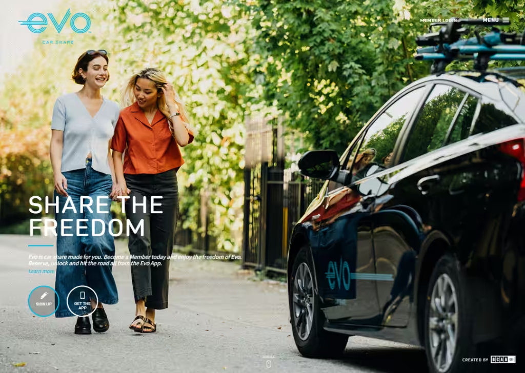
EVO’s landing page is great because it clearly explains car sharing without owning a car.
Right away, you understand that you can book cars when you need them and return them easily.
The language is simple and focused on everyday situations, like errands or weekend trips.
Visuals show clean cars and real city settings, which builds trust. The steps to get started are clearly explained, so users know what to do next.
Overall, EVO’s landing page is effective because it makes car sharing feel simple, reliable, and convenient.
17. Ibotta
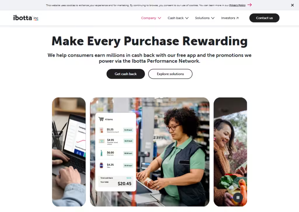
Ibotta’s landing page stands out because it focuses on saving real money.
Right away, it explains that you can earn cash back when you shop. That’s easy to understand and very appealing.
The design is bright and friendly, making saving money feel fun instead of complicated.
Clear buttons encourage users to “Get cash back” or “Explore solutions”.
Ibotta’s landing page works because it turns a simple habit… shopping… into an obvious reward.
Wrapping up
At this point, you’ve seen what works.
These mobile app landing pages are clear, simple, and focused on one thing:
Getting people to install the app. No noise. No confusion.
The main lesson is this…
Show the value fast, guide users with one clear action, and remove doubt with proof. You don’t need a fancy design. You need clarity.
Use these examples as a guide, test what fits your app, and start making visitors install your app.
Frequently Asked Questions
How many sections should a mobile app landing page have?
Most mobile app landing pages work best with 5 to 7 sections. These include the hero section, app benefits, feature highlights, reviews, screenshots, and a clear install button.
What makes a mobile app landing page convert well?
A high-converting mobile app landing page has a clear headline, simple text, strong visuals, social proof, and one main action. It removes confusion and tells users exactly why the app is useful.
Do mobile app landing pages need app screenshots?
Yes, app screenshots help users see how the app works. They build trust and reduce doubt. Clear screenshots also make the landing page easier to understand.
