Are you wondering why your website gets visitors but few people take action?
Understanding on-page website design statistics can make a huge difference.
In this blog post, you will discover 11 on-page website design statistics that reveal how colors, layouts, images, buttons, and other elements grab attention and keep visitors engaged.
You’ll see which design choices make people click, stay longer, and trust your website more.
By the end, you’ll know how small changes on your website can lead to better results, higher conversions, and happier visitors.
Whether you’re designing your own website or managing client websites, these statistics will help you create pages that really work.
Let’s get into it…
In this article
Blue (46%) and green (30%) are the most preferred colors among consumers visiting business websites

This means most people feel more comfortable when they see blue or green on a website.
Blue often makes people think of trust, safety, and calm. Green feels fresh, healthy, and easy on the eyes.
When a business website uses these colors, visitors feel relaxed and more willing to stay. Loud or strange colors can feel stressful or confusing.
So, using blue or green helps people feel safe, understand the website faster, and trust the business more.
That’s why many banks, tech companies, and service websites use these colors a lot.
38% of visitors focus on a website’s page layout or navigation links during their first visit

This shows that many people care about how easy a website is to use.
When someone visits a website for the first time, they quickly check if they can find what they need.
They look at menus, buttons, and links to see where to click next. If the layout is messy or confusing, they may leave.
A clean layout helps people move around without stress. Simple menus, clear links, and good spacing make visitors feel in control.
When people know where to go, they stay longer and trust the website more.
Only 18% of consumers pay attention to font styles when visiting a website for the first time

This means most people do not care much about fancy fonts. They just want to read the content easily. As long as the text is clear and not too small, they are fine.
Using hard-to-read fonts can annoy people, but using fancy fonts does not impress most visitors either. Simple fonts help people read faster and understand better.
People come for answers, not decoration. So, it’s better to use clean and simple text than to worry too much about style.
Clear words matter more than fancy letters.
Visitors spend approximately 57% of their total page-viewing time above the fold

“Above the fold” means the part of the page people see first without scrolling.
This shows that most attention happens at the top of the page.
If the important message is hidden too far down, many people may never see it. That’s why headlines, key text, and main buttons should be near the top.
People decide quickly if a page is useful. A clear message at the top helps them understand what the website is about and what to do next.
First impressions matter a lot on websites.
Internal link CTAs perform better than sidebar CTAs, recording a 121% higher click-through rate

This means buttons or links placed inside the content work better than ones in the sidebar.
When people are reading and see a link that fits the topic, they are more likely to click it.
Sidebar links are easy to ignore because people often see them as ads. Internal links feel more natural because they appear right when the reader needs them.
For example, a link inside a blog post feels helpful, not pushy.
This shows that placing links in the right spot increases clicks and keeps people moving through the website.
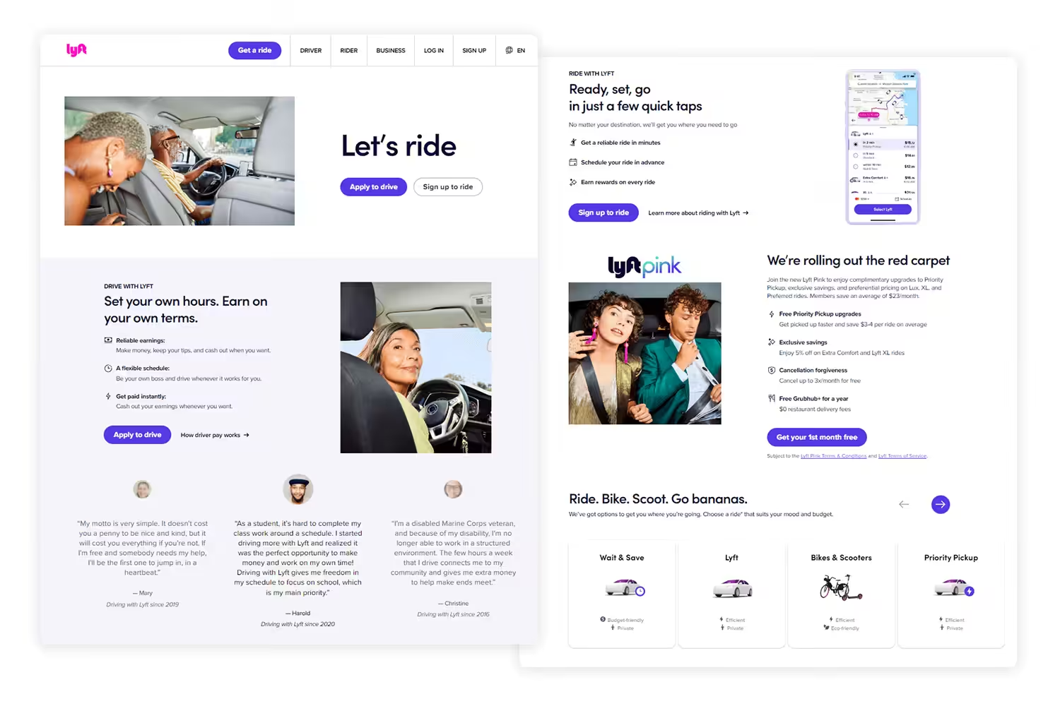
Centered CTAs receive 682% more clicks than left-aligned CTAs

This shows that people notice centered buttons more than ones pushed to the side.
A centered button sits right in front of the reader’s eyes, so it’s hard to miss. Left-aligned buttons can blend into the text and get ignored.
When a button is centered, it feels important and clear. People understand that it’s the next step to take. This is why signup, contact, or buy buttons often work better when centered.
Simple placement changes can greatly affect how many people click.
Photos and images (40%) are the most appreciated visual elements on websites

This means people like seeing pictures more than other design elements.
Images help explain things faster than text alone. A good photo can show a product, a person, or an idea in seconds.
Images also make a website feel more friendly and real. Too much text can feel boring, but images break it up and keep people interested.
When visitors see clear and relevant images, they understand the message quicker and feel more connected.
This is why websites with good images often feel easier and nicer to use.
Color usage (39%) is another highly valued visual element among consumers

Colors help set the mood of a website. They guide the eyes and make things easier to understand.
For example, one color can be used for buttons so people know where to click. Another color can show warnings or important messages.
When colors are used well, the website feels clean and organized.
Bad color choices can make a website feel confusing or tiring.
This statistic shows that people notice colors almost as much as images. Good color use helps people stay longer and feel comfortable while browsing.
Videos (21%) are also appreciated but rank lower than images and color
Videos are useful, but not everyone wants to watch them.
Some people are in a hurry or browsing quietly. Others may have slow internet. That’s why videos are liked, but not as much as images or colors.
Videos work best when they explain something clearly and quickly.
Long or auto-playing videos can annoy users. This shows that videos should support the page, not take over.
When used well, videos help. When overused, they can push people away. Balance is very important.
88.5% of website designers use flat design styles in their websites

Flat design means simple design with fewer shadows, effects, or heavy styles. Buttons, icons, and layouts look clean and plain.
Designers use this style because it loads faster and is easier to understand.
Flat design works well on phones and computers. It also helps users focus on content instead of decoration.
This statistic shows that most designers agree that simple design works better than complex design.
Flat design helps websites feel modern, clear, and easy to use for everyone.
51% of people believe thorough contact information is the most important element missing from many companies’ websites

This means many visitors want clear ways to contact a business but don’t find them.
People want phone numbers, email addresses, or contact forms that are easy to see.
When contact details are hidden or missing, visitors feel unsure and lose trust. They may wonder if the business is real.
Clear contact information makes people feel safe and confident. It shows the business is open and reachable. This is very important for sales and trust.
A website should never make it hard to contact the business.
Wrapping up
These 11 on-page website design statistics show that small changes can make a big difference in how people use your website.
From colors and images to button placement, every detail matters for keeping visitors and getting clicks.
If you’re an agency and you want a website that not only looks good but also converts visitors into customers/clients, Block Agency can help.
We design high-quality, white-label websites for agencies, so you can offer top-notch websites to your clients without the stress.
Let us handle the design while you focus on growing your business.
Talk to us here: hey@blockagency.co
Frequently asked questions
Which colors do visitors prefer on websites?
Visitors prefer blue and green colors the most. Blue is associated with trust and calm, while green feels fresh and easy on the eyes. Using these colors strategically on buttons, headers, or backgrounds can make a website feel more welcoming and trustworthy to visitors, improving engagement and clicks.
Do font styles matter for website visitors?
Only 18% of visitors notice font styles on a website. Most people care more about readability than fancy fonts. Using clean, simple, and legible fonts helps visitors read content faster and understand the message. Avoid complicated or hard-to-read fonts, as they can distract or frustrate users.
Which visual elements do visitors like most on websites?
Visitors like photos and images the most (40%), followed by colors (39%), and videos (21%). Images help explain ideas quickly, colors guide attention, and videos add detail. Using these elements wisely can make a website more attractive, easy to understand, and engaging for visitors.
What design style do most website designers use?
Most website designers (88.5%) use flat design on websites. Flat design is simple, clean, and easy to understand. It avoids heavy effects, shadows, or complex graphics. This style helps websites load faster, works well on all devices, and keeps the focus on content, making it easier for visitors to navigate.
Do button positions on websites affect clicks?
Yes, button placement greatly affects clicks. Centered buttons get 682% more clicks than left-aligned ones. Internal buttons inside content also perform 121% better than sidebar buttons. Proper placement makes buttons more noticeable, encouraging visitors to take action like signing up, buying, or contacting the business.