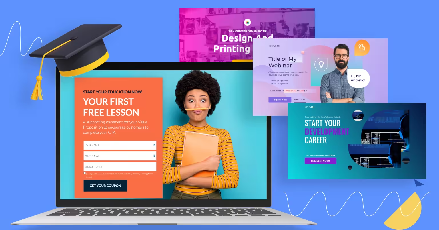
You want to see real online course landing page examples that can help you get more sign-ups, right?
That’s exactly what this blog post will show you.
Because here’s the truth:
If your landing page is unclear, boring, or too busy, people won’t sign up… even if your course is great.
You’ll lose leads, lose money, and keep wondering why no one is joining.
This blog post will fix that.
You’ll see 17 online course landing page examples that actually work. Each one shows you what to say, what to show, and how to guide people to click “Sign Up.”
You’ll learn simple things you can copy, use, and test on your own landing page to boost conversions without stress.
Let’s get into it…
In this article
1. Marie Forleo – B‑School
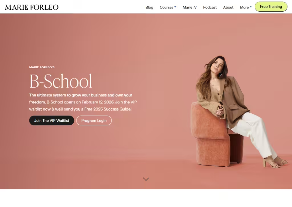
Marie Forleo’s B‑School page feels like you’re talking to a teacher who gets you.
Right from the start you see what the course helps you do… grow your business and own your freedom.
They use big goals people care about (“freedom,” “prosperity,” “happiness”), not long tech talk. The headline is clear:
It’s for both beginners and people already running a business.
There’s lots of social proof… real quotes and stories from students who succeeded… and that builds trust fast.
The page also uses a free bonus (Success Guide) to get people excited and signed up.
The look is clean, and the words are easy to read, which helps visitors quickly understand what B‑School is and why it matters.
2. Part‑Time YouTuber Academy
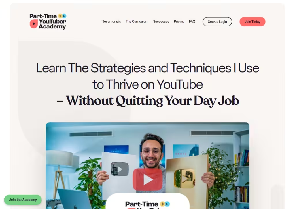
The Part‑Time YouTuber Academy landing page speaks like a helpful coach. It immediately tells you the big promise:
“Learn how to grow on YouTube without quitting your job.”
That’s a clear benefit visitors care about.
The page dives into what you’ll learn in everyday language, like publishing & repurposing, idea generation, filming better videos, etc… so people easily see how this course makes life simpler.
You’ll also see real testimonials and star ratings early on… these show that others have taken the course and gotten results, which builds trust.
Most of the buttons say simple things like “Join the Academy Today,” so it’s always easy to sign up without confusion.
3. MasterClass – Gordon Ramsay Teaches Cooking
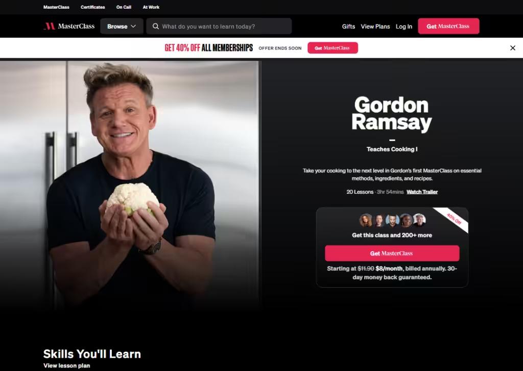
This landing page works well because it uses a famous teacher as the star of the course.
Seeing Gordon Ramsay’s name and photo right up front makes people stop and pay attention… many already trust him from TV and his restaurants, so that trust makes the course feel real and valuable.
The title is short and clear: “Gordon Ramsay Teaches Cooking I,” and the subtitle tells you exactly what you’ll learn… real methods, ingredients, recipes… not vague promises.
They also show how many lessons and total time the course has (20 lessons, ~4 hours), so people know what they’re getting.
The Watch Trailer button at the top lets visitors preview the content before committing, which builds confidence.
Another smart thing is the pricing info… they show that you get this class plus 200+ others with a subscription, and there’s a money‑back guarantee to reduce risk.
All of this together makes it feel safe, exciting, and worth trying.
4. SuperHi
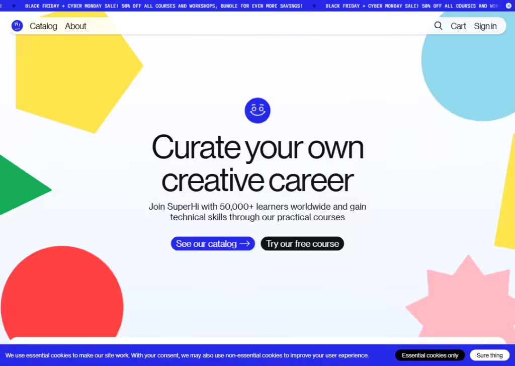
SuperHi’s landing page feels friendly and practical.
Right at the top, it tells you the big benefit… create a carrier part by learning real, useful technical skills.That matters because people want something they can use, show, or sell later.
The page mentions how many learners already joined, which makes new visitors feel like they’re joining a community, not diving in alone.
One thing that stands out is the free course option. Instead of making you pay to try it out, you can start a free beginner course, so you get a taste of how they teach before spending money.
They break their offerings into clear categories (like “Learn to code,” “Digital design”), so you know exactly what type of skill you’ll get.
The page also talks about lifetime access, meaning once you buy a course, you can return to it whenever you want. This removes pressure to finish quickly and makes learners feel like they’re getting real long‑term value.
Overall, the language is simple and honest, with a friendly, supportive tone that invites exploration.
5. Piano In 21 Days
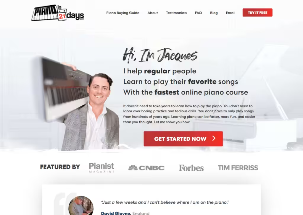
What makes this landing page strong is clarity and promise.
Right away, it tells you what you’ll get… a guide to learn piano fast.
They say you can start playing songs quickly instead of spending years on traditional lessons, which speaks to what most learners really want.
You also get a free workbook up front so you can try the method without paying first, which lowers fear and builds trust.
The page uses simple language about how online learning works and how you can go at your own pace, which makes it feel doable even if you’re busy with work or life.
It also shows real testimonials and numbers (like how many people have tried it), so visitors see that others have made progress too.
6. Creators Training
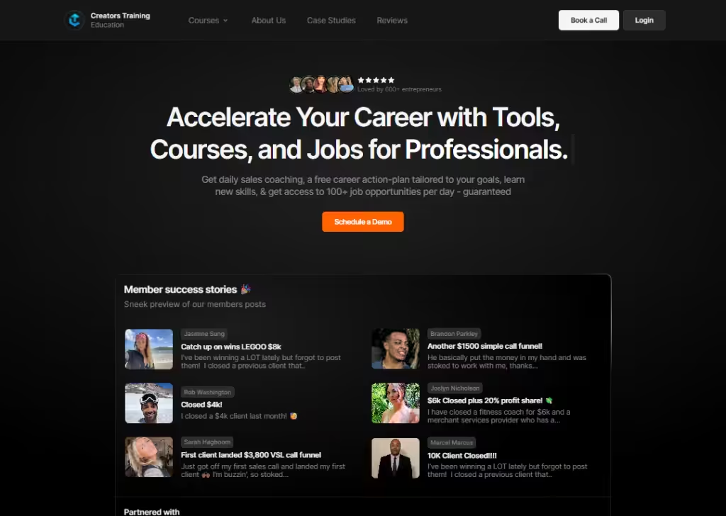
Creators Training lands well because it speaks directly to your goal as a creator.
Right away, the landing page shows what kinds of people it’s for… Marketers, Freelancers, Entrepreneurs… so you know if you belong here.
One smart thing they do is include short, real success stories from people who’ve used the training, which builds trust fast.
There are multiple calls‑to‑action (CTAs) placed in logical spots so you can sign up whenever you’re ready.
Overall, it feels supportive, clear, and practical, which makes visitors more likely to enroll.
7. Ripple Training
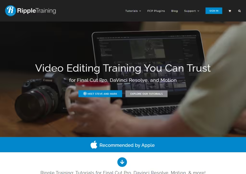
Ripple Training’s landing pages feel like a helpful teacher who knows their craft.
Right at the start, they show exactly what skills you’ll get… editing in Final Cut Pro, DaVinci Resolve, and Motion… in a way that’s clear and practical.
They don’t overload you with fancy words; they talk about real video editing tasks you’ll learn, step by step, so even beginners can understand what they’ll gain.
One thing that stands out is the focus on quality and clarity… each course mention exactly what tool you’ll master and how many training is in it.
Overall, the page is simple, friendly, and shows real value… you know what you’re signing up for and that others like it too.
8. CXL Institute
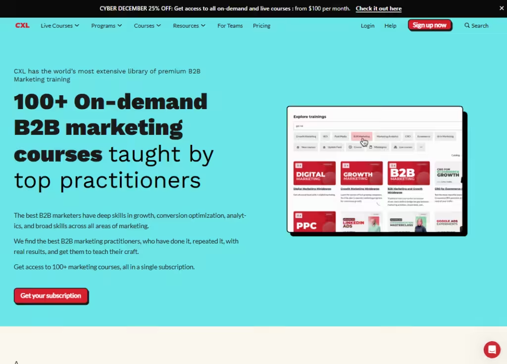
CXL Institute’s landing page is strong because it makes learning feel like a smart career move without confusing you with tech talk.
First, they show that their courses are created by real experts who work in the field, not just teachers who repeat theory.
There are lots of real courses and a wide catalog, so whether you’re a beginner or already experienced, you can pick learning that matches your pace and goals.
Another thing that stands out is the subscription pricing method. You subscribe and get access to 100+ courses.
Overall, the landing page feels trustworthy, practical, and focused on skills you can use right away, not just theories you’ll forget.
9. TeamTreehouse
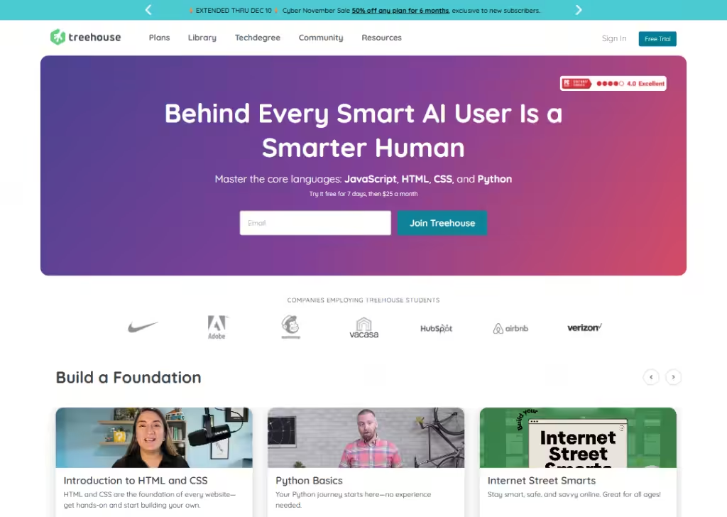
TeamTreehouse works as a landing page because it’s simple and approachable, especially for people who have never coded before.
The first thing you see is that you can start with a free 7‑day trial, so you can try lessons before paying.
The courses and paths are broken into clear topics like HTML, CSS, JavaScript, and Python, so you always know what skill you’re going to learn next.
They use a clean, familiar layout that doesn’t feel overwhelming… the colors are easy on the eyes, and buttons to start learning are obvious and friendly.
Overall, the page feels safe and simple, which helps beginners feel confident jumping in without stress or confusion.
10. FutureLearn
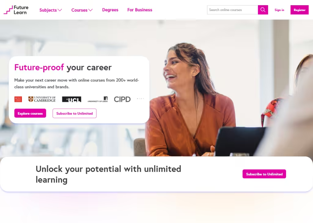
FutureLearn works well because it feels like a real online university classroom, not just a course page.
The landing pages show clear categories and brief descriptions of courses, so you can easily find something you’re interested in and see how long it runs and what skills you’ll learn. That makes it feel honest and straightforward.
One smart thing is the free course option… many courses let you join and start learning without paying right away, which reduces fear of signing up.
Finally, they use a simple, clean layout with clear buttons like “Explore Courses”, “Subscribe to Unlimited”, making it easy to take action without confusion.
The landing page feels calm, not overwhelming, which helps people stick around and explore learning options.
11. Fitness Blender
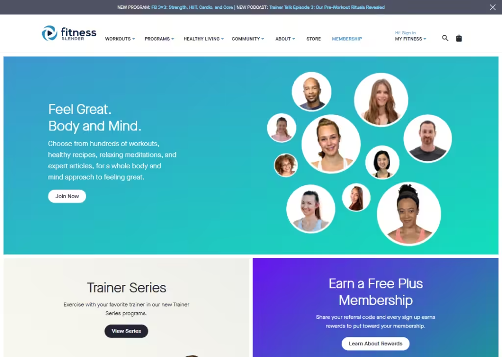
Fitness Blender’s landing page feels light and welcoming.
It focuses on real workouts and healthy habits you can start right away.
They show options like programs, membership, and workout videos right from the top, so you know what you’ll get without guessing.
The language is simple and friendly… words like feel great and start with the basics make visitors feel like the program is for everyday people, not fitness experts.
Overall, the page feels like a supportive guide rather than a hard sell, which helps people feel comfortable signing up or exploring their options.
12. Yoga International
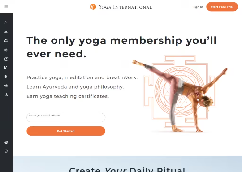
Yoga International’s landing page stands out because it feels calm and inviting… just like yoga itself.
They use soft colors and clean fonts that help visitors feel relaxed as soon as they arrive.
The page quickly tells you what you’ll get:
Practice yoga, meditation and breathwork. Learn Ayurveda and yoga philosophy. Earn yoga teaching certificates.
What makes it good is how every option feels personal. They talk about progress and wellbeing in simple, everyday words so visitors feel the course is friendly and doable, not intimidating.
The calls to action like “Get Started” are clear and easy to spot, so you always know how to begin.
Testimonials or quotes from real members help build trust by showing that real people enjoy the community and results.
The layout stays clean and uncluttered, so anyone can scroll down, understand the value, and decide without feeling overwhelmed.
13. The Songwriting Academy
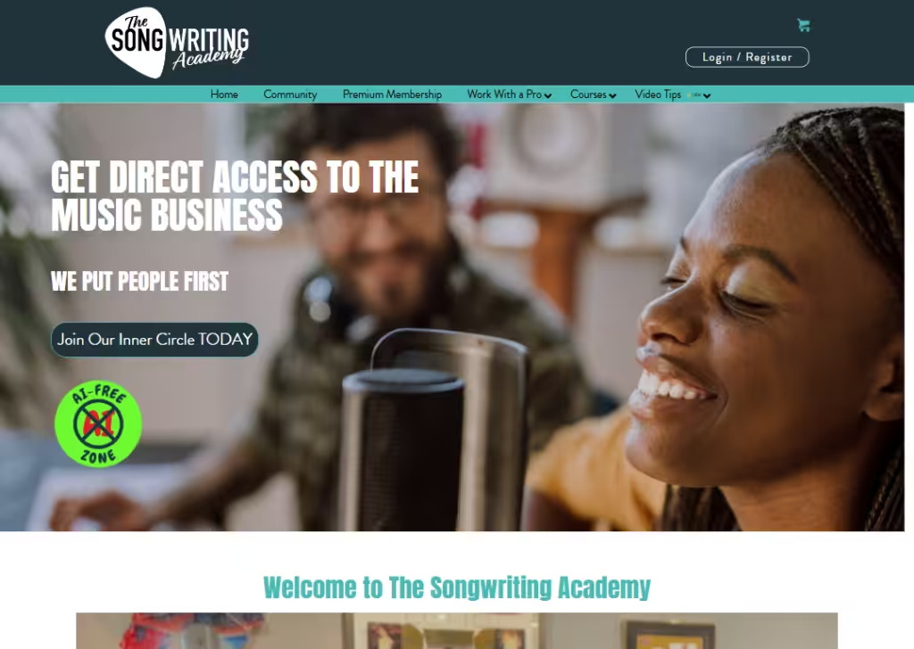
The Songwriting Academy landing page works because it feels like a community, not just a course.
Right away you see you’re joining a group of real songwriters, not just watching video.
They promote live events, challenges, and sessions where people share and get feedback. That makes visitors feel like they’ll belong and grow with others instead of doing it alone.
They also highlight a big video library and live events, so people instantly know what they get… hours of training plus Sunday live section.
The language is simple and inspiring: they talk about connecting with hit songwriters and industry pros, which makes the promise feel real and exciting.
The page doesn’t bury details… it shows event dates, training hours, and testimonials from people who say they’ve grown as writers.
That honesty and community feel make the offer more inviting and easier to trust.
14. Mastering Anger
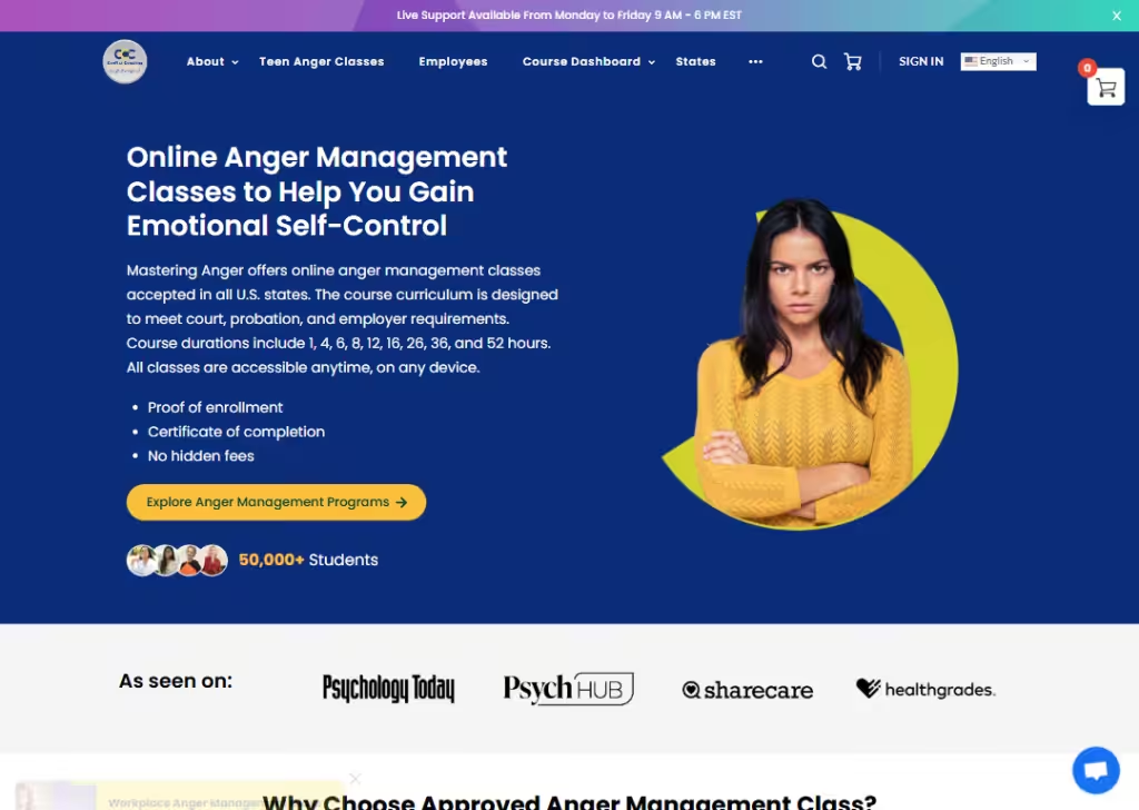
The Mastering Anger landing pages are effective because they are clear about who they help and how.
They immediately tell you this course is accepted by courts, employers, and probation officers in all US states… which matters a lot if you need it for legal or job reasons.
They list course options by hours, so people can pick the exact length that fits their situation (like 4 hours, 8 hours, or more).
The prices and what you get… lessons, quizzes, certificate… are right there, which removes guesswork and builds trust.
Another smart thing is the self‑paced access… you can start, pause, and resume anytime on any device, which feels easy and flexible.
15. Foundr – Instagram Domination
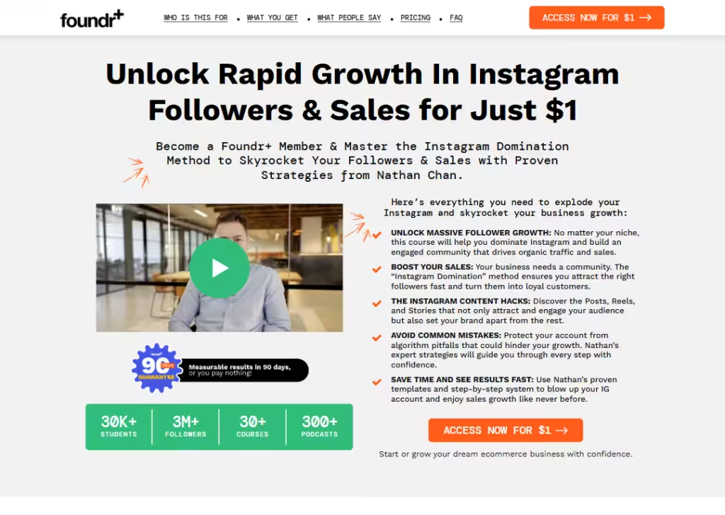
Foundr’s IGD membership landing page is strong because it focuses on results people care about… followers and sales.
It talks about growing your Instagram followers and using Instagram to sell products or services, which is a big goal for many entrepreneurs.
They show student stories and real numbers (like businesses getting thousands of followers and making money), so visitors see that other people actually got results, not just promises.
The copy also explains what the program teaches… content strategy, community building, sales funnels… in plain language that’s easy to understand.
Another good thing is the low trial price and clear breakdown of what you get, so it feels like real value, not a vague subscription.
16. Codecademy
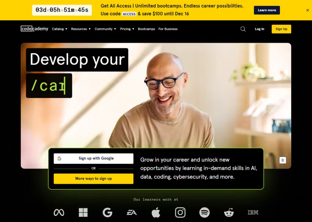
Codecademy’s landing page is effective because it speaks directly to people who want real coding skills.
The layout is simple and friendly instead of overwhelming, which helps beginners who might feel nervous about coding.
They also show that you can learn by doing, with interactive lessons you practice in your browser. This makes it feel more like hands‑on learning instead of just watching videos.
Buttons like “Start up, it’s free” and “Sign up with Google” make the next step very clear without confusing terms.
Overall, it feels supportive, clear, and beginner‑friendly.
17. Flux Academy – Freelancing for Web Designers
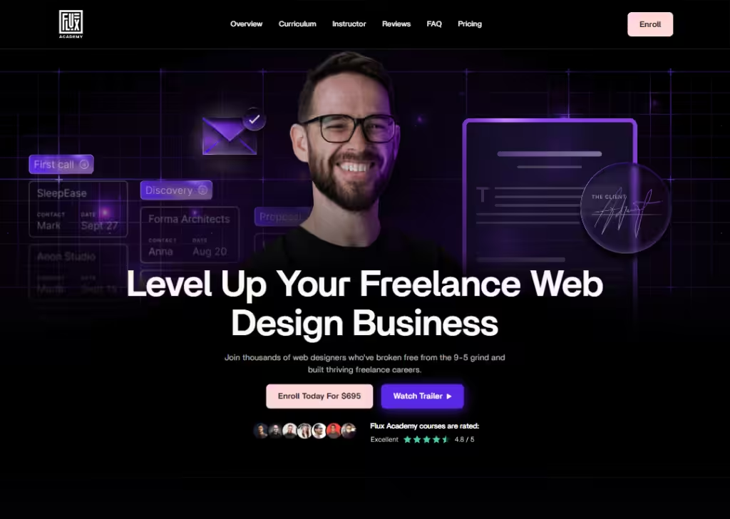
Flux Academy’s freelancing course page works because it speaks to real struggles web designers face… like finding clients, pricing work, and building a business.
The landing page lists common problems people have and shows that the course teaches solutions you can use right away.
It shows clear outcomes… learn client outreach, pricing, proposals, negotiation, and more… in straightforward, everyday language.
The page has real testimonials, pricing options, and a money‑back guarantee, which helps people feel safe buying.
That mix of honest promises and practical detail makes the page feel grounded and trustworthy.
Wrapping up
And that’s it… 17 online course landing pages that show you what actually works.
You don’t need fancy tricks. You just need a clear message, a clean layout, and a page that makes people feel, “This is for me.”
Take the ideas you’ve seen here, pick one or two, and try them on your own page. Small changes can boost your sign-ups more than you think.
Now go build a landing page that gets people excited to join your course.
Frequently Asked Questions
What should be included on an online course landing page?
An online course landing page should include a headline, course benefits, who the course is for, what’s inside the curriculum, testimonials, pricing, and a clear call-to-action. Simple layouts work best because people quickly understand the value and feel more confident signing up for the course.
How long should an online course landing page be?
An online course landing page should be long enough to explain the value but short enough to keep attention. Most pages work well when they include clear benefits, simple visuals, and a strong sign-up button. The goal is clarity, not length, so each section should serve a purpose.
Why study online course landing page examples before building one?
Studying examples helps you see what strong pages have in common. You learn how they structure their message, show benefits, use visuals, and build trust. This makes it easier to avoid mistakes and create a page that feels clear, modern, and focused on boosting course sign-ups.
