You want to understand how responsive design affects how people use websites, right?
You want real facts, not guesses.
That is exactly what these responsive website design statistics will show you.
Ignoring this topic can cost you visitors, trust, and sales, especially as more people browse on their phones.
In this blog post, you will discover 10 must know responsive website design statistics that explain…
- How people behave on websites
- Why mobile experience matters
- And how responsive design improves user experience, return visits, and results for businesses of all sizes
Let’s get into it…
In this article
Websites with responsive design see up to 11% higher conversion rates

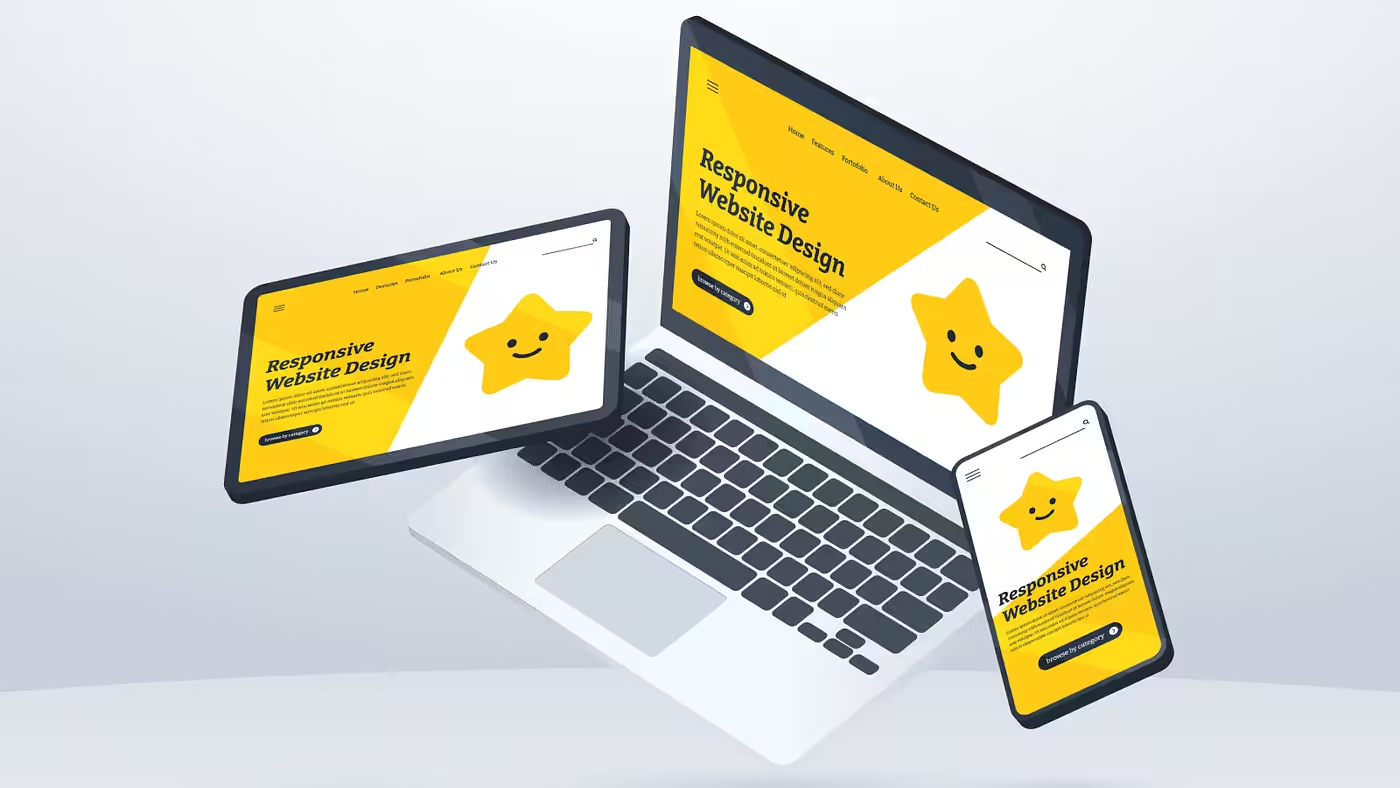
When a website is responsive, it adjusts itself to fit any screen, whether it’s a phone, tablet, or computer.
This makes it easier for people to read, tap buttons, and understand what to do next.
Because everything feels smooth and simple, more visitors end up signing up, buying, or contacting the business. That’s why responsive websites can get up to 11% more conversions.
In simple terms, when people don’t struggle with your website, they are more likely to take action instead of leaving out of frustration.
Nearly 90% of websites have already implemented responsive design

Nearly 90% of websites already use responsive design because screen sizes have changed how people browse the internet.
Most people now visit websites on their phones, not just laptops. If a website doesn’t adjust to different screens, it looks broken or hard to use.
Businesses don’t want to lose visitors, so they follow what already works.
This number shows that responsive design is no longer special or optional. It has become the normal way websites are built today, just like having a homepage or a contact page.
53.8% of web designers say lack of responsiveness across devices is a major reason for redesigning a website

More than half of web designers say they redesign websites mainly because they don’t work well on all devices.
This usually means the site looks fine on a laptop but becomes messy on a phone. Text may be too small, buttons hard to click, or pages may not fit the screen.
When that happens, users get annoyed and leave. Designers see this problem often, so fixing responsiveness becomes a top reason for redesign.
Simply put, if a website doesn’t adapt to phones and tablets, it quickly becomes outdated.
73.1% of web designers believe non-responsive design is the main reason visitors leave a website

Most web designers believe people leave websites mainly because they are not responsive.
Imagine opening a site on your phone and having to zoom in, scroll sideways, or struggle to click links. Many people won’t bother fixing it; they just leave.
This statistic shows that design problems push visitors away faster than bad content. Even if the information is good, people won’t stay if the site feels hard to use.
A responsive design removes these problems and keeps visitors comfortable and engaged.
Almost 60% of users say they would not recommend a business with a poorly designed mobile site

Almost 60% of users say they would not recommend a business with a badly designed mobile website.
People often judge a business by how its website looks and feels. If the mobile site is slow, confusing, or broken, users may feel the business is not serious or trustworthy.
Even if the product or service is good, a poor mobile experience leaves a bad impression.
Since recommendations are based on trust, many people simply won’t tell others about a business whose website feels frustrating on their phone.
61% of mobile users are more likely to contact a local business if its website is mobile-friendly

When a website is mobile-friendly, it makes it easy for users to find phone numbers, directions, and contact forms.
That’s why 61% of mobile users are more likely to contact a local business if the site works well on their phone.
People often search for local services while on the move. If the website loads fast and buttons are easy to tap, users can quickly call or send a message.
A mobile-friendly site turns quick searches into real customer contact.
8 out of 10 consumers stop engaging with content that does not display properly on their mobile devices

8 out of 10 people stop reading or interacting with content if it doesn’t display well on their phone.
This means most users won’t try to adjust the screen or wait for things to load properly.
If text overlaps, images break, or pages look messy, people lose interest immediately. They may close the site within seconds.
This shows how short attention spans are on mobile devices.
A responsive website keeps content clear and readable, which helps users stay longer and actually consume the information.
74% of visitors are more likely to return to a website that is mobile-friendly

When users have a good experience on a mobile-friendly website, they remember it.
That’s why 74% of visitors are more likely to return to a site that works well on their phone.
Easy navigation, readable text, and smooth scrolling make browsing feel comfortable.
People are more willing to come back to a site that didn’t waste their time or frustrate them. Over time, this builds familiarity and trust.
A responsive design helps turn first-time visitors into repeat visitors.
62% of companies report increased sales after adopting responsive mobile website designs

62% of companies say their sales increased after switching to a responsive website.
This happens because more visitors can easily browse products, understand offers, and complete purchases on any device. When checkout pages work well on mobile, fewer people give up halfway.
Also, a better experience makes customers feel confident buying from the business.
This statistic shows that responsive design is not just about looks. It directly affects how much money a business makes by removing obstacles in the buying process.
Google prioritizes mobile when crawling and indexing websites

Google now looks at the mobile version of a website first when deciding how to rank it in search results. This is called mobile-first indexing.
If your mobile site is slow, broken, or hard to use, Google may rank your website lower, even if the desktop version is fine.
Since most searches happen on phones, Google wants to show results that work well on mobile.
A responsive website helps search visibility, making it easier for people to find your business online.
Wrapping up
All these stats point to one simple truth:
People want websites that work well on their phones and computers.
If your site feels hard to use, visitors will leave and may not return. A responsive website keeps things clear, easy, and stress-free for users.
If you run an agency and need help delivering this for your clients, Block Agency can help.
We design responsive websites as white-label services, so you look good and your clients get real results without extra stress.
Talk to us here: hey@blockagency.co
Frequently asked questions
What is responsive website design?
Responsive website design means a website adjusts to fit any screen size, like phones, tablets, and computers. The layout, text, images, and buttons resize automatically so users can read, scroll, and click easily without zooming or struggling.
Can responsive design help increase conversions?
Yes, responsive design removes barriers that stop users from taking action. Clear layouts, easy forms, and readable text make it simpler for users to sign up, contact a business, or make a purchase on any device.
Is responsive design good for SEO?
Yes, search engines favor mobile-friendly websites. Responsive design helps improve rankings because it offers a better experience on mobile devices, reduces bounce rates, and follows search engine guidelines for modern websites.
How does responsive design affect website traffic?
Responsive design helps keep visitors on a website longer. When pages load well and look clean on mobile devices, users are less likely to leave quickly, which improves engagement and can lead to more page views.