If you’re an agency that designs websites for SaaS clients, you’re probably here to learn how to build landing pages that actually convert… not just look good.
You want to know the real SaaS landing page best practices that turn clicks into sign-ups, demos, or paying users.
Without understanding what makes SaaS landing pages different, your designs can fail fast.
You might spend weeks on a page that looks clean and modern but still gets little or no conversions.
The truth is, SaaS audiences don’t buy looks… they buy value and clarity.
That’s why this blog post is for you.
You’ll learn 8 proven SaaS landing page best practices that help agencies create pages that perform.
From writing benefit-driven headlines to using visuals that sell, adding strong CTAs, and removing distractions… every tip here is tested and easy to apply.
By the end, you’ll know exactly how to design SaaS landing pages that get results for your clients…
Pages that not only impress visitors but also make your agency stand out as a conversion-focused partner.
In this article
8 proven SaaS landing page best practices for agencies
If you design landing pages for SaaS clients, you already know one thing… it’s not the same as designing for eCommerce or service-based businesses.
SaaS pages must convince visitors to try a product they can’t touch.
That means every word, image, and button must help visitors understand the value quickly and take action fast.
Here are 8 simple but powerful best practices to help your agency create SaaS landing pages that convert like crazy.
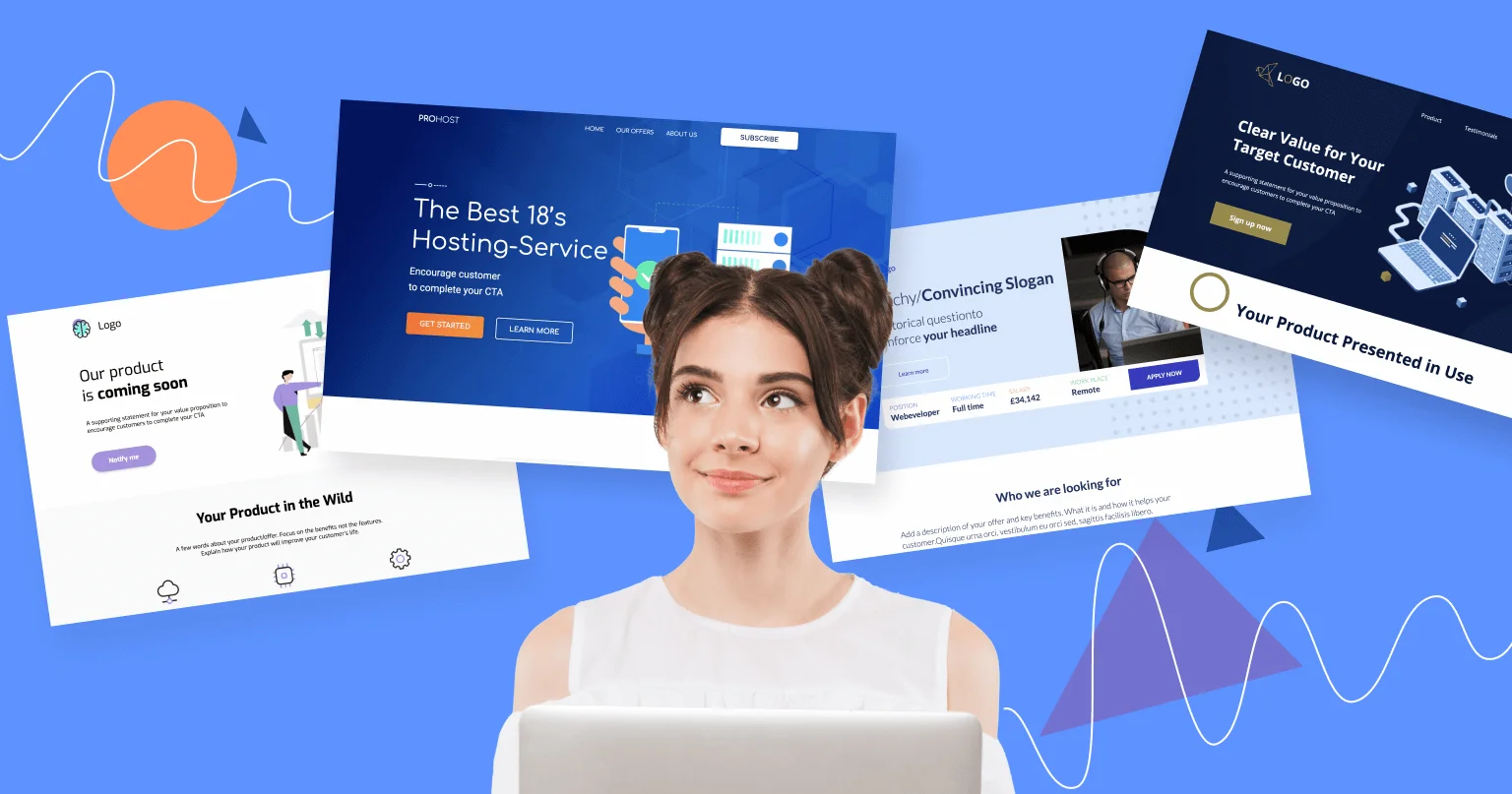
1. Craft a clear and benefit-focused value proposition

Let’s start with the most important part… your value proposition.
This is the line that answers, “Why should I care about this product?” in less than 5 seconds.
Many agencies make the mistake of focusing on features… things like “AI automation,” “real-time tracking,” or “custom dashboards.”
But here’s the truth:
SaaS customers don’t buy features. They buy outcomes.
They want to know how your product makes life easier, saves time, or helps them grow.
For example:
- Wrong: “AI-Powered Email Analytics”
- Correct: “Know exactly which emails drive sales… no guesswork.”
See the difference?
The second one focuses on benefit, not tech.
Quick tips:
When writing your SaaS value proposition:
- Start with what the user gets (save time, reduce cost, increase leads).
- Keep it short… one sentence or a simple headline.
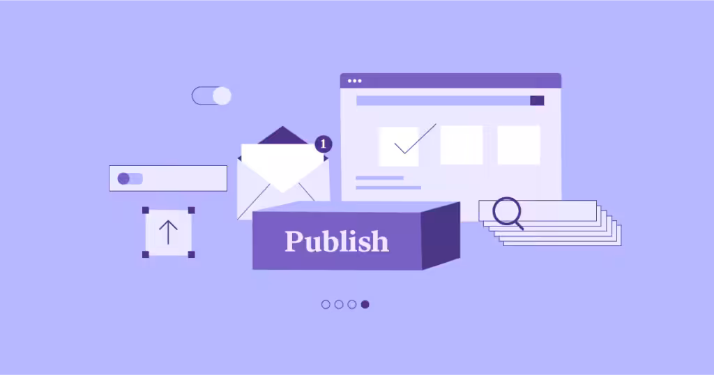
2. Use visuals that show, not tell

SaaS products are often digital… there’s no physical item to show.
That’s why visuals matter a lot.
Use visuals that help people see the product in action.
Think:
- Screenshots of your dashboard
- Short product GIFs
- A 30-second explainer video showing how it works
These help visitors imagine what using the product feels like.
It turns “abstract features” into something real.
But keep one thing in mind…
Don’t clutter the page.
Use clean visuals that focus on what matters most: how the product helps the user.
And yes, loading speed matters.
If your page is full of heavy videos and images, it’ll load slowly… and people will bounce.
Quick tip:
Compress images, use short videos, and test load speed before going live.
3. Place strong, repeated CTAs across the page

Your CTA (call to action) is what turns visitors into leads or customers.
But here’s where many agencies go wrong… they place only one CTA at the bottom of the page.
Bad idea.
Not everyone scrolls that far. So you need to repeat your CTA in key spots:
- One above the fold
- One in the middle of the page (after showing benefits)
- One at the end.
Example CTAs that work well for SaaS:
- “Start Free Trial”
- “Book a Demo”
- “See It in Action”
- “Get Started — It’s Free”
Your CTA should be clear, short, and action-focused.
Avoid vague ones like “Learn More” or “Submit.”
Quick tips:
- Use contrasting button colors so your CTA stands out.
- Make it impossible to miss.
4. Leverage social proof to build trust fast

People trust people… not ads.
That’s why social proof is one of the strongest tools for SaaS landing pages.
Before signing up, visitors want to know:
“Do others use this? Did it work for them?”
Show proof like:
- Customer logos
- Short testimonials
- Case studies
- User numbers (e.g., “Trusted by 10,000+ businesses”)
If your SaaS client is new, help them collect social proof by offering:
- Beta access for early users in exchange for reviews
- Mini success stories from trial users
Quick tips:
- Keep testimonials short (1–2 lines).
- Add a photo or company logo for credibility.
5. Keep design clean and mobile-optimized

A good SaaS landing page is like a clear desk… easy to focus.
Avoid clutter, too many colors, or fancy animations that distract visitors.
Instead, use whitespace… blank space that lets your content breathe.
Here’s why it works:
- Makes key elements (like CTA buttons) stand out.
- Helps users focus on one action at a time.
- Improves reading experience, especially on mobile.
And don’t forget… most visitors come from phones.
So your design must be mobile-responsive: text should fit properly, buttons should be clickable, and visuals shouldn’t overlap.
Quick tips:
- Test your landing page on different devices.
- Keep font readable (16px minimum).
- Use one primary color for CTAs.
6. Simplify navigation and remove distractions

When people land on a SaaS page, you want them to do one thing… sign up, book a demo, or start a trial.
Anything else is a distraction.
Remove unnecessary navigation links like “About Us,” “Blog,” or “Pricing” (unless that’s the conversion goal).
Every extra link is a potential exit point.
Keep it simple: one page, one purpose.
Quick tip:
If your client insists on including multiple links, use a sticky header with only one key button like “Start Free Trial.”
The fewer choices a visitor has, the easier it is for them to act.
7. Optimize copy for clarity and conversion

Words matter… a lot.
Your copy should sound like a human conversation, not a tech manual.
Here’s what to do:
- Use short sentences.
- Avoid jargon.
- Focus on what users care about… time, money, results.
- Talk directly to them (“you” and “your team”).
For example:
- Wrong: “Our API enables automated data synchronization.”
- Correct: “Connect your tools once — and never copy data manually again.”
Quick tips:
Use…
- Clear headline (benefit first)
- Short intro that explains how it helps
- Simple bullet points for key features
Good copy doesn’t try to sound smart… it tries to make sense fast.
8. Test, track, and continuously Improve

No landing page is perfect on the first try.
Even a great one can get better with data.
Encourage your clients to test:
- Different headlines
- CTA button colors
- Page layouts
- Form lengths
This process is called A/B testing.
You create two versions of a page… show them to different people… and track which performs better.
Useful tools for this:
Quick tip:
Test one thing at a time.
That way, you’ll know exactly what made the difference.
Common mistakes agencies make with SaaS landing pages

Even experienced agencies sometimes get SaaS landing pages wrong.
They design beautiful pages, write fancy copy, and still wonder why the conversions are low.
It’s not because the product is bad… it’s usually because the page doesn’t speak to what users actually care about.
Here are some common mistakes agencies make (and how to fix them).
1. Using feature-heavy copy instead of benefits
This is the most common one.
Agencies love listing out all the product’s cool features…
“AI-powered dashboard,” “real-time sync,” “24/7 monitoring,” and so on.
Sounds impressive, right?
But here’s the problem:
Customers don’t care about the tool itself… they care about what it does for them.
Let’s say your SaaS client offers an email marketing tool.
Instead of saying:
“We provide advanced automation and segmentation.”
Say this instead:
“Send personalized emails that bring in more sales… while you sleep.”
See the difference?
The second line focuses on the result the user gets, not the technical part.
Quick fix:
Before writing any line, ask:
“How does this help the customer save time, make money, or work easier?”
If it doesn’t do any of those, reword it.
2. Overloading design with animations
We all love creative designs… motion graphics, moving icons, and slides.
But too much of it can ruin the user’s focus.
SaaS landing pages should be clear and calm.
If everything is moving, glowing, and bouncing, people won’t know where to look.
And the worst part?
Too many animations slow down the page… which makes visitors leave before it even loads.
Quick fix:
- Use simple, meaningful animations… like a product GIF or a subtle hover effect on buttons.
- Make sure every design element helps explain the product, not distract from it.
3. Ignoring analytics and conversion tracking
This one hurts the most. And it was explained earlier.
Some agencies design a page, hand it over to the client, and move on… without tracking how the page actually performs.
But without tracking, you can’t tell what’s working and what’s not.
You need to know:
- How far users scroll.
- Which buttons they click.
- Where they drop off.
That’s how you improve.
Quick fix:
Set up tools like Google Analytics or Hotjar from day one.
They’ll help you see what users are doing… and guide you to make smarter design or copy changes.
4. Not aligning the landing page with Ad or funnel intent
This is a sneaky one.
If a visitor clicks an ad that says, “Try our free project management tool,” but lands on a page talking about pricing plans… they’ll leave right away.
Why?
Because the message doesn’t match what they expected.
Your landing page should always match the promise made in the ad, email, or post that brought the visitor there.
Quick fix:
Check every traffic source… ad, email, or post… and make sure the landing page headline and CTA continue the same message.
Wrapping up
Creating SaaS landing pages that convert isn’t about fancy words or flashy designs. It’s about clarity, trust, and helping users take action fast.
When your agency focuses on real benefits, clean layouts, strong CTAs, and data-driven tweaks, results always follow.
If you’d rather save time and get expert help, our team at Block Agency can handle it for you.
We partner with digital agencies as a white-label team to design high-converting websites and landing pages for their clients.
Let’s help you deliver results your clients will love… without the extra workload.
Talk to us here: hey@blockagency.co
Frequently Asked Questions
How much does a SaaS landing page cost?
The cost of a SaaS landing page depends on the design quality, copy, and features needed. On average, agencies charge between $1,000 to $2,500+ per page.
What visuals work best on SaaS landing pages?
Use visuals that show your product in action… like screenshots, short demo videos, or GIFs. Avoid random stock photos or heavy animations.
How long should a SaaS landing page be?
A SaaS landing page should be long enough to explain what the product does and why it helps, but not too long to lose attention.