Are you looking for SaaS landing page examples that actually work?
You want to see what strong design, clear copy, and smart layout look like in real SaaS products, right?
If this isn’t learned, the result is clear:
- More traffic, but fewer sign-ups.
- Visitors will scroll, get confused, and leave without taking action.
In this blog post, 15 real SaaS landing page examples are broken down to show what makes them convert.
The layout, copy, visuals, and calls to action are explained in simple terms.
By the end, it will be clear what to copy, what to avoid, and how to build a SaaS landing page that turns visitors into users.
Let’s get into it…
In this article
1. Polymer

Polymer’s landing page is great because it tells you exactly what the tool does the moment you land on it.
The headline “Hiring made simple” is short and clear… no confusing words, just straight to the point.
Right below it, the sub-copy explains that you get a site for jobs, applicant tracking, and job board distribution… so you immediately understand what you’re signing up for.
The call-to-action button (“Get started free”) stands out in a bright color that feels friendly and inviting.
Visually, the design feels clean and modern. It uses real product screenshots so users can see the dashboard, which builds confidence… people like seeing how a product feels before using it.
The layout breaks the content into easy sections (hero, features, benefits), so your eyes don’t have to search for meaning.
All this makes Polymer’s page easy to skim and persuasive, which is key for SaaS conversions.
2. Highnote

Highnote’s landing page does a good job of telling a complex story in a simple way.
Right at the top, it states it’s a unified embedded finance platform… meaning businesses can issue cards, accept payments, manage ledgers, and more… all in one place.
That helps visitors grasp its big value fast.
The design uses a clear headline and short sub-text to explain why this matters… it’s not just features, it’s about solving real business payment problems.
Navigation links like “Products,” “Solutions,” and “Docs” help different visitors find what matters to them (technical people vs business buyers).
The layout often shows visuals next to simple text blocks, which makes the complex product feel approachable rather than overwhelming.
The copy avoids jargon when it can, and instead focuses on outcomes: launch faster, reduce work, scale smoothly. The buttons (“Get Started,” “Contact Sales”) are clear enough to encourage action.
Together with trust elements like customer logos and testimonials, it’s a landing page that feels professional and trustworthy without feeling busy.
3. Ghost

Ghost’s landing page feels calm and direct right when you land on it.
It tells you exactly what the product is (“Turn your audience into a business”) and what you can do… publish content, run newsletters, and build paid memberships.
The headline isn’t confusing fluff; it speaks to real purpose people care about.
The layout uses plenty of whitespace and organized sections so your eyes aren’t overwhelmed.
Screenshots and icons show real product capabilities, not random stock art, which helps you see what you’re signing up for.
The CTA button (“Try Ghost completely free for 14 days”) is clear, so you always know what next step to take.
The copy is friendly and focused on benefits, not tech jargon… it explains that Ghost helps creators grow their audience and even make money.
Overall, Ghost’s page feels trustworthy, simple, and easy to understand… exactly what you want from a SaaS landing page.
4. Ramp

Ramp’s landing page immediately tells visitors what they get: corporate cards, expense management, and accounts payable in one platform.
The headline “Time is money. Save both.” is short but powerful… it connects your problem (too much time spent on finance work) with the solution.
The design uses clean sections that break down each major benefit with simple icons and clear text next to real product visuals. You don’t have to guess what the product does.
The navigation menu clearly points to Products, Solutions, Pricing, and more, so visitors can jump to exactly what they want.
The CTA “Get started for free” is easy to spot and repeated, which encourages action no matter where you are on the page.
Ramp also uses customer numbers and testimonials early on (“50,000+ finance teams…”) to build trust quickly.
Overall, Ramp’s layout is simple, benefits-focused, and user-friendly… showing visitors how the product helps them right away.
5. Ahrefs

Ahrefs’s landing page stands out because it shows value immediately instead of hiding it behind gimmicks.
The main sections quickly explain what the tool does… help you rank higher, get more traffic, and understand your SEO performance.
Showing real data or screenshots helps visitors see the product in action instead of just reading about features.
The copy is short and clear with benefit-focused language, not long paragraphs of jargon. This helps visitors grasp the value quickly without feeling overwhelmed.
The site also places CTAs (like “Sign up for Ahrefs”) where people can see them right away, making it obvious what the next step is.
Ahrefs combines minimalist design with smart use of social proof (like real customer numbers) and visuals so you trust what you’re signing up for.
Even though Ahrefs is complex SEO software, the page keeps things simple so visitors know what they’re signing up for and why it’s worth it.
Ahrefs also highlights how organic growth plays a big role for SaaS. Even the best landing pages rely on things like SaaS link building to attract the right traffic.
6. Mode

Mode’s landing page works because it speaks directly to data teams without sounding complex.
The headline clearly explains the value: Business intelligence built around data teams.
The layout is clean and well spaced. Each section answers one question at a time: what Mode does, who it’s for, and why it’s better.
Product screenshots are used well to show real dashboards, charts, and workflows. That makes the product feel real, not abstract.
The copy focuses on outcomes like faster insights and better decisions, not just features. CTAs like “Try for free”, “Request demo” are clear and placed after key areas, which feels natural.
Mode also uses customer logos and short proof points to build trust.
Overall, the page feels calm, focused, and easy to follow… perfect for a data-heavy SaaS.
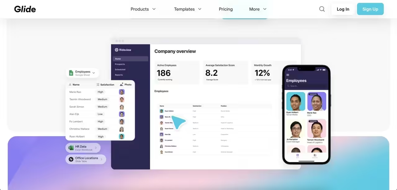
7. Glide Apps

Glide’s landing page does a great job of showing what the product can do.
Right away, you see examples of apps built with Glide, which makes the value obvious.
The headline explains that you can build apps without code, and the visuals prove it.
The layout is bright, friendly, and easy to scan. Each section highlights one benefit… speed, ease, or flexibility… with short text and strong visuals. This makes the page feel fast and modern, just like the product itself.
The copy is simple and encouraging. It speaks to non-technical users and removes fear by showing how easy app building can be.
Glide also uses examples from real teams, which builds trust.
Overall, the page is clear, visual, and confidence-boosting.
8. Jasper

Jasper’s landing page is very strong at selling benefits instead of just features.
The headline clearly states what Jasper helps you do: create content faster with AI. This instantly connects with marketers, writers, and teams.
The design uses bold sections, icons, and product visuals to guide your eyes down the page. Each section answers a key question… what it does, how it helps, and who it’s for.
The layout makes a complex AI product feel easy to understand.
The copy is short and punchy. It focuses on outcomes like saving time, staying on brand, and writing better content.
CTAs like “Start free trial” and “Get a demo” are clear.
Jasper also uses customer logos and short quotes to build trust.
Overall, the page feels energetic, focused, and built to convert.
9. Mixpanel

Mixpanel’s landing page works because it explains analytics in a very practical way.
Instead of talking about “data” in general, it focuses on understanding user actions and improving products.
The subheadline clearly states the outcome:
Mixpanel helps teams turn user behavior insights into clear next steps, without delays or SQL bottlenecks.
The layout is structured and easy to follow. Each section focuses on one idea, supported by charts and real product screenshots. This helps users see exactly how Mixpanel works.
The copy avoids long explanations and uses simple language to explain complex ideas. CTAs like “Get started free” and “Book a demo” are clear and repeated in the right places.
Mixpanel also uses strong social proof, showing that many teams trust the platform.
Overall, the landing page is clear, professional, and focused on helping product teams take action with data.
10. Webflow

Webflow’s landing page is powerful because it lets the product speak for itself.
The subheadline clearly says you can create, manage, and optimize personalized web experiences that drive real results… faster than ever. That instantly attracts designers and teams.
The design is bold but clean. Animations, layouts, and visuals show exactly what Webflow can do, which is smart because it’s a design tool.
The page flows smoothly from one section to the next, guiding you through features, benefits, and examples.
The copy balances confidence with clarity. It highlights speed, flexibility, and control instead of just saying “no-code.”
Webflow also uses strong social proof from well-known brands.
Overall, the page feels modern, confident, and very convincing.
11. Framer

Framer’s landing page feels fast… just like the product.
From the first screen, it shows that Framer helps you design and publish websites quickly.
The headline is short and direct, and the visuals do a lot of the talking.
The layout is highly visual, with smooth animations and real examples of websites built with Framer. This instantly builds confidence because you can see the results.
Sections are short and clear, which makes the page easy to scroll and understand.
The copy is simple and modern. It focuses on speed, ease, and collaboration, which are key needs for designers and teams.
CTAs like “Start for free” are clear and placed at the right moments.
Framer’s landing page works because it feels modern, simple, and product-first.
12. Basecamp

Basecamp’s landing page stands out because it feels honest and human.
Instead of flashy design, it uses simple text and clear ideas to explain how it helps teams work better together.
The headline focuses on calm, organized work… something many teams want.
The layout is straightforward, with text-heavy sections that explain problems and solutions clearly. This builds trust because Basecamp explains why it works, not just what it does.
The copy is conversational and opinionated. It talks about less stress, fewer meetings, and clearer communication.
Overall, the page works because it feels real, clear, and built for people… not hype.
13. Clearscope

Clearscope’s landing page works because it focuses on one clear goal: helping teams write content that ranks better.
The headline tells you that right away, without extra words. You instantly know it’s for SEO and content teams.
The design is clean and calm, with lots of space and simple sections.
Screenshots show the editor and keyword grading system, so you can see how the tool works before signing up. That builds trust fast.
The copy stays simple and benefit-focused. It talks about writing better content, aligning with search intent, and saving editing time. There’s no hype… just clear value.
CTAs like “Request demo” match the type of buyer Clearscope wants. Customer logos from known brands add credibility.
Overall, Clearscope’s landing page feels focused, honest, and built for serious teams.
14. Linear

Linear’s landing page is very strong because it feels focused and confident.
The headline clearly says it’s a tool for building software better, faster, and with less noise. That speaks directly to product and engineering teams.
The design is dark, clean, and modern. Animations and screenshots show real workflows like issues, cycles, and roadmaps. This helps users understand the product without reading too much text.
The copy is short and precise. It highlights speed, clarity, and focus… the same values the product is known for.
Linear also uses social proof from well-known startups, which builds trust.
Overall, the page feels calm, fast, and intentional… just like the product itself.
15. Clay

Clay’s landing page works because it clearly explains a powerful but complex product in a simple way.
It positions Clay as a tool for building better outbound and sales workflows using data. The headline sets that expectation clearly.
The layout uses clean sections that walk you through what Clay does, who it’s for, and how it fits into your workflow.
Visuals and diagrams help explain the product without long text.
The copy focuses on outcomes like better leads, cleaner data, and smarter outreach. It avoids heavy sales talk and instead explains real use cases.
Clay’s page works because it makes a complex product feel understandable and valuable.
Wrapping up
If there’s one thing these SaaS landing page examples prove, it’s this:
Clear design and simple words sell.
The best landing pages don’t try to impress… they help visitors understand and act fast.
If you’re an agency and you want a landing page like this for your clients, Block Agency can help.
We design high-converting websites and landing pages, and we do it white-label, so your agency stays front and center.
Talk to us here: hey@blockagency.co
Frequently Asked Questions
How many sections should a SaaS landing page have?
Most SaaS landing pages work best with 5–8 clear sections. These often include the hero section, benefits, features, social proof, pricing or demo, and a strong call to action.
What is the best call to action for SaaS landing pages?
Common high-performing calls to action include “Start free trial,” “Get started,” and “Book a demo.” The best option depends on product price, audience, and how complex the tool is.
Do SaaS landing pages need pricing shown?
Showing pricing can help build trust and reduce friction. Many SaaS landing pages include pricing or a clear next step to learn pricing, especially for self-serve products.
How long should a SaaS landing page be?
There is no fixed length. A good SaaS landing page is as long as needed to explain value and remove doubts. Simple tools need shorter pages, while complex tools need more details.
How often should SaaS landing pages be updated?
SaaS landing pages should be reviewed every few months. Updates are needed when features change, user behavior shifts, or conversion rates drop. Small changes can lead to better results.