When people visit a website, they expect one thing:
CLARITY.
They want to know what the site is about, where to click, and what to do next. That’s why learning the right web design best practices matters.
These are the simple rules that help websites feel easy, clean, and useful.
If these best practices are ignored, websites become slow, confusing, and hard to trust. Visitors get tired, feel lost, and leave without taking action.
No matter how good the offer is, poor design can push people away.
In this blog post, you’ll learn 15 web design best practices every website should follow.
Each one is explained in simple terms, with clear examples, so anyone can understand and apply them to build a website people enjoy using.
Let’s get into it…
In this article
1. Design mobile-first

Designing mobile-first means you start building the website for phones before laptops. Why?
Because most people will open your website on their phone… while scrolling on the bus, in bed, or during a break.
If your site looks bad on mobile, they won’t wait to check it on a laptop. They’ll just leave. This is why mobile devices have the highest bounce rate at 51%.
When you design for mobile first, you focus on what truly matters: clear text, easy buttons, and simple layouts. There’s no space to hide mistakes on a small screen. So everything must be clear and useful.
Once the mobile version works well, you then adjust it for bigger screens like tablets and laptops. This makes the website feel smooth everywhere.
Think of it like packing a small bag first. If it fits well in a small bag, it will fit easily in a big one. Mobile-first keeps your site clean, fast, and easy to use.
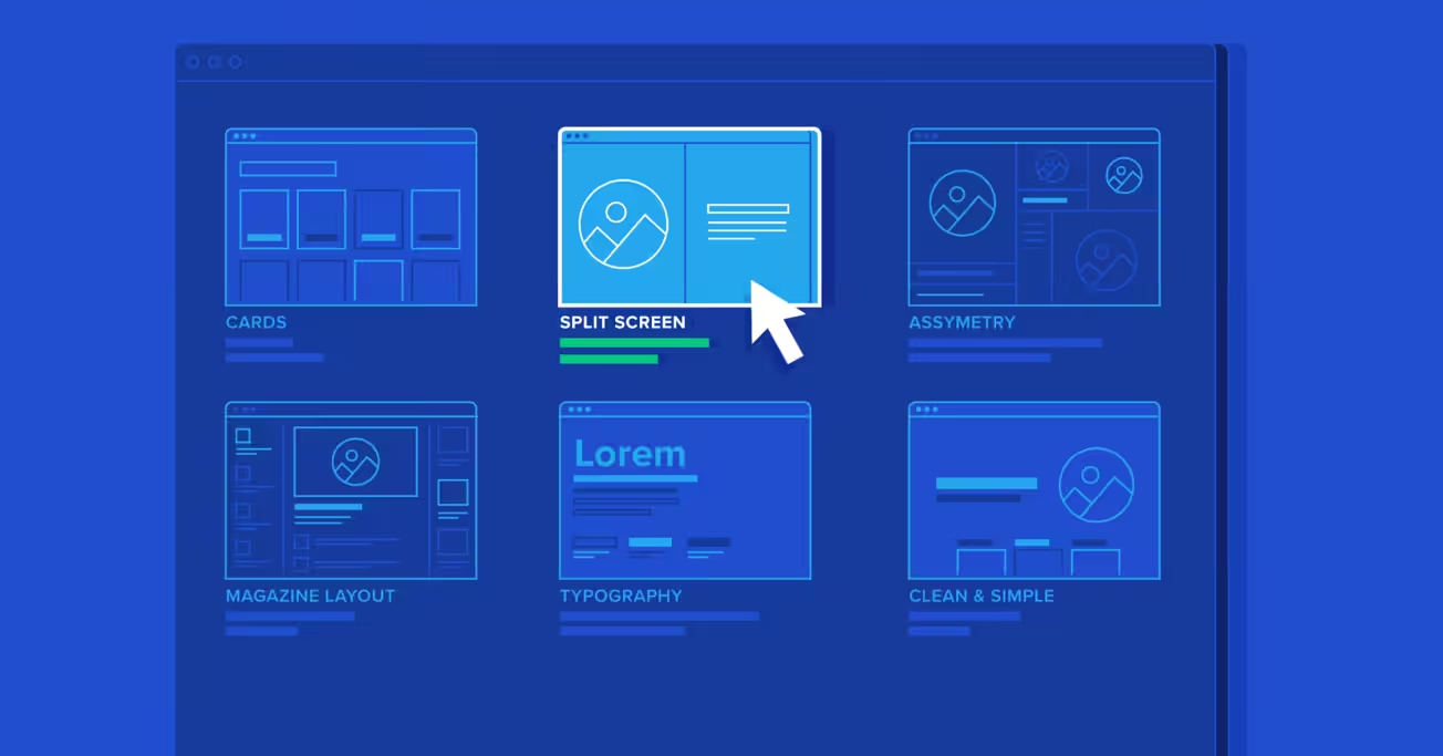
2. Keep the layout simple and scannable
People don’t read websites word by word.
They scan. They scroll fast, looking for what matters to them. If your page looks crowded or confusing, they won’t try to understand it. They’ll just leave.
A simple layout means clear sections, enough space between things, and no visual noise. Each section should answer one question only. Not five.
Scannable means users can quickly spot:
- Headlines
- Short paragraphs
- Bullet points
- Buttons
Whitespace (empty space) is not wasted space. It helps the eyes rest and makes content easier to understand.
Think of a messy room versus a clean one. In a clean room, you can find things easily.
On a clean website, users can find answers fast… and that keeps them around longer.
3. Make navigation obvious and predictable

Navigation is how people move around your website.
If visitors don’t understand where to click or how to find pages, they get frustrated. And frustrated users leave… fast.
Your menu should be easy to see and easy to understand. Use normal words like “Home,” “About,” “Services,” and “Contact.” Don’t try to be clever.
Also, keep navigation in places people expect… like the top of the page or a clear menu icon on mobile. When you move things around too much, users feel lost.
A good rule: someone new to your site should find what they want in five seconds or less.
Think of navigation like road signs. Clear signs help drivers reach their destination. Confusing signs cause people to turn back. Your website works the same way.
4. Use clear visual hierarchy
Visual hierarchy means showing what is most important first.
When someone opens your page, their eyes should know where to look without thinking.
Big text tells them, “This is important.” Smaller text says, “This supports it.”
Headlines should look like headlines. Buttons should look like buttons. Links should look clickable.
If everything looks the same size and style, users won’t know what to do next. They’ll feel confused.
Good hierarchy guides people step by step:
- Headline grabs attention
- Short text explains
- Button tells them what to do
Think of it like a conversation. You don’t shout everything at once. You speak in order.
Visual hierarchy helps your website “talk” clearly to visitors without using too many words.
5. Optimize page speed

Page speed is how fast your website loads.
If your site takes more than a few seconds to open, many people will leave… especially on mobile. They won’t wait. There are many other sites to choose from.
Slow websites feel broken, untrustworthy, and annoying. Fast websites feel professional and smooth.
To keep pages fast:
- Use smaller image files
- Avoid too many animations
- Don’t load things users don’t need
Speed matters for three big reasons:
- Users stay longer
- Google ranks fast sites higher
- More visitors take action
Think of your website like a store door. If it opens slowly, people walk away. If it opens instantly, they step inside without thinking.
6. Use readable typography
Typography is simply how text looks on your website.
If people struggle to read your text, they won’t read it… no matter how good your message is.
Use simple fonts. Avoid fancy or curly styles. Stick to one font for headings and one for body text. That’s enough.
Make sure the text is big enough, especially on mobile. Small text forces people to zoom in, which feels annoying.
Also, leave space between lines. Tight lines make reading feel stressful.
Think of reading a book with tiny letters versus clear, spaced text. One feels easy. The other feels like work.
Your goal is simple: make reading feel effortless. If users don’t notice the font, you chose the right one.
7. Design with accessibility in mind

Accessibility means making your website usable for everyone.
Not everyone sees, hears, or uses a mouse the same way. Some people use screen readers. Some use keyboards. Some have weak eyesight.
Good accessibility helps all users, not just people with disabilities.
Simple things make a big difference:
- Strong color contrast (dark text on light background)
- Clear fonts
- Text descriptions for images
- Buttons that work with a keyboard
When a site is accessible, it feels easier and calmer to use.
Think of a building with ramps and clear signs. It helps wheelchairs, parents with strollers, and even tired people.
Accessibility works the same way online… it makes life easier for everyone.
8. Use consistent branding
Consistent branding means your website should look and feel the same everywhere.
Colors, fonts, button styles, and tone should not change from page to page. When they do, users feel confused and unsure.
Consistency builds trust. It tells visitors, “This is one real brand, not a random collection of pages.”
If one page looks modern and another looks old, people may wonder if they’re still on the same site… or if something is wrong.
Think of big brands you trust. Their websites, apps, and ads all feel connected. That’s not an accident.
Consistency makes your site easier to use because users don’t have to re-learn how things work on every page.
9. Make CTAs clear and action-focused

A CTA is a button that tells users what to do next.
Bad CTAs are vague. Good CTAs are clear and specific.
“Submit” doesn’t tell people much. “Get a free quote” tells them exactly what will happen.
People hesitate when they’re unsure. Clear CTAs remove fear and confusion.
Good CTAs:
- Use action words
- Explain the benefit
- Feel friendly, not pushy
Examples:
- “Book a free call”
- “Download the checklist”
- “Start your free trial”
Think of CTAs like giving directions. If you say “Go there,” people hesitate. If you say “Turn left and walk straight,” they move with confidence.
10. Avoid clutter and unnecessary elements
Clutter is when a page has too much going on.
Too many colors, images, buttons, and messages all fighting for attention. This overwhelms users.
Every item on your page should have a reason to be there. If it doesn’t help the user understand, decide, or act… remove it.
More options don’t help people choose. They slow them down.
A clean page feels calm. A cluttered page feels stressful.
Think of a tidy desk versus a messy one. On a tidy desk, you work better. On a tidy website, users decide faster.
Less noise = more clarity.
11. Use real content, not placeholders
Placeholder text like “Lorem ipsum” looks fake and misleading.
Designing with real content helps you see how the website will actually feel when it’s live.
Real text shows:
- How long sections really are
- Where things feel crowded
- What needs more space
Real images show whether layouts truly work… or just look good in theory.
When you design with fake content, surprises show up later. And fixing them later costs more time and money.
Think of trying on clothes without checking the mirror. It might look fine in your head… but reality is different.
Real content keeps your design honest and practical.
12. Show trust signals

People don’t trust websites easily… especially when money or personal details are involved.
Trust signals help visitors feel safe. These include:
- Customer reviews
- Testimonials
- Client logos
- Case studies
- Security badges
Seeing that others have used your service reduces fear. It answers the silent question: “Can I trust this?”
Without trust signals, users hesitate. With them, they relax.
Think of choosing a restaurant. You check reviews before walking in. Websites work the same way.
Trust signals don’t brag. They reassure.
13. Design forms for ease

Forms should be easy and quick to fill.
Long forms feel tiring. Short forms feel friendly.
Only ask for what you truly need. Every extra field reduces the chance someone will finish.
Use clear labels. Tell users exactly what to enter. If something goes wrong, explain it in simple words.
Forms should also work well on mobile. Big input boxes. Easy typing. No zooming.
Think of a checkout line. A short line moves fast. A long line makes people walk away.
Easy forms = more signups.
See different examples of form here.
14. Ensure cross-browser and device consistency

Your website should work well on all major browsers and devices.
Some people use Chrome. Others use Safari or Firefox. Some use phones, others use laptops.
If your site breaks on one browser, those users feel ignored.
Test your site on different screen sizes. Make sure buttons, text, and images still work.
A broken layout looks unprofessional… even if it works fine for you.
Think of sending a message that only some people can read. That’s what broken designs feel like.
Consistency shows care and professionalism.
15. Design for goals, not just aesthetics
A pretty website is nice… but looks alone don’t pay the bills.
Every page should have a clear goal:
- Get a signup
- Book a call
- Read more
- Buy something
Design should guide users toward that goal without forcing them.
If users admire your site but don’t know what to do next, the design has failed.
Think of a shop with beautiful decor but no cashier. It looks nice… but nothing happens.
Good design helps users act. Beauty supports the goal, not the other way around.
Wrapping up
Good web design is not about looks alone. It’s about helping people understand your site, trust your brand, and take action without stress.
When these best practices are done right, your website works like a quiet sales helper for your business.
If you run an agency and want better websites for your clients without doing all the work yourself, Block Agency can help.
We design clean, clear, and high-converting websites as white-label services for agencies. You focus on clients. We handle the design.
Talk to us here: hey@blockagency.co
Frequently asked questions
What are web design best practices?
Web design best practices are simple rules that help make a website easy to use. They focus on clear layout, fast loading, easy reading, and simple navigation. Following these practices helps visitors understand the site quickly and take action without feeling confused or stressed.
How do web design best practices improve user experience?
Web design best practices improve user experience by making pages easy to scan and understand. Clear text, simple menus, and visible buttons help users find what they need fast. This reduces frustration and makes the website feel smooth and friendly to use.
Do web design best practices help with SEO?
Yes, web design best practices help with SEO. Fast loading pages, mobile-friendly design, clear headings, and simple navigation make it easier for search engines to understand the site. This can help the website rank higher and bring in more visitors.
What are common mistakes to avoid in web design?
Common mistakes include slow loading pages, too many colors, small text, hidden menus, and long forms. Ignoring web design best practices often leads to poor user experience. These issues make visitors leave before taking any action.