Are you looking for website layout examples or website layout ideas that actually work?
Choosing the wrong layout can make your site confusing, hard to read, or even drive visitors away.
A messy website can hurt your brand and stop people from taking action.
In this blog post, you’ll see 12 website layout examples used by top websites.
You’ll learn how each layout…
- Organizes content
- Guides visitors
- And makes sites look clean and professional
By the end, you’ll have clear website layout ideas you can use for your own site or client projects, so your pages are easy to navigate, attractive, and effective.
Let’s get into it…
In this article
Example 1: Asymmetrical layout

An asymmetrical layout does not look even on both sides. One side may have more text, images, or space than the other.
Even though it looks uneven, it still feels balanced because elements are placed on purpose.
This layout feels modern and creative. It helps guide the eye to important parts of the page without using a strict structure.
Best for:
- Creative brands
- Personal websites
- Agencies
- Portfolios
It works well when you want to show personality and avoid a boring look.
It is not great for heavy content or data-focused sites because it can feel confusing if overused.
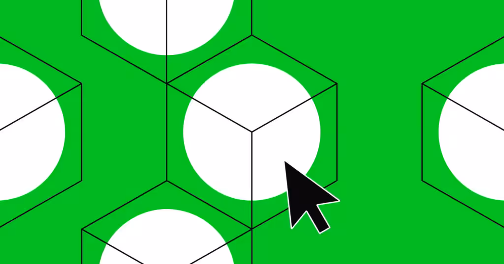
Example 2: Grid layout

A grid layout uses rows and columns to place content in neat boxes. Everything lines up evenly, which makes the page easy to scan.
Most blogs, news sites, and business websites use this layout because it feels clean and organized. Each section has its own space, so nothing feels messy.
Best for:
- Blogs
- Business websites
- SaaS pages
- E-commerce/online stores
- Dashboards
It is perfect when you have a lot of content and want users to find things fast.
It also works well on mobile because grids adjust easily to smaller screens.
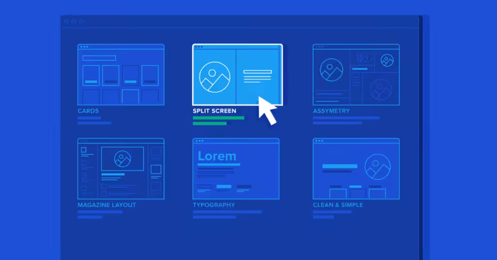
Example 3: Split-screen layout

A split-screen layout divides the screen into two clear sections, usually left and right.
Each side shows different content, like text on one side and an image on the other. Sometimes both sides are clickable.
This layout makes it easy to compare options or show two ideas at once.
Best for:
- Landing pages
- Product comparisons
- Service choices
- Brand stories
It works well when you want users to choose between two paths or understand two related ideas quickly. It is not ideal for long content.
Example 4: Full-screen layout

A full-screen layout uses the entire screen with no distractions.
Content fills the screen from top to bottom, often with large images, big text, or videos. Scrolling usually reveals new sections one screen at a time.
This layout feels bold and focused.
Best for:
- Landing pages
- Brand launches
- Portfolios
- Event pages
It is great when you want users to focus on one message at a time.
It is not best for content-heavy websites because too much scrolling can feel tiring.
Example 5: Card layout

A card layout shows content in small boxes called cards. Each card holds a short piece of info like an image, title, and short text.
Cards can be moved, stacked, or rearranged easily. This makes the page flexible and easy to browse.
Best for:
- Blogs
- Product listings
- Dashboards
- Mobile apps
- SaaS tools
It works well when content updates often. It is easy to scan and feels friendly.
Many social media platforms use this layout.
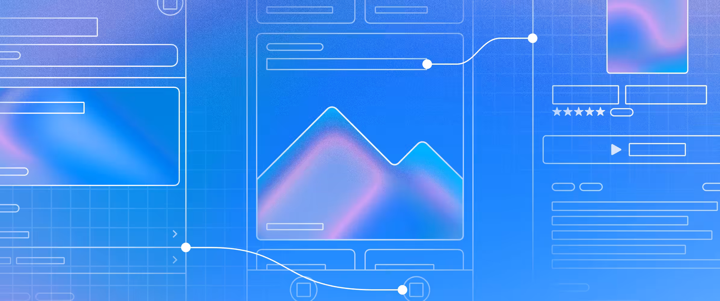
Example 6: Magazine layout

A magazine layout looks like a digital magazine or newspaper.
It mixes large headlines, images, and smaller text sections. Important stories stand out more than others.
This layout helps guide readers through long content in a clear way.
Best for:
- Online magazines
- Blogs
- News sites
- Content-rich websites
It works well when storytelling matters.
It is not ideal for simple business sites with only a few pages.
Example 7: Side-scrolling layout

A side-scrolling layout moves content from left to right instead of up and down. Users scroll sideways to see more content.
This layout feels playful and different but can confuse users if not done well.
Best for:
- Creative projects
- Movie websites
- Image gallery
- Portfolios
- Art showcases website
It works best for short, visual content.
It is not good for blogs or SEO-heavy sites because users expect vertical scrolling.
Example 8: Gallery layout

A gallery layout focuses on images or videos arranged in a clean visual grid.
Users can click items to see more details. Text is usually minimal.
The goal is to let visuals do most of the talking.
Best for:
- Photographers
- Designers
- Artists
- Real estate sites
- Product showcases
It is great when visuals matter more than text. It is not suitable for websites that rely on long explanations.
Example 9: F-pattern layout

The F-pattern layout matches how people read on screens.
Users scan from left to right at the top, then move down slightly and scan again, forming an “F” shape.
Important content is placed along this path.
Best for:
- Landing pages
- Blogs
- Content-heavy pages
It helps users find key points fast.
This layout works best when you want readers to scan instead of read every word.
Example 10: Interactive layout

An interactive layout responds to user actions like clicks, hovers, or scrolling. Buttons change, content moves, or new info appears.
This keeps users engaged and makes the site feel alive.
Best for:
- SaaS products
- Demos
- Learning platforms
- Modern brands
It works well when you want users to explore.
Too much interaction can slow the site, so balance is important.
Example 11: Zig-zag layout

A zig-zag layout places content in an alternating left-right pattern as users scroll down.
Text may be on the left, image on the right, then switch. This keeps the page interesting and easy to follow.
Best for:
- Landing pages
- Service pages
- Product features
It helps tell a story step by step. It is simple, clear, and works well on both desktop and mobile.
Example 12: Animated layout

An animated layout uses motion like fades, slides, or moving elements.
Animations guide attention and explain actions. When done right, they make the site feel smooth and modern.
Best for:
- Brand sites
- Startups
- Portfolios
- Product launches
It helps explain ideas visually. Too much animation can distract users or slow the site, so it should be used carefully.
Wrapping up
Choosing the right website layout is not about looks alone. It helps people read, click, and take action without stress.
The best websites use layouts that feel clear and easy, not confusing.
If you run an agency and you want a layout that works and still looks good for your client, Block Agency can help.
We design websites for agencies as white-label services, so you can deliver clean, high-quality sites to your clients with confidence.
Let’s build websites that people enjoy using and trust.
Talk to us here: hey@blockagency.co
Frequently asked questions
What is the layout of a website?
The layout of a website is how content is arranged on a page. It shows where text, images, buttons, and sections are placed. A good layout helps users read easily, find information fast, and move through the website without confusion.
Which website layout do top websites use most?
Top websites often use grid, card, and zig-zag layouts. These layouts are easy to scan and work well on mobile screens. They help users move through content smoothly without feeling lost.
What is the best website layout for businesses?
The best website layout for businesses is one that is simple and clear. Grid and zig-zag layouts work well because they guide users step by step and highlight important actions like buttons and links.
Can website layouts affect SEO?
Yes, website layouts can affect SEO. A clear layout helps search engines read the page better. It also keeps users on the site longer, which can improve search rankings over time.
What are the 4 main parts of any website layout?
The 4 main parts of a website layout are the header, main content area, sidebar, and footer. The header shows the logo and menu. The main area holds the content. The sidebar shows extra links. The footer contains contact and legal info.