Every agency wants a website that does more than just look good… they want a website that converts traffic to sales.
Because at the end of the day, a pretty design means nothing if visitors leave without taking action.
You want people to book calls, fill forms, and buy… not just scroll and bounce. The hard truth?
Many agency websites fail at this.
They get traffic but no results. Visitors come, look around, and leave confused or unimpressed.
Without a conversion-focused website, all your marketing efforts… SEO, PPC ads, or social media… end up wasted. You’ll keep attracting visitors who never turn into paying clients.
But the good news is, fixing this isn’t complicated.
With the right website structure, design, and message, you can turn your website into a quiet salesperson that works 24/7.
In this guide, you’ll learn 14 simple and proven tips to build a website that converts traffic to sales… from attracting the right visitors to using smart design and CTAs that make people take action.
By the end, you’ll know exactly how to turn your website into a consistent source of new clients.
In this article
14 tips to convert website traffic to sales (for agencies)
1. Bring in the right traffic first

Not all traffic is good traffic.
You can get 10,000 visitors a month, but if they’re not people who need your service, they won’t buy.
So instead of chasing random clicks, focus on the right audience… people who actually want what you offer.
For example, if your agency helps small businesses with website design, target small business owners, not just anyone searching “cool websites.”
Use SEO, social media posts, and ads that clearly describe who you help and what problem you solve.
When your traffic is relevant, even a small number of visitors can bring steady sales. It’s not about volume… it’s about the right fit.
2. Keep your website design clean, beautiful, and functional
A messy website confuses visitors.
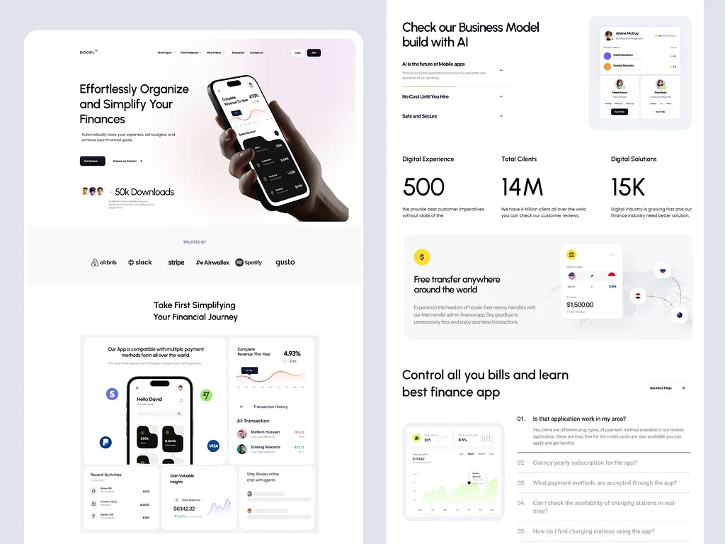
The truth is, people decide whether to stay or leave within seconds. A clean, well-organized design helps them find what they need fast.
- Use simple colors, clear fonts, and enough white space so your message stands out.
- Make sure everything works smoothly… links, buttons, forms, and menus.
A beautiful design isn’t about fancy animations or effects; it’s about guiding visitors easily from one step to the next.
Think of it like walking into a neat store… you can find what you want without asking for help.
That’s the kind of experience your website should give.
3. Build trust from the first click

People buy from those they trust.
The moment someone lands on your website, they’re silently asking, “Can I trust this business?”
Show them they can.
- Use real images, not stock photos.
- Add clear information about who you are, what you do, and where to reach you.
- Make your pricing transparent or at least give an idea of what clients can expect.
- Display security badges if you collect payments or personal data.
- A simple “About Us” page that tells your story can also help people connect with your brand.
Remember, trust is what turns curious visitors into confident buyers.
4. Showcase reviews and testimonials proudly
People trust people more than brands.
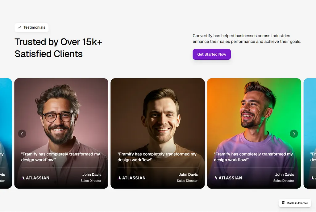
That’s why reviews and testimonials are gold. They tell new visitors, “Others tried this, and it worked for them.”
Don’t just hide your testimonials on one page… sprinkle them across your website, especially near call-to-action buttons.
Add photos, company names, or short stories about how your agency helped.
If possible, include video testimonials for extra credibility.
When potential clients see proof that others have succeeded with your help, they’re far more likely to take the next step.
5. Write copy that sells, not just describes
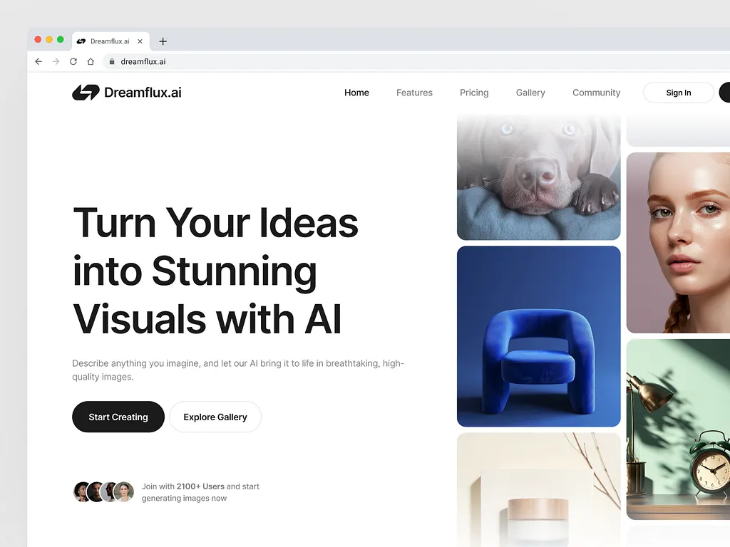
Your website copy should do more than explain what you do… it should persuade.
- Don’t just list features like “We build responsive websites.” Instead, connect it to a benefit: “We build fast-loading websites that help you get more clients.”
- Speak directly to your reader’s pain points and goals.
- Keep sentences short and conversational.
- Use “you” more than “we.”
- Show results through stories or quick examples.
The goal is to make readers feel, “This agency gets me… and they can help.”
Simple, clear, and benefit-focused copy always wins.
6. Place CTAs where they matter most
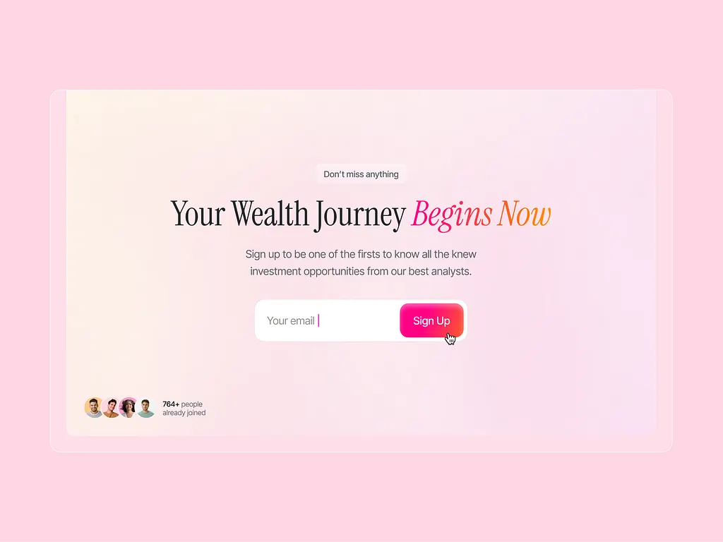
A call-to-action (CTA) is like a friendly invitation… “Book a Call,” “Get a Free Quote,” or “Start Now.”
But where you place it matters.
If visitors have to scroll too much or search for it, they’ll leave. Add CTAs in key spots:
- Right after explaining your offer.
- At the bottom of sections, and especially above the fold (the top part of your homepage).
Make them stand out with contrasting colors and action words. Each CTA should feel natural, not pushy.
Think of it as gently guiding your visitor to the next step, not forcing them.
7. Segment your audience for personalization

Not every visitor wants the same thing.
Some are small startups; others are big B2B agencies. If you talk to everyone the same way, you lose connection.
Segmenting your audience means tailoring your message to fit different needs.
For example…
- You can create separate landing pages for different industries or service types.
- You can also send personalized emails or show specific popups based on what users click.
When people see content that speaks directly to them, they feel understood… and that builds trust and conversions.
8. Use smart popups to capture leads
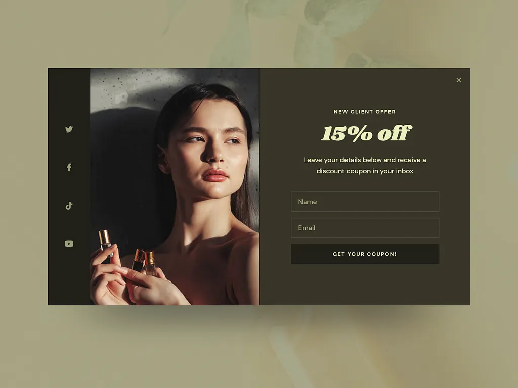
Popups can be annoying… unless they’re helpful. A smart popup offers value at the right time.
For example, instead of interrupting visitors the second they land, trigger a popup when they’ve scrolled halfway down or are about to leave.
- Offer something useful, like a free guide, consultation, or discount.
- Keep the message short and friendly.
The goal isn’t to force people to give their email but to make them want to.
Done right, popups can help you collect leads without turning people off.
9. Add subtle slide-ins to re-engage visitors
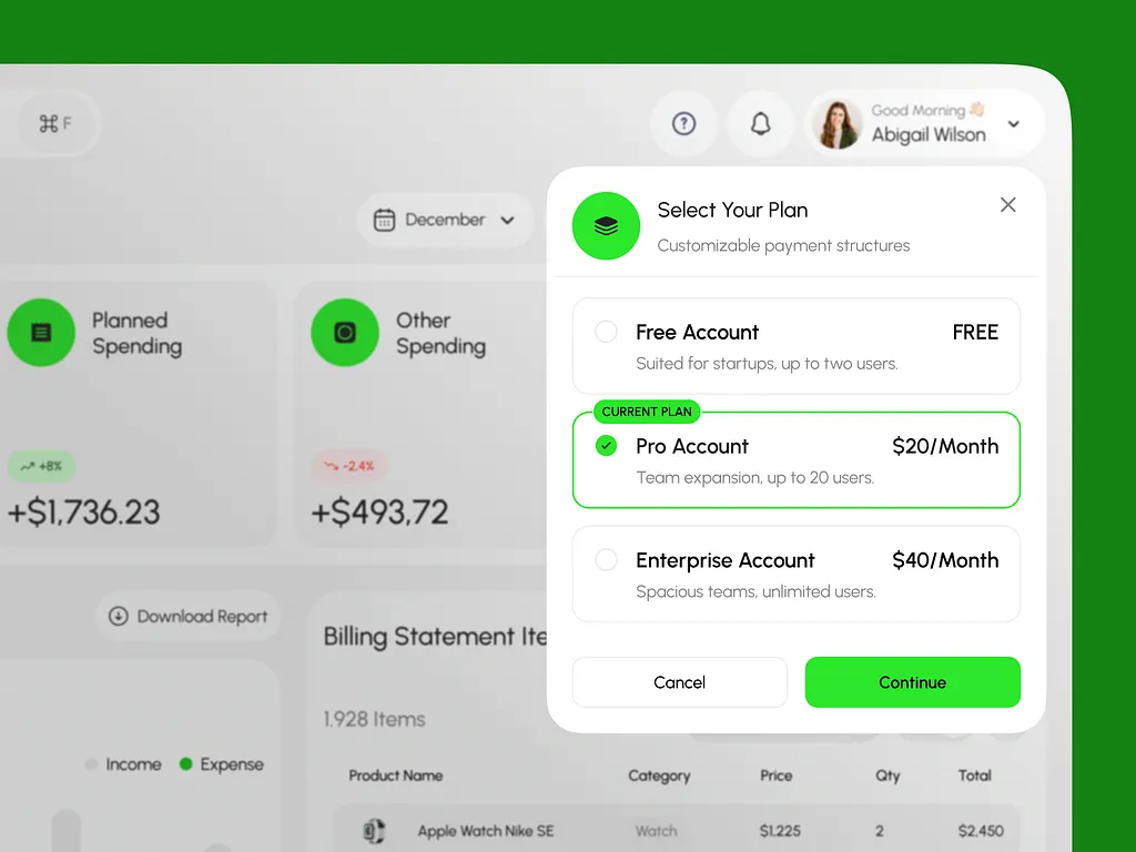
Slide-ins are those small boxes that appear at the corner of a page. They don’t block the screen, but they grab attention.
You can use them to promote a new offer, invite people to subscribe, or share updates.
Because they’re less intrusive than full popups, visitors often find them more pleasant.
For example, a slide-in saying “Want a free website review? Click here” can pull in curious leads.
Keep the design simple and timing natural… after a few seconds or once users scroll past a section.
10. Use floating bars for urgent offers or announcements
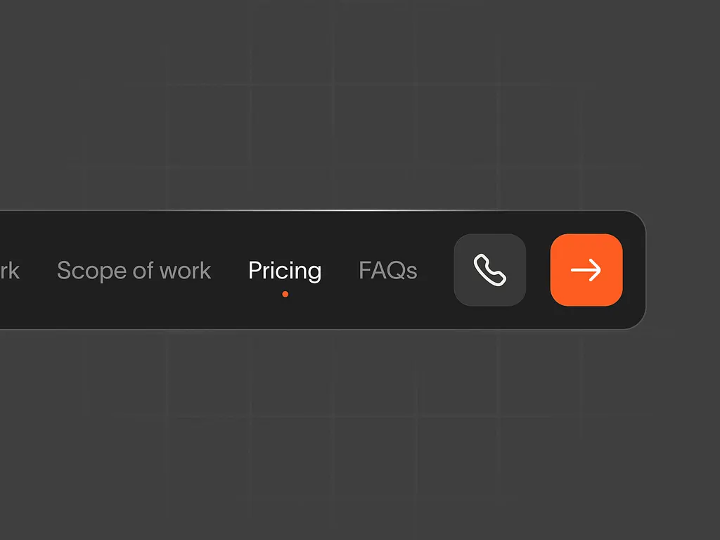
A floating bar sticks to the top or bottom of your website while people scroll.
It’s great for sharing time-sensitive news… like “Limited Slots for Free Consultations This Week!” or “Get 20% Off Website Audits Today.”
It keeps your offer visible without being annoying.
Floating bars work best when the message is clear and short. Add a bright button that leads straight to your CTA page.
This simple feature can create a sense of urgency that encourages quick action.
11. Try two-step popups for higher engagement
A two-step popup works like this:
First, you show a small button or text link… something like “Want a Free Checklist?” When users click, then the form appears.
This small action (the click) makes them more likely to complete the form because they’ve already said “yes” once.
It’s based on psychology… people like to stay consistent with their actions.
Use this technique for free offers, newsletters, or lead magnets.
It’s a gentle way to get more signups without overwhelming your visitors.
12. Enable live chat support
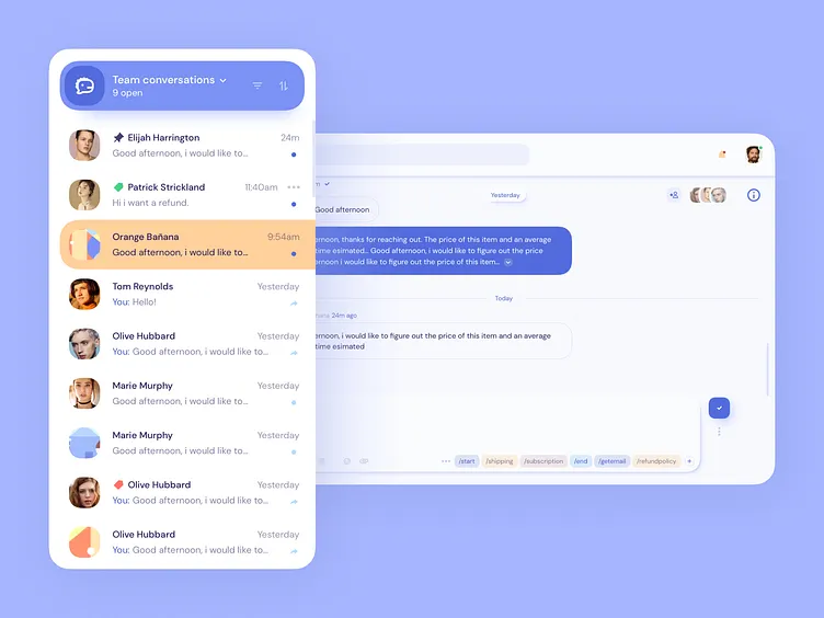
Visitors often have questions before they decide to buy or book a call. A live chat feature lets them get instant answers instead of leaving to “think about it.”
You don’t need to be online 24/7… you can use a chatbot for simple questions and jump in for complex ones.
Keep replies friendly and helpful, not robotic. Even a short, personal message like “Hi there! Need help finding the right plan?” can make a big difference.
Live chat makes your agency feel approachable and builds trust fast.
13. Track your conversions and analyze behavior
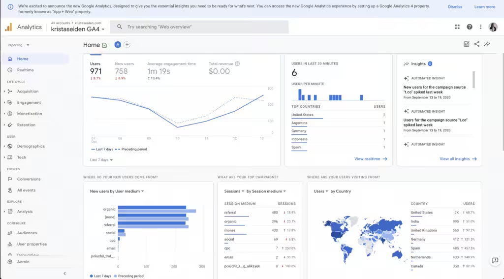
If you don’t measure it, you can’t improve it.
Tracking conversions means knowing how visitors behave…
- Where they click
- How far they scroll
- And where they drop off
Use tools like Google Analytics or Hotjar to see what pages bring the most leads and which ones lose them.
Sometimes small things like button color or page load time can affect conversions. The goal isn’t to guess what works… it’s to use real data to make smarter decisions.
That’s how you turn more traffic into sales.
14. Run A/B tests regularly
A/B testing means trying two versions of something… like two headlines or two CTAs… to see which one performs better.
It’s one of the simplest ways to boost conversions over time.
You don’t have to change everything at once; test one thing at a time.
Maybe a shorter headline works better. Or maybe changing “Book a Call” to “Get a Free Strategy Call” increases clicks.
Keep testing, keep learning. The more you test, the better your website becomes at turning visitors into clients.
Wrapping up
Building a website that actually turns visitors into clients isn’t luck… it’s the result of clear design, honest messaging, and smart testing.
When your website looks good, builds trust fast, and guides people to take action, sales follow naturally.
But if doing all this feels like a lot, that’s where Block Agency comes in.
We help agencies (and their clients) build beautiful, conversion-driven websites that get real results.
Want a website that turns traffic into deals or leads?
Let’s talk here: hey@blockagency.co
Frequently Asked Questions
Do popups really help increase website conversions?
Yes, when used smartly. Popups that offer value… like free guides, audits, or discounts… get more signups. The key is timing. Don’t interrupt visitors too soon. Trigger popups when they scroll or before they leave your website.
What are common mistakes that hurt website conversions?
Cluttered design, slow speed, and unclear messaging are major conversion killers. Many agencies also forget to add trust elements like testimonials or forget to test what’s working. If visitors can’t find what they need fast, they leave without taking action.


