Websites with responsive design achieve 11% higher conversion rates… meaning?
People are more likely to buy, sign up, or take action on a website that looks good and works well on every device… whether it’s a phone, tablet, or laptop.
Think about it.
Imagine you open a website on your phone, but the text is too tiny, the images don’t fit, and you have to zoom in just to click a button. Frustrating, right?
Most people would simply leave.
Now picture another website that automatically adjusts… buttons are easy to tap, text is clear, and everything fits your screen perfectly. You’d stay longer and maybe even buy something.
That’s what responsive design does… it makes sure your website “responds” to the screen size, giving visitors a smooth experience.
And because people enjoy using it, they’re 11% more likely to take the next step, like making a purchase or filling out a form.
So, in this blog post, we’ll answer the question currently on your mind: “What is responsive design, and why is it important?”
What you read earlier is just a glimpse… let’s get into the main discussion.
In this article
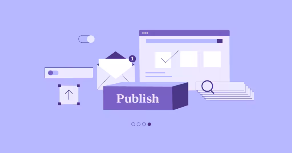
What is responsive design?
 1")
As mentioned before, responsive design means building a website that looks good and works well on any device…
Whether you’re using a big desktop computer, a laptop, a tablet, or a smart phone. The website “responds” to the size of your screen and adjusts itself so you don’t have to zoom in, scroll sideways, or struggle to click buttons.
Think of it like water in a cup. No matter what shape the cup is… tall, short, wide… the water fits in perfectly.
Responsive design works the same way. Your website content (text, images, buttons) flows and reshapes itself to fit the screen you’re using.
Why Is responsive design important?
 2")
When you visit a website, what do you really expect?
You expect it to be easy to read, easy to click, and easy to use, right?
That’s exactly why responsive design is important.
Let’s go more deeper.
1. It improves user experience
Think about the last time you opened a website on your phone, and the text was so tiny you had to pinch and zoom just to read it.
Or maybe the button you wanted to click was hidden off the screen, and you had to scroll sideways to find it. Frustrating, isn’t it?
Most people won’t waste time… they’ll just close the website and move on.
Now imagine opening a website where everything fits perfectly on your screen.
The text is clear, the buttons are easy to tap, and the images load in the right size. That’s what responsive design does.
It removes all those annoying barriers and makes the experience smooth.
When your website is easy to use, visitors stick around longer and actually enjoy browsing through it.
2. It boosts mobile traffic engagement
Here’s a fact:
Most people browse the internet on their phones today.
From scrolling through social media to shopping online, our phones have become our mini-computers.
So if your website isn’t designed to handle mobile visitors, you’re basically shutting the door on a huge part of your audience.
Responsive design makes sure mobile users get the same smooth experience as desktop users.
For example, someone on their lunch break can quickly check out your website on their phone, read your content without zooming, and maybe even buy something with just a few taps.
When mobile visitors find your website easy to use, they spend more time on it, explore more pages, and engage more with your content or products.
3. It increases conversions
Here’s where it gets exciting.
As mentioned before, a study show that websites with responsive design have 11% higher conversion rates.
“Conversion” simply means getting visitors to take action… like buying a product, signing up for a newsletter, or filling out a contact form.
Why the increase?
It’s simple. If your website is easy to use on any device, people don’t get frustrated. They can complete what they came for without struggling.
For example, if a shopper visits your online store and the “Buy Now” button is easy to tap on their phone, they’re far more likely to complete the purchase.
4. It builds trust and credibility with visitors
First impressions matter… especially online.
If someone visits your website and it looks messy on their phone, they’ll assume your business isn’t professional or up-to-date.
On the other hand, a clean, responsive website shows that you care about your visitors and value their time.
Think of it like walking into a store. If the store is neat, well-lit, and organized, you’ll trust the business more and feel comfortable shopping there.
But if it’s cluttered and hard to move around, you’ll probably leave.
The same goes for websites.
A responsive website makes visitors feel confident that your brand is reliable, modern, and worth their attention.
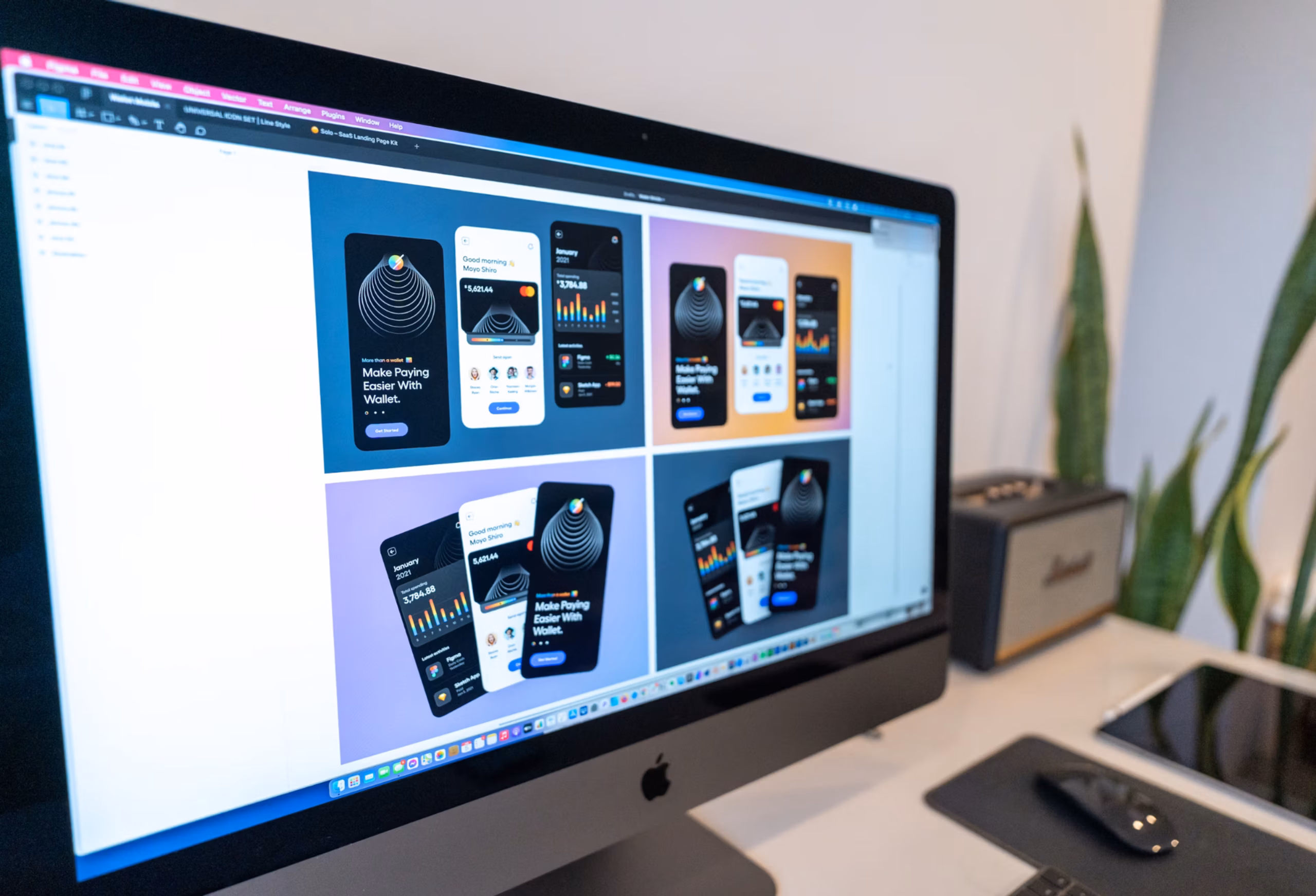
How to implement responsive design
 3")
Okay, so now you know what responsive design is and why it’s important. But the big question is:
How do you actually make your website responsive?
Don’t worry, it’s not as scary as it sounds. Let’s walk through 3 simple ways you can do it… even if you’re not a tech expert.
1. Use a responsive framework (like Bootstrap or Tailwind)
Think of a framework as a ready-made toolbox for building websites.
Instead of starting from scratch, you get pre-built parts that already know how to “stretch and shrink” depending on the device.
For example, frameworks like Bootstrap and Tailwind have built-in designs for buttons, menus, grids, and layouts. So when you use them, your website automatically adjusts to different screen sizes.
It’s like buying furniture from IKEA… you get all the pieces and instructions. You just put them together, and voila… you have something neat and functional.
Without a framework, it’s like cutting down your own wood and trying to build a chair from scratch. Possible, but way harder.
The best part?
These frameworks are widely used by developers around the world, so they’re reliable and updated often.
Using them saves you time and makes sure your website is mobile-friendly from the start.
2. Test with a mobile-friendly test tool
Here’s something cool:
You don’t have to guess if your website is responsive. There is a free tool to check it. It’s called the “Mobile-Friendly Test”.
All you do is go to the tool, type in your website link, and hit enter. In a few seconds, It’ll show you if your website works well on mobile or not.
If there are problems… like text being too small, buttons being too close together, or images not fitting… the tool will point them out for you.
It’s like going to the doctor for a check-up. Instead of waiting until your visitors complain, you get a clear report of what’s working and what needs fixing.
This way, you can catch issues early and make improvements before they hurt your traffic or sales.
And here’s a bonus:
Google actually ranks mobile-friendly websites higher in search results.
So if you pass the test, you don’t just get a better website; you also improve your chances of being found on Google.
3. Work with a professional website design agency
Now, let’s be honest…
Not everyone has the time or skills to mess with frameworks and tests. And that’s okay.
Sometimes the smartest move is to hand things over to professionals.
This is where a website design agency comes in.
A good agency doesn’t just make your website look pretty. They make sure it’s fully responsive, fast, and ready to convert visitors into customers.
They know the tricks, tools, and shortcuts that save you stress and headaches.
At Block Agency, that’s exactly what we do.
We specialize in helping digital agencies build their websites. So if you run an SEO agency, a PPC agency, or a branding agency, we can help you build a stunning, strong and responsive website.
Think of it like hiring a mechanic for your car. Sure, you could watch YouTube videos and try to fix it yourself.
But wouldn’t it be faster, safer, and more effective to let someone who does it every day handle it?
Let’s handle your website.
Talk to us here: hey@blockagency.co
Wrapping up
So in summary, why is responsive design important? It’s not just about looking pretty. It’s about:
- Giving visitors a smooth, enjoyable experience.
- Making sure mobile users stay and engage with your content.
- Increasing the chances that people will take action (with that sweet 11% higher conversion rate).
- Building trust and showing you run a professional, credible business.
In short, responsive design helps you keep visitors happy, boost your results, and stand out in a crowded online world.
Frequently Asked Question
Does responsive design affect SEO?
Yes, responsive design can improve SEO. Google ranks mobile-friendly websites higher because they give users a better experience. A responsive website also lowers bounce rates since people don’t leave quickly. This means more visibility on search engines and a higher chance of attracting new customers.
Does responsive design make websites load faster?
Yes, in many cases it does. Responsive design often uses modern layouts and images that adjust for smaller screens, which helps pages load faster. A fast, responsive website keeps visitors happy and reduces bounce rates. And since speed also helps with SEO, it’s a big win for websites.