You built a great SaaS product. You know it solves a real problem. But when people land on your website… they leave.
No signups. No conversions.
Why?
Your SaaS website might be pushing them away instead of pulling them in.
- Maybe it’s cluttered.
- Maybe it’s confusing.
- Maybe it doesn’t show them why they need your product right away.
And here’s a fact: just a one-second delay in page load time can drop your conversions by 7%. Imagine losing potential customers simply because your website takes too long to load!
But guess what? You can fix this.
What if, instead of people leaving, they stayed? What if they clicked that “Sign Up” button without hesitation? What if your website worked for you, turning visitors into loyal users on autopilot?
It’s possible. And it starts with a clear, conversion-focused SaaS website structure.
In this article, we’ll show you how to structure and design a SaaS website that keeps visitors engaged, removes confusion, and gets them to take action.
In this article
Homepage design
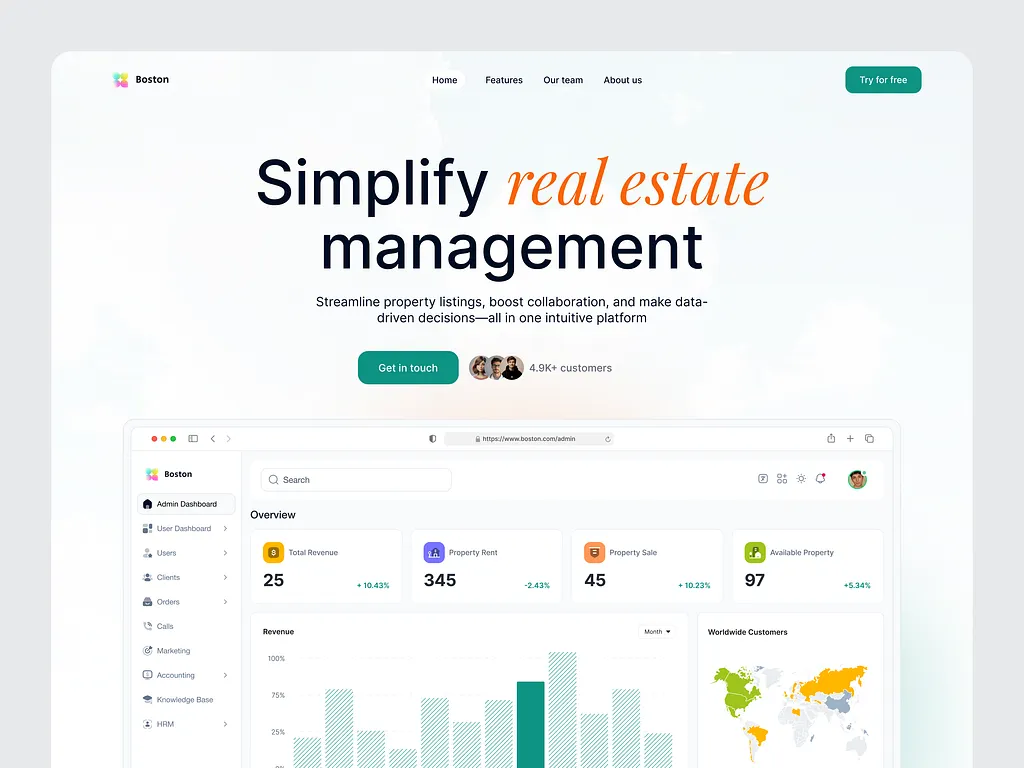
Your homepage is the first thing visitors see. If it’s not clear, engaging, and convincing, they’ll leave. A great SaaS website design makes people stay, explore, and take action.
Here’s how to structure yours for more signups (and sales):
1. Hero section
People decide in seconds if they’ll stay or go. Start strong.
- A clear headline that tells them exactly what they’ll get. Example: “Turn Visitors into Customers with Smart Analytics.”
- A subheadline explaining how your product solves their problem. Keep it short and to the point.
- A call-to-action (CTA) button like “Try this for free” or “Get started today without paying a dime.” Make it stand out.
- A visual—product image, GIF, or short explainer video. Why? Because 90% of the information sent to the brain is visual.
2. Social proof section
People trust what others trust. Show them they’re in good company.
- Logos of companies already using your product.
- A big, bold stat like “10,000+ people trust us.”
3. Key features
Pick 3-5 core features and explain the benefits of each. Use icons or images to make them easy to scan.
4. Final CTA
Reinforce the next step. A simple, clear CTA: “Try for free – No credit card required.”
Product page design
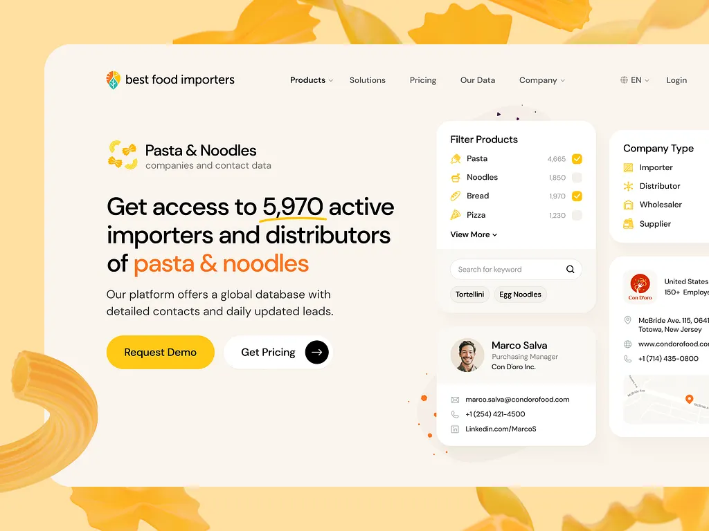
Your product page shouldn’t just list features; it should show visitors why your product is the best solution for them. A well-structured page helps them see the value, compare options, and take action.
Here’s how to do it better:
1. Break down features by use case
As mentioned before, people don’t buy features—they buy solutions to their problems.
- Organize features by use case so visitors can see how each one helps.
- Keep explanations simple: What does it do? How does it help?
- Use visuals—screenshots, GIFs, or short videos. Remember, 90% of the information our brain processes is visual.
2. Show why you’re better
Your visitors are likely comparing options. Make the decision easy.
- Create a comparison section that highlights why your product is better.
- Compare against spreadsheets, competitors, or outdated methods.
- Use simple, direct points. Don’t make them guess why you’re the best choice.
3. Call-to-Action
Every section should make it easy for visitors to sign up. Add CTA buttons in key spots… Make them stand out so they’re easy to find.
Pricing page
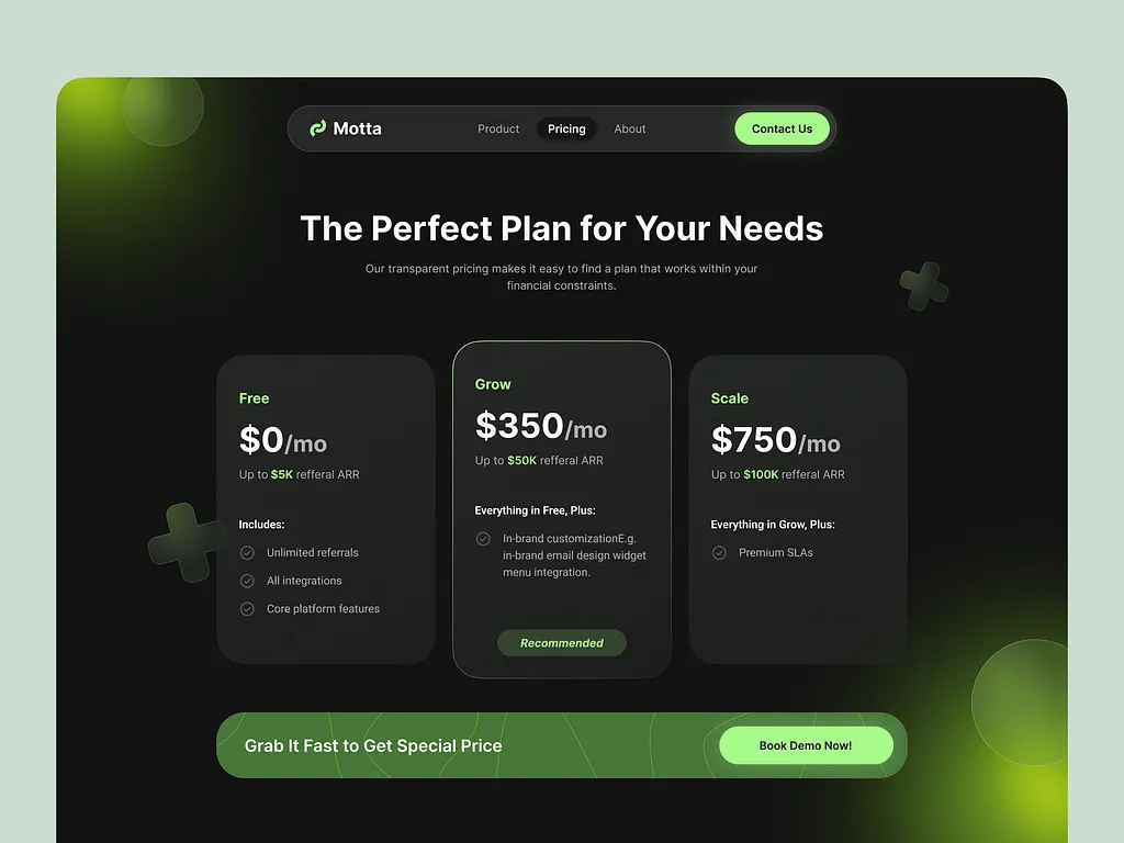
Your pricing page is where visitors decide if they’ll pay for your product, or walk away. If it’s unclear or overwhelming, you’ll lose them. A well-structured pricing page makes the decision easy, builds trust, and boosts conversions.
Here’s how to design it right:
1. Keep pricing simple & transparent
Confusion kills sales. Make your pricing clear at a glance.
- Show pricing tiers (e.g., Free, Pro, Enterprise) so users can find the plan they can afford.
- List what’s included in each plan—no surprises.
2. Remove risk & increase trust
People hesitate when they feel there’s a risk. Eliminate that fear.
Offer a 14-day free trial, no credit card required, or a money-back guarantee. Highlight this near the pricing to make signing up feel safe.
3. Enterprise option to keep big clients/customers interested
Some companies or individuals need custom solutions. Make it easy for them to reach out.
Add a “Contact Us” button for enterprise pricing. Keep it visible so larger businesses don’t get stuck.
4. Answer common questions
If visitors are unsure, they won’t sign up. Address their concerns upfront.
Include an FAQ section answering key questions like “What happens after the trial?” Keep answers short and clear.
5. Use personalized CTAs for higher conversions
A generic “Sign Up” button won’t work most times. Personalize your call-to-action.
Research shows personalized CTAs perform 202% better than standard ones. Use CTAs like “Start Your Free Trial” or “Find Your Perfect Plan” for a better response.
About page
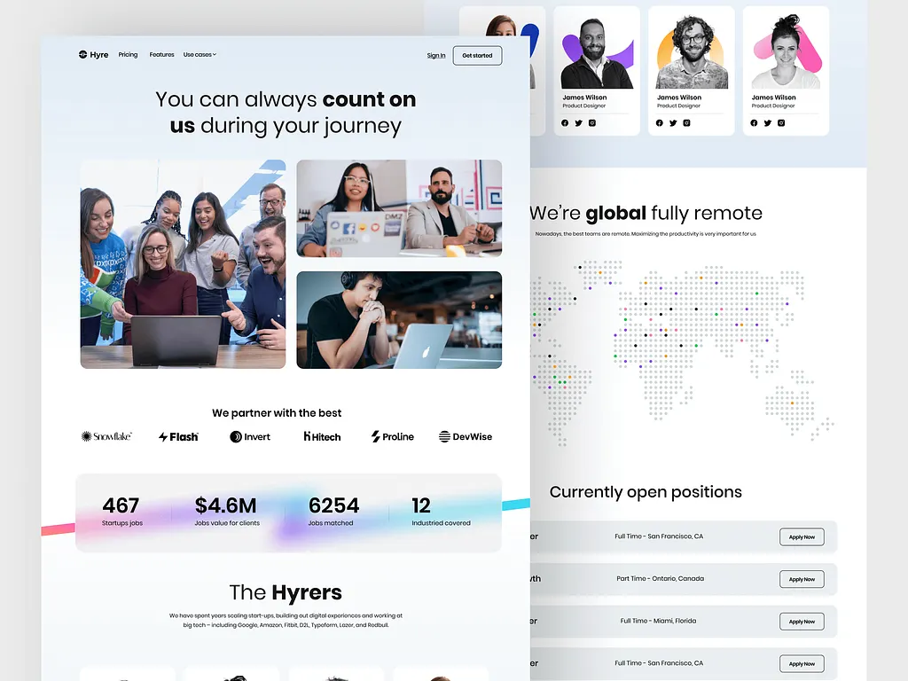
Your About page is where visitors decide if they trust your brand… Because people buy from brands they trust. A well-structured About page makes your SaaS feel real, relatable, and trustworthy.
Here’s how to design it:
1. Share your mission & story
People love a good story. Tell them why you built this SaaS and who it helps.
- What problem inspired you to create it?
- Who benefits the most from using it?
- What’s your big vision for the future?
Keep it simple and personal—let them see the heart behind your brand.
2. Show the people behind the product
Users trust real faces more than logos. Introduce your team.
- Feature photos of founders & key team members.
- Add short bios to highlight their experience and passion.
This makes your brand feel more human and approachable.
3. Highlight press mentions & partnerships (not compulsory)
Social proof builds credibility fast. If you’ve been featured somewhere big, show it.
- Add logos of media outlets that have covered your SaaS.
- Mention awards or recognitions your brand has received.
- List any big-name partnerships to establish authority.
A strong About page helps visitors connect with your brand, trust your product, and feel confident in choosing you.
5. Blog/resources page
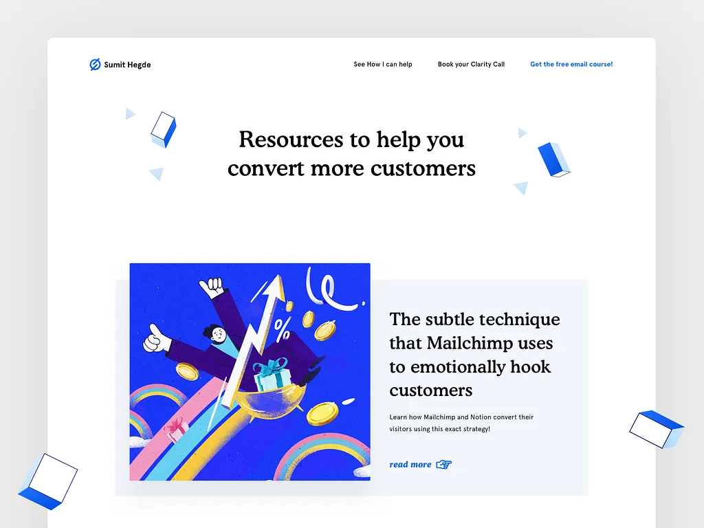
Your blog or resources page is a tool to educate visitors, build trust, and turn them into loyal users. A well-structured page keeps them engaged, helps them find what they need, and encourages them to take action.
Here’s how to design it for conversion:
1. Provide valuable educational content
People visit resource pages to learn. Give them high-quality content that solves real problems.
Share blog posts, guides, or case studies that address industry challenges. Make sure you focus on helpful, practical insights—not just product promotion. When visitors find value, they’re more likely to trust (and buy from) you.
2. Offer lead magnets to grow your email list
Don’t let visitors leave without staying connected with your brand. Give them a reason to share their email.
Offer a free eBook, checklist, or webinar in exchange for an email signup. Make it easy—just a one-click signup form with a clear benefit. More emails mean more potential customers down the line.
3. Add a search function for easy navigation
No one wants to scroll endlessly to find useful content. Help them get what they need—fast.
- Include a search bar so users can find relevant posts quickly.
- Organize content by categories or tags for a better experience.
Contact & support page
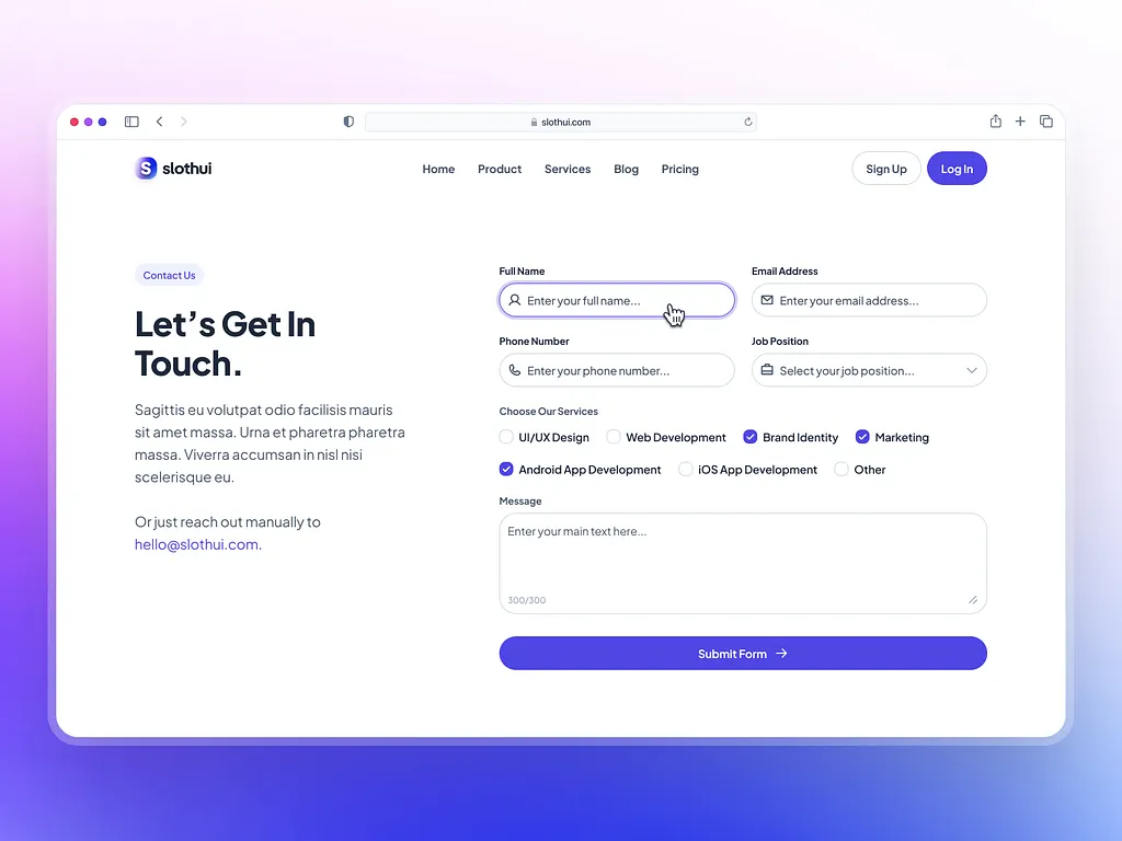
When visitors need help, your contact page should make it easy to reach you. If it’s confusing or hard to find, they’ll get frustrated and leave. A well-structured support page reassures users, provides quick answers, and builds trust.
How can you design it?
1. Offer multiple contact options
People have different preferences when reaching out. Give them choices.
- Provide email, chat, or phone support so they can pick what works best.
- Include a simple contact form for inquiries—ask only what’s needed.
2. Add a help center for quick answers
Many users prefer to solve problems themselves. A knowledge base helps them do that.
Include self-serve articles answering common questions. Organize the topics clearly so users can find what they need fast. This reduces support requests while keeping users happy.
Signup & onboarding flow
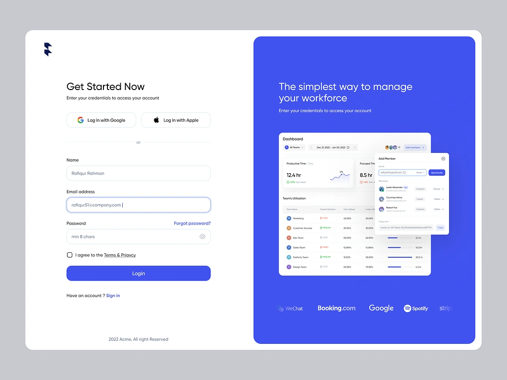
Your signup and onboarding process is the first experience users have with your product. If it’s frustrating or confusing, they’ll leave before they even get started.
A simple, guided flow helps them sign up fast and take action right away. Design it better by following this guide:
1. Make your signup frictionless
Don’t make users jump through hoops just to get started.
- Offer Google sign-in or a quick email & password option.
- Avoid long forms—keep it simple and ask for more details later.
The easier it is to sign up, the more people will complete it.
2. Guide users with a welcome screen
New users often don’t know what to do next. Help them with a simple walkthrough.
- Show a welcome screen with a quick setup checklist.
- Use a short walkthrough video or step-by-step guide.
This keeps users engaged and reduces drop-offs.
3. Use an action-oriented CTA
Once they sign up, direct them to the next step immediately… Use CTAs like “Add Your First Project” or “Invite Your Team”. Make it easy and rewarding.
Footer design
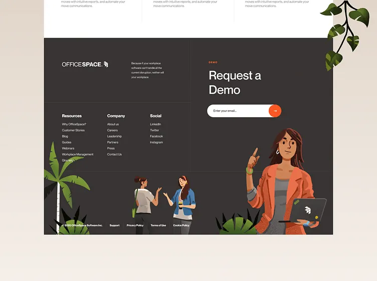
Your website’s footer might seem like a small detail, but it plays a big role. It helps visitors find key information, builds trust, and keeps them connected to your brand.
Here’s how to design it for the best results:
1. Make contact information easy to find
If users need to reach you, don’t make them search for it. Include your email address, phone number, and physical address (if applicable). Why? It builds trust and reassures visitors that you’re a real, accessible business.
2. Add navigation links to important pages
Visitors often scroll to the footer for quick links. Give them what they need. Include links to Privacy Policy, Terms of Service, Blog, and Support pages. This improves user experience and keeps them engaged with your site.
3. Link to your social media profiles
Help visitors stay connected with your brand beyond your website. Add social media icons linking to your active profiles. Why? It encourages ongoing engagement and builds brand awareness.
4. Include copyright information
Protect your brand and show professionalism… Display the year and your company name in the footer. Example: © 2025 [Your Company Name]. All Rights Reserved.
Wrapping up
So, that’s it! A detailed guide on how you can structure (or design) your SaaS website for conversion.
But here’s the thing—doing all this yourself and getting it right is HARD. A poor design, slow loading pages, or unclear messaging can send potential customers away (you know this already).
But there’s good news: We can help you make more money from your product by designing your SaaS website. Don’t worry, we understand conversion-focused design.
At Block Agency, we don’t just build good looking SaaS websites. We craft high-converting ones that turn visitors into loyal users. We handle the strategy, design, and optimization so you can focus on growing your business.
If you’re serious about making money on autopilot with your SaaS website, let’s make it happen.
Reach out here: hey@blockagency.co

