We’ve picked 14 of the best real estate website designs to show you.
These real estate website examples are not just good-looking. They are converting visitors into leads, calls, and real buyers.
If you take ideas from them and apply them to your own site, there is a strong chance your results will improve too.
According to research, 51% of buyers found the home they purchased online first.
That means most buyers start their search online. And if they land on a website that looks bad or is hard to use, they will leave and move to the next one.
In this blog post, we’ll break down these 14 real estate website designs so you can learn what works and use it to improve your own site.
Let’s get into it…
In this article
1. Olivia Harper Homes

If you’re looking for real estate website design ideas that feel polished and personal, Olivia Harper Homes delivers.
- Layout: Clean, single-column flow with generous white space. Each section has breathing room.
- Typography: Elegant serif headings paired with light sans-serif body text. It signals luxury without being loud.
- Navigation: Minimal top nav with just four links: Projects, Services, About, Vision. Easy to scan.
- What works: The hero section opens with three rotating words: “Architectural, Crafted, Considered,” which immediately sets the tone. Project cards are clearly labeled as “Current” or “Completed,” which builds trust.
2. Tbilisi Gardens

This one takes a bold, creative approach.
The homepage uses a layered parallax effect with illustrated buildings, moving clouds, and a cityscape background. It feels more like a short animation than a property listing.
- Layout: Fully immersive, scroll-driven storytelling.
- Typography: Bold, modern type in both English and Georgian.
- Navigation: The language switcher (English/Georgian) is right at the top. Smart for an international audience.
- What works: The visual concept is memorable and stands out. You feel like you’re stepping into the development before you even read a word.
3. FIND Real Estate

This is one of the best real estate website designs for an agency trying to feel human and modern at the same time.
- Layout: Hero image with a centered headline and a big “Find Properties” CTA. Simple, intentional.
- Typography: Strong, confident type. Bold headlines with relaxed body copy. The phrase “Find What Moves You” sets a warm emotional tone right away.
- Navigation: Top bar with Search, Agents, Join, Resources, and Sign In. Very user-focused.
- What works: The 3-step process section: Talk to a Human → Get Clarity → Move Forward… makes the journey feel easy. Testimonials are woven in naturally.
4. Place Laval

Place Laval is a commercial real estate site for a large office complex in Quebec, and it does the job cleanly.
- Layout: Professional, structured grid. Sections are clearly separated with good hierarchy.
- Typography: Conservative but readable. A safe sans-serif throughout.
- Navigation: Dropdown menus for “Spaces for Lease” and “Resources” keep it organized for business tenants.
- What works: The LEED Silver and BOMA BEST certifications are prominently featured with visual badges… perfect for attracting eco-conscious tenants. Stats (865,000 sq. ft., 5 towers) are listed upfront.
5. Mersi Architecture

Mersi is a Paris-based interior architecture studio, and its website feels like walking into their showroom.
- Layout: Full-width photo grid on the homepage. Projects fill the screen with no clutter.
- Typography: The opening line “Quiet luxury interiors shaped by true stories” is outstanding. The type is minimal, French-editorial in style.
- Navigation: Just five links: Projets, Agence, Process, Shop, Contact. Nothing extra.
- What works: This is a strong example of luxury real estate website design done through atmosphere rather than words. You feel the brand before you read it.
6. BoxCar Apartments

BoxCar is a luxury apartment complex in Spartanburg, SC, and the website leans hard into its downtown, rail-inspired identity.
- Layout: Bold hero with a full-width promo banner at the very top (currently advertising $2,000 off move-in). Strong visual hierarchy throughout.
- Typography: Industrial-style fonts that match the BoxCar brand. It feels urban and edgy.
- Navigation: A long top nav that includes: Amenities, Floor Plans, Penthouses, Neighborhood, Gallery, Virtual Tour, FAQs. Thorough.
- What works: The “Virtual Tour” link is a great conversion tool. The penthouse section gets its own nav item, which signals premium offerings clearly.
7. Verity & Co. Homes

This Yorkshire homebuilder’s site is warm, personal, and community-focused… and that’s exactly the point.
- Layout: Story-driven scroll with big images and human-centered copy. Feels less like a sales site, more like an invitation.
- Typography: Friendly, readable fonts with earthy tones. The tagline “Crafted with care. Designed to last.” is simple and believable.
- Navigation: Clean top nav with a smart “Favourites” feature (saved homes) and a “Homeowner Stories” section… rare and thoughtful.
- What works: The family narrative is front and center. Founded in 1986 by Brian Verity, now run by his daughters. This story builds trust immediately.
8. Volta SKAI

Among the real estate website examples in this list, Volta SKAI is one of the most architecturally impressive. It’s a high-rise development in Tallinn, Estonia, and the site matches the building’s ambition.
- Layout: Full-screen video hero followed by a structured, scroll-based tour of the development’s features.
- Typography: Modern, spacious type. Wide letter-spacing on headlines gives it a premium feel. The tagline “Homes with a sense of future” is memorable.
- Navigation: Expandable menu with detailed sections: Location, Amenities, Interior, SKAI Villas, Prices and Plans, Gallery, and even For Investors.
- What works: Sales contact info (names, phone numbers) is surfaced on the homepage immediately… smart for high-value buyers. The EST/ENG toggle is well-placed.
9. PropertyClub NYC

PropertyClub is a data-rich real estate platform for NYC rentals and sales… and it shows.
- Layout: Utility-first design. The homepage is built around search, navigation, and listings… less editorial, more functional.
- Typography: Clean, system-style sans-serif. Nothing flashy, legibility over style.
- Navigation: A deep, well-organized mega menu covering Rentals, Sales, Buildings, and Tools. Broken down by NYC borough and popular neighborhoods.
- What works: The dropdown menus are genuinely useful. Popular buildings like 432 Park Avenue are linked directly. Mortgage calculators and buyer rebate info are built in.
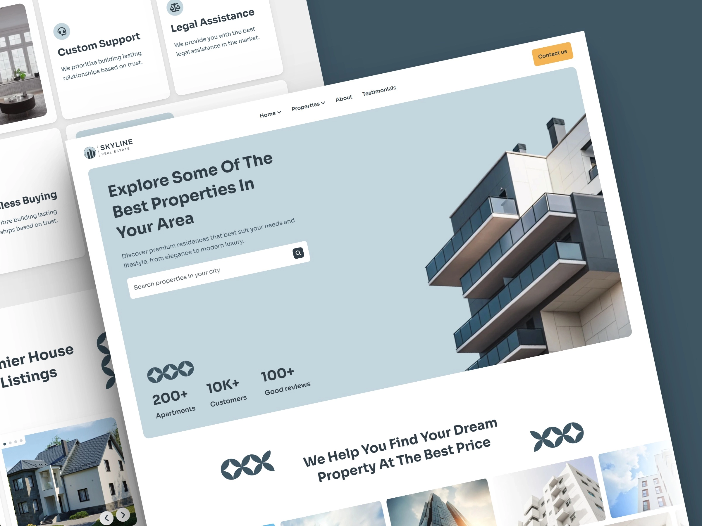
10. Vista Properties

Vista is one of Montreal’s largest property holders, managing over 10 million square feet of commercial and residential space. And the website communicates that scale with confidence.
- Layout: Clean, minimal, corporate-modern. Each section introduces a theme word (Purpose, Details, Relationships) before expanding into prose. A smart storytelling device.
- Typography: Bold headlines with generous line spacing. The contrast between single-word section titles and full-paragraph descriptions creates a nice rhythm.
- Navigation: Super minimal: just Available Properties, Contact Us, and a language switcher (EN/FR).
- What works: The “Featured Projects” section neatly separates Industrial from Residential, making it easy for different types of users to self-select.
11. Landed Houses

Landed Houses is a UK platform for high-end country properties: manor houses, estates, barn conversions, and rural retreats.
The site is built around editorial-style property descriptions that read more like travel writing than listings.
- Layout: Image-led, gallery-style grid. Properties are shown with large hero photos and evocative captions.
- Typography: Traditional serif fonts that feel at home with the country house aesthetic.
- Navigation: Straightforward. Properties is the main draw.
- What works: The copy is exceptional. Descriptions like “a gorgeous, sunny-stoned rectory near the Jurassic Coast” paint a picture before you see the photos.
12. Anyone.com

Anyone is a global real estate platform built around speed, simplicity, and AI-powered agent matching… and the website says all of that clearly.
- Layout: Clean, app-style homepage with a bold hero headline and a property search widget front and center.
- Typography: Modern, confident sans-serif. The line “It’s so easy, anyone can do it. Even your cat…” shows they’re not afraid of personality.
- Navigation: Minimal top nav: Buy, Sell, For Agents. Everything else is one scroll away.
- What works: The “Old Way vs New Way” comparison (60–90 days vs ~3 weeks) is an extremely effective conversion element. The feature walkthrough using short video clips is well done.
13. Enclave

Enclave is a London build-to-rent brand with apartments in King’s Cross, Birmingham, and Acton. And the website communicates a specific lifestyle, not just a place to sleep.
- Layout: Full-screen video hero, followed by feature callouts in a clean card grid.
- Typography: Elegant, high-contrast type. The hero line “Your home. Effortless living.” is short and sharp.
- Navigation: Clean top nav with Locations (King’s Cross, Birmingham, Acton) as a dropdown. Good for multi-city browsing.
- What works: The amenity list is well-presented. Smart home, pet-friendly, co-working, 24-hour resident teams. Enclave sells a lifestyle and the site backs it up visually.
14. Crossings at Center

Crossings at Center is a modern apartment community in Salem, Oregon. The site is simple, functional, and gets straight to the point.
- Layout: Standard apartment website format: hero image, features list, floor plans, gallery, and contact. No surprises, but it works.
- Typography: Clean, readable sans-serif throughout. Nothing remarkable, but nothing distracting either.
- Navigation: Solid top nav: Home, About, Features, Floor Plans, Gallery, Contact, Apply Now, Pay Rent. Practical and complete.
- What works: The Apply Now and Schedule a Tour CTAs are repeated multiple times… smart for a leasing site. The feature bullets (on-site gym, dog park, balconies, pet-friendly) are easy to scan.
Wrapping up
You’ve just seen what great real estate websites look like in 2026.
Clean layouts. Clear messaging. Easy navigation. And most importantly, sites that turn visitors into buyers, sellers, and leads.
Now here’s the honest part: inspiration is good, but results come from execution.
If you want a website that doesn’t just look nice but actually brings in clients, that’s where Block Agency comes in.
We design real estate websites that are simple, fast, and built to convert. So instead of guessing what works… let’s build something that does.
Ready when you are. Talk to us here: hey@blockagency.co
Frequently asked questions
What are common mistakes in real estate website design?
Common mistakes include slow loading, poor images, no mobile support, and unclear navigation. Some sites also lack clear calls to action or easy contact options. These issues make users leave quickly and reduce chances of getting leads or inquiries.
What features should a real estate website have?
A real estate website should have property search filters, high-quality images, listing pages, contact forms, and clear call-to-action buttons. It should also include area pages and fast loading speed. These features help users find homes faster and take action without confusion.
What pages should a real estate website include?
A real estate website should include a homepage, property listings, listing details, about page, contact page, and area pages. These pages help users explore properties, learn about the agent, and take action. Each page should guide users clearly toward booking a call or making an inquiry.
What is IDX in real estate website design?
IDX is a system that allows real estate websites to show property listings from a shared database. It helps users search homes directly on the site. While useful, some websites also use custom pages and local content to stand out and improve results.