You already know your food is good. But if your website doesn’t show that, people will click away before deciding to walk through your door.
Right now, 77% of diners check a restaurant’s website before deciding where to eat.
That means your website is the first impression that either wins them over or sends them straight to your competitor.
But sadly, most restaurant owners don’t know what a great website actually looks like. That’s exactly why this post exists.
We’ve pulled together 16 of the best restaurant website design examples in 2026, from cozy neighborhood spots to Michelin-starred dining rooms.
You’ll see what makes each one work, what design choices actually bring people in, and what you can copy for your own site.
Let’s get into it…
In this article
1. Frituur Rumbeke Platse

This is a Belgian frituur (chip shop) website, and it doesn’t try to be anything more than that, which is exactly why it works.
- Layout: Simple, single-scroll page built with Elementor on WordPress. Clean sections stack neatly from top to bottom.
- Color: Warm red and earthy tones that feel like comfort food. It instantly matches the vibe of a local fry shop.
- Typography: Friendly, rounded fonts. Nothing fancy, but very readable on mobile.
- Navigation: Minimal. The menu items are few and easy to find, no confusion.
What makes it work:
- It’s local and warm. You feel like you know the place before you visit.
- Great use of food photography that makes the frites look irresistible.
- Contact info and location are easy to find.
It’s a great example among restaurant website design examples for small, community-based eateries that want to feel real and approachable rather than fancy.
2. Da Maria Roma

This is a Webflow e-commerce template styled as an Italian restaurant, and it’s one of the most polished template-based designs out there.
- Layout: Multi-page structure with a sticky top nav. The homepage has a strong hero section, followed by clean content blocks.
- Color: Cream, off-white, and muted earth tones give it an Italian trattoria feel. Warm and inviting.
- Typography: Elegant serif fonts for headings, paired with clean sans-serif body text. Very editorial.
- Navigation: HOME, ABOUT, MENU, RESERVE, RESTAURANT, ARTICLES. Clear and logical. The cart icon is always visible too.
What makes it work:
- The food imagery is styled beautifully. The pasta plate on the hero is a showstopper.
- The dual-logo system (full logo + monogram) is a smart branding touch.
- The reservation and online ordering are built right in.
A strong pick for anyone searching for restaurant website design ideas from a Webflow template.
3. Just Falafel Vegan Cafe

A plant-based Houston restaurant with a website that feels as clean and fresh as its food.
- Layout: Built on Elementor/WordPress. Full-width sections with a clear hierarchy: hero, about, menu, location.
- Color: White background and black. Perfect for a vegan brand that wants to feel natural and earthy.
- Typography: Modern and clean. Nothing too bold or jarring.
- Navigation: Simple top menu that links to all key pages quickly.
What makes it work:
- The brand identity is tight. The falafel vector logo is charming and memorable.
- The copy (“elevate your palate, uplift the earth”) sets the tone fast.
- It’s mobile-friendly and loads quickly.
Great for plant-based and health-focused restaurants that want to look clean without looking cold.
4. Rebel Rebel Somerville

A wine bar in Somerville, Massachusetts with a website that matches its edgy name perfectly.
- Layout: Clean one-pager built on Squarespace. Bold imagery, minimal clutter.
- Color: Milk background with high-contrast text. Feels moody and cool, exactly what a wine bar should feel like.
- Typography: All-caps logomark, clean nav links. It’s confident without trying too hard.
- Navigation: Super stripped back: Home, About, and an external link to Events on Eventbrite.
What makes it work:
- The restraint. There’s no over-explaining. It trusts its vibe to sell the experience.
- Events linked directly to Eventbrite keeps things functional.
A cool, low-fuss site for a bar that knows its crowd.
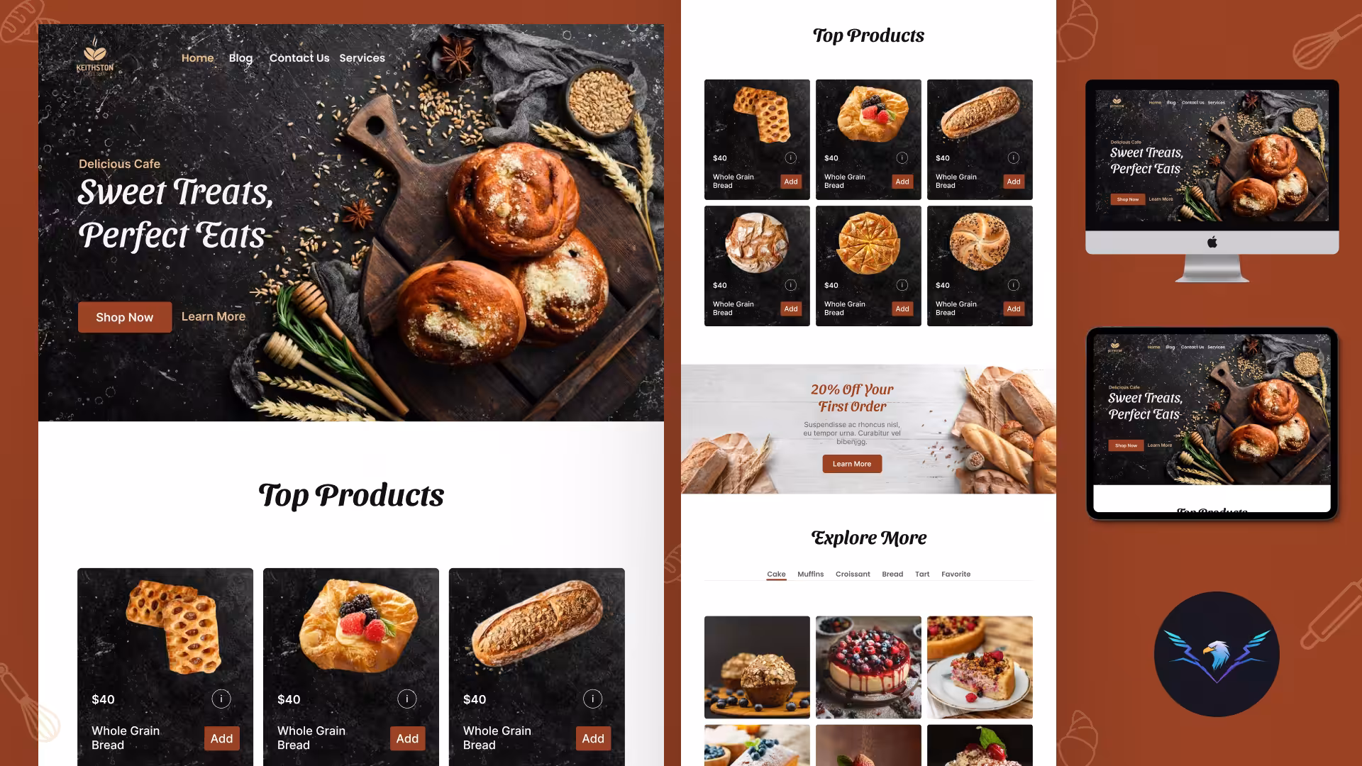
5. Bennett’s Sandwich Shop

A multi-location sandwich shop in New England with a site that feels warm, fresh, and approachable.
- Layout: Squarespace-based, multi-page. Clear sections for locations, menu, and ordering.
- Color: Warm tones… blue, yellow and creams. Feels like a deli counter, familiar and friendly.
- Typography: Readable and clean. Nothing too adventurous, but totally appropriate.
- Navigation: Standard top nav with location info clearly accessible.
What makes it work:
- It lists all 5 locations (Portsmouth, Burlington, Boston, Kennebunk, Salem) without making it confusing.
- Online ordering is built in, easy conversion path.
Exactly what a sandwich chain needs: honest, quick to navigate, and food-forward.
6. Pizzeria Beddia

A cult pizza spot in Philadelphia with a website that matches its no-nonsense attitude.
- Layout: Squarespace, minimal pages. Homepage does the heavy lifting.
- Color: Simple, probably white or cream background with dark text. No distractions.
- Typography: Clean and unfussy. Like the pizza itself, nothing extra.
- Navigation: Minimal. Just the essentials: menu, hoagie room, reservations.
What makes it work:
- The “Private Hoagie Room” concept is interesting and highlighted well.
- Simplicity signals confidence. They don’t need to convince you, you already know.
One of the better restaurant website design examples for a restaurant that leads with reputation over flash.
7. Tacos My Guey

An authentic Mexican street taco brand with 5 locations in Orlando and a website that matches the energy.
- Layout: WordPress/Elementor. Multi-section homepage with location finder, menu highlights, and catering info.
- Color: Warm, punchy tones… red, yellow, and green that scream street taco energy.
- Typography: Bold and fun. The brand name itself sets the playful tone.
- Navigation: Clear top nav with online ordering, locations, and catering links.
What makes it work:
- Five locations covered cleanly without feeling cluttered.
- Online ordering and catering booking are both easy to find.
- Food photography is appetizing and real-looking, not overly styled.
A good example of a growing fast-casual chain that keeps its personality intact as it scales.
8. Akaneya Japan

A Japanese sumibiyaki restaurant with locations in Barcelona, Madrid, and Paris… and a website as refined as its wagyu.
- Layout: WordPress-based, clean multi-page structure. The language switcher (EN) is a thoughtful touch for an international audience.
- Color: White backgrounds. Fire, charcoal, tradition. Perfect for a grill-focused Japanese concept.
- Typography: A mix of Japanese-inspired display fonts and clean body text. Elegant.
- Navigation: Clear and minimal. Reservation, Gift, Menus… enough to guide without overwhelming.
What makes it work:
- The brand story (fire, tradition, wagyu) is communicated through design before you read a word.
- Multi-city presence is handled without confusion.
- The imagery of glowing charcoal and beautifully plated meat is stunning.
A great reference for luxury restaurant website design in the fine dining Japanese space.
9. Giusto Newport

A freestyle Italian restaurant at Hammetts Hotel in Newport, Rhode Island.
- Layout: Built with GetBento (a restaurant-focused site builder). Simple, clean, hotel-adjacent.
- Color: White and light tones with subtle brand color. Clean and airy, fits a coastal Newport setting.
- Typography: Clean, professional, Italian restaurant-appropriate.
- Navigation: Standard: Menu, Event, About, Reservations, Contact. No surprises.
What makes it work:
- The hotel connection is clearly communicated, which builds trust.
- SEO keywords are thoughtfully included (“best Italian Newport,” “best date spot”).
- The reservation system is front and center.
Solid and functional, a reliable design for a hotel restaurant that needs to convert tourists fast.
10. MIDA Boston

An Italian neighborhood restaurant in Boston, owned by Chef Douglass Williams, with a site that feels warm and chef-driven.
- Layout: Squarespace. Clean, simple, single-column feel with focused sections.
- Color: Dark, deep pink, and white. Fitting the evening-focused dinner-only restaurant.
- Typography: Minimal and refined. The logo is a clean, type-based mark.
- Navigation: Simple Squarespace nav. Menu, home, location… all there.
What makes it work:
- The chef-owned angle is front and center (Chef Douglass Williams’ name is in the description).
- Handmade pasta deserves nice photography, and the site delivers.
A clean, chef-proud site that doesn’t overcomplicate things.
11. The Eddy NYC

A cozy East Village restaurant in New York City focused on seasonal, global cuisine.
- Layout: Simple custom HTML site. One-page scroll with anchor navigation.
- Color: The white logo on Image background matches the East Village mood.
- Navigation: Anchor links: Reservations, Contact, Food & Drinks, Our Story, News… all in a clean top bar.
What makes it work:
- The Resy embed for reservations is smooth and functional.
- The single-page layout works perfectly for a small, intimate spot.
- “Seasonal Global Cuisine” is clearly communicated above the fold.
It’s proof that a small restaurant doesn’t need a complex site… just a clear, well-built one.
12. FENN’S

A Dutch restaurant with a strong nature theme. The tagline translates to “naturally together.”
- Layout: Built on Webflow. Clean, nature-inspired layout with event promotion built in (Mother’s Day High Tea was featured).
- Color: Soft greens, earth tones, and natural textures that match the “nature meets flavor” concept.
- Navigation: Menu, Over ons (About), Impressie (Gallery), Contact, Agenda (Events), Reserveren (Reserve).
What makes it work:
- The events section (Agenda) is prominent, showing the restaurant is an experience destination, not just a meal stop.
- The Dutch-language site is consistent and culturally appropriate.
- The Webflow build gives it a polished, modern feel.
Great for restaurants that want to position themselves as a full experience rather than just dinner.
13. Albi DC

A Michelin-starred, James Beard Award-winning restaurant in Washington, D.C. from chef Michael Rafidi… and the website reflects that prestige.
- Layout: Webflow. Editorial, full-width imagery. Every section feels intentional.
- Color: Deep, rich tones. Mixed color backgrounds with warm accent colors. Feels expensive without being cold.
- Typography: Clean, confident. The nav uses a simple slash “/” as the home link… a bold, design-forward choice.
- Navigation: Menu, Our Team, Gift Cards, Reservations. Minimal and purposeful.
What makes it work:
- The Michelin star and James Beard credentials are let in through the design feel, not just text.
- The team page is a smart touch. It puts faces to the food.
- No clutter. Every pixel earns its place.
One of the best examples of luxury restaurant website design among award-winning American restaurants.
14. Aiyanna Ibiza

A restaurant on the island of Ibiza with a site that’s as atmospheric and immersive as the island itself.
- Layout: Custom WordPress theme with a full-screen loading animation. Cinematic from the first second.
- Color: Whites and naturals with contrast imagery of the Ibiza landscape. Feels open, summery, Mediterranean.
- Navigation: Gastro & Mixo, Experience, Environment. Three sections that tell the full story of the place.
What makes it work:
- The loading screen creates anticipation, you feel like you’re arriving somewhere special.
- The IG link is prominent, which makes sense for a visually stunning Ibiza venue.
- The “noindex” meta tag suggests this may be a staging or private preview, but the design itself is strong.
A bold, experience-first site that sells the feeling of Ibiza dining.
15. Los Tontos

A Mexican restaurant in Elewijt, Belgium with a website that has real personality.
- Layout: WordPress. Dark green background sets a bold, jungle-like tone. Clean sections below.
- Color: Deep forest green, warm golds, and pops of color. It’s festive but not garish.
- Typography: Bold display type that feels fun and slightly irreverent, matching the “Los Tontos” (The Fools) brand name.
- Navigation: Clean and simple, typical WordPress top-bar structure.
What makes it work:
- The dark green hero is unexpected and memorable, you don’t forget it.
- The Mexican identity feels authentic rather than clichéd.
- Location info (between Mechelen and Vilvoorde) is easy to find, important for a destination restaurant.
A confident, personality-packed site that stands out among Belgian restaurant websites.
16. Galvin Restaurants

A collection of Mediterranean-British restaurants in London and Essex by Michelin-starred brothers Chris & Jeff Galvin.
- Layout: WordPress with a custom theme. Multi-restaurant structure with individual venue pages.
- Color: Ash color with gold accents. Classic, rich, and British fine dining through and through.
- Typography: Elegant and traditional. Serif display fonts, clean body copy. Very proper.
- Navigation: A full nav that covers all the Galvin venues, private dining, press, and bookings.
What makes it work:
- The gold-on-ash color palette immediately communicates fine dining without a single word.
- The family-run, chef-brother story is a strong and memorable brand narrative.
- Managing multiple restaurants under one site is done without losing individual venue identity.
A polished, award-winning restaurant group site that shows how to handle multi-venue branding with grace.
Wrapping up
And there you have it…
16 restaurant websites that prove good design isn’t just about looking pretty. It’s about making people want to walk through your door before they’ve even tasted your food.
Whether you love the moody boldness of Albi DC or the quiet storytelling of Galvin Restaurant, one thing is clear: the best restaurant websites always feel like the place they represent.
So, what does your restaurant website say about you?
If the answer makes you cringe a little, that’s where Block Agency comes in.
We build websites that match the real energy of your restaurant, not just a template slapped together overnight.
Let’s build something worth bookmarking. Get in touch with us here: hey@blockagency.co
Frequently asked questions
What makes a good restaurant website design?
A good restaurant website makes it easy for visitors to find the menu, location, hours, and a way to book a table. It loads fast, looks great on mobile, and uses strong food photos. The design should also match the feel of the restaurant… a fine dining spot should look different from a taco truck.
What pages should a restaurant website have?
Most restaurant websites need a homepage, menu page, about page, contact page, and a reservations or order online page. Some also add a gallery, press mentions, and an events page. Keep it simple, customers mostly want the menu, location, and a way to book fast.
How much does it cost to design a restaurant website?
Costs vary a lot. A basic template site can cost as low as $500, while a fully custom-designed restaurant website can range from $3,000 to $15,000 or more. The price depends on the number of pages, features like online ordering, and whether a professional agency is building it from scratch.
What platform is best for a restaurant website?
Squarespace, Wix, and WordPress are the most used platforms for restaurant websites. Squarespace is great for clean, visual designs. WordPress gives more flexibility for bigger sites. Webflow is popular for more custom, design-heavy builds. The right choice depends on budget, tech comfort level, and how much control is needed.